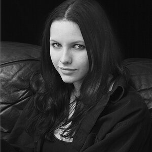
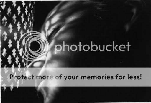
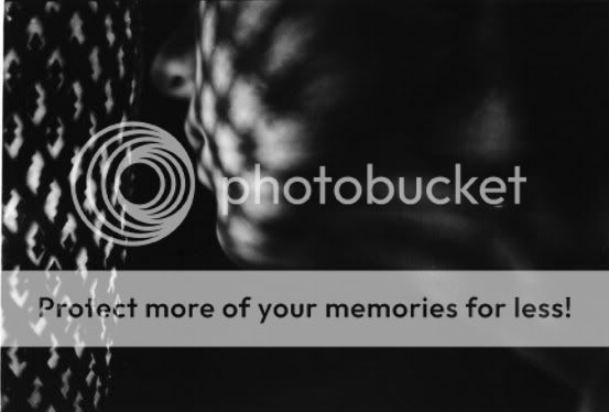
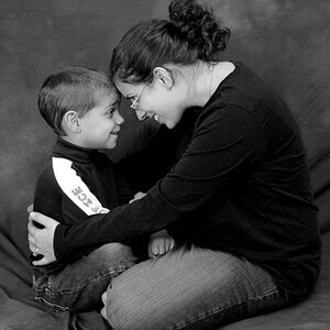
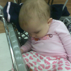
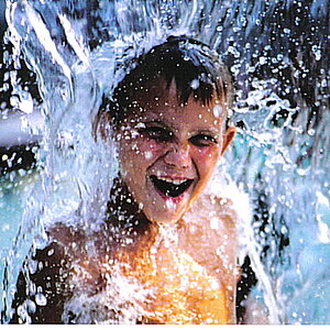
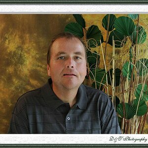
Usually for critique it helps to just post one pic I like the first, it's very dramatic. The lighting really adds to it. There is a part in the top left hand corner that could be burned in a little more (make it darker). The second one seems too dark overall, and doens't provide teh feel that the first does. It's hard for me to tell on the last b/c it's running into the second pic. I think it could use more contrast, there's no real whites in it, sort of just overall grey. Hopefully that helps a bit.
A little Man Ray! I think you are on to something. The noir lights effect should be much brighter. This will give your subject more freedom in the highlight and shadow area.
of the 3 i like the first one the best too. the mood kinda creeps me out though... sorta looks like a dead person or something. there is no detail to point to any other emotion, for me, other then creepy


") I like the first, it's very dramatic. The lighting really adds to it. There is a part in the top left hand corner that could be burned in a little more (make it darker). The second one seems too dark overall, and doens't provide teh feel that the first does. It's hard for me to tell on the last b/c it's running into the second pic. I think it could use more contrast, there's no real whites in it, sort of just overall grey. Hopefully that helps a bit.
I like the first, it's very dramatic. The lighting really adds to it. There is a part in the top left hand corner that could be burned in a little more (make it darker). The second one seems too dark overall, and doens't provide teh feel that the first does. It's hard for me to tell on the last b/c it's running into the second pic. I think it could use more contrast, there's no real whites in it, sort of just overall grey. Hopefully that helps a bit.
![[No title]](/data/xfmg/thumbnail/37/37605-90c8efaef5b7d1f52d4bf8e7dfd33673.jpg?1619738148)
![[No title]](/data/xfmg/thumbnail/41/41937-bd46d08f9adcefe8bc65477f19a4f580.jpg?1619739947)
![[No title]](/data/xfmg/thumbnail/34/34114-dd12be026979ccd4182c5f478bd91448.jpg?1619736284)