What's new

Noob, asking for critique :)

Image 1: good concept, but you're too close and the hands are large (due to perspective) compared to the head.
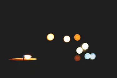
Image 2: Love it. but the lowest light is cut off by the table - either get it in fully, or edit it out. The roundness of the rest of the OOF lights is appealing, as is the placement and composition.
Image 3: excellent, except for the white at the extreme right, which competes for our attention. Also, you scalped her, which your friend may not appreciate.
Image 4: nice light, nice image, but it needs critical sharpness at the irises, a a touch more contrast to give it "pop".
Image 5: the tilt works for me, but again, the bright background competes for our attention. It's good, but too bright. You're using the DOF well, however.
Image 6: Again, good concept, pretty good execution. Don't particularly like the post-processing.
Image 7: Another very nice image, good use of DOF, light is excellent... but you scalped her.
Image 8: well captured. The upper right corner shows the edge of the vessel and diminishes the attractiveness of the image. Perhaps incorporating a little contrasting colour would also help.

As for you calling yourself a "noob" - you're being modest. The quality of the images is much better than what I could expect from someone who has only been shooting for a year. Your exposures are good, your use of DOF is excellent. The areas for improvement that I can see are more related to composition and especially control of the foreground/background so that it doesn't compete with or distract from your main subject.

And you have beautiful friends. That always helps.;)


Your post honestly just made me really happy lol. And you brought things to my attention that i didnt notice before thats the best part. I see exactly what you saying with the distractions. & I ALWAYS scalp people... gr. but anywho, thank you very much :)
 
Can I ask how you shot the black & white of the woman?? I am brand new at this and have been trying to shoot and achieve a similar effect...focus on an object a few feet away, while everything in the foreground is out of focus. What lens? f/, shutter speed?
 
Image 1: good concept, but you're too close and the hands are large (due to perspective) compared to the head.
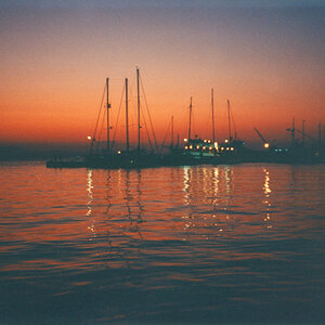
Image 2: Love it. but the lowest light is cut off by the table - either get it in fully, or edit it out. The roundness of the rest of the OOF lights is appealing, as is the placement and composition.
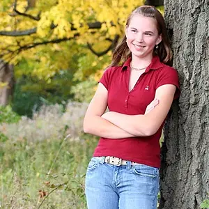
Image 3: excellent, except for the white at the extreme right, which competes for our attention. Also, you scalped her, which your friend may not appreciate.
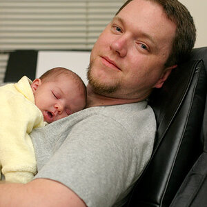
Image 4: nice light, nice image, but it needs critical sharpness at the irises, a a touch more contrast to give it "pop".
Image 5: the tilt works for me, but again, the bright background competes for our attention. It's good, but too bright. You're using the DOF well, however.
Image 6: Again, good concept, pretty good execution. Don't particularly like the post-processing.
Image 7: Another very nice image, good use of DOF, light is excellent... but you scalped her.
Image 8: well captured. The upper right corner shows the edge of the vessel and diminishes the attractiveness of the image. Perhaps incorporating a little contrasting colour would also help.


I wish more people would critique like this rather than criticize (which I sadly see much of).
 
$new candle.webp

What do y'all think about this version?
 
Well, pgriz did an excellent job covering these images, so I'll just add my impressions. (warning - I'm very sincere in my thoughts. hehe.. )

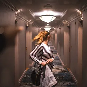
1) Cute and playful, but it doesn't really interest me much. It feels scripted. The girl's shadow bothers me, too.
2) Moody. Not too interesting, otherwise.
3) Very nice! Great DOF. Feels natural and genuine and happy. Nice composition.
4) meh...
5) I like the way the model's energy matches the graffiti's energy. Playful, great color. The tiled angle only works because of the graffiti and the youthful energy, imo. I don't like the train tracks, but you work with what you have. I just feel a certain tension/danger around train tracks - it can detract.
6) Not bad. A little canned, but okay. Nice color.
7) Great potential! Nice color, texture, expression, candor, mood. I love this photo. Problems: centered, head cut off, diagonal lines.
8) Good start. For ideas, read Post #8 in this thread: http://www.thephotoforum.com/forum/macro-photography/265618-drip-drip-drip.html

I really like your work and the freshness it seems to embody. I'm looking forward to seeing more. :)

PS: I'm a noob, too! ;)
 
#1 is cute, and well done. I can't think of anything to "improve" this shot.
#2 nice bokeh, but what is "missing" is the candle itself. perhaps a very low-powered fill light just enough to show us the candle.
#3 should have been in portrait format, and don't cut off anyone's head, but you can crop some of the excess foliage on the left.
#4 I don't like. If you are going to make her eyes the main subject, include both of them, and her eyebrows.
#5 in spite of the cliche, this is not too bad. No doubt the model's choice of venue, but where are the ropes and Snidely Whiplash? Nice shot choice for a "tilt".
#6 the focus appears to be on the bubbles, and the model's face is far out of focus, therefore not as successful as #1
#7 needs to be in portrait format, and don't cut off anyone's head.
#8 very nice water shot
 
View attachment 9605

What do y'all think about this version?

Both candle shots suffer from the sideways flame. Yes, it is sometimes difficult to find a calm room, but if you are going to go to the trouble, try to find a place where there isn't air movement blowing the flame sideways.
 
View attachment 9605

What do y'all think about this version?

Both candle shots suffer from the sideways flame. Yes, it is sometimes difficult to find a calm room, but if you are going to go to the trouble, try to find a place where there isn't air movement blowing the flame sideways.


See the funny thing about this picture is that i took this picture on a window. The bokeh is actually street lights outside. And to explain the sideways flame, it was snowing outside and really strong winds. But idk i kinda like the sideways flame.

oh & thanks for the statements above :)
 
The third shot is wonderful in black and white. The depth of field is perfect. The model is great with a great smile. composition is right on.

All of the images seem a bit soft, but that could be from the upload or website they are hosted on. I know Photobucket has a tendency to soften images.

Great job. Keep on shooting.
 
You got talent, that's obvious. :)
 
I was just discussing this in another forum and now I feel its essential, You lack consistency. Your photos look a bit random and if you were to advertise your work, clients would be confused as to what to expect from you. (Shouts out to Overread)
http://www.thephotoforum.com/forum/photographic-discussions/285520-consistency-more-professional-less-creative.html#post2600842
Here's the forum I was talking about^
Learn to use consistency to your advantage, It will make your portfolio look much more professional
 
I was just discussing this in another forum and now I feel its essential, You lack consistency. Your photos look a bit random and if you were to advertise your work, clients would be confused as to what to expect from you. (Shouts out to Overread)
http://www.thephotoforum.com/forum/photographic-discussions/285520-consistency-more-professional-less-creative.html#post2600842
Here's the forum I was talking about^
Learn to use consistency to your advantage, It will make your portfolio look much more professional

I see your point and of course if i were to ever get to the professional level (hopefully one day :) ) i would deff be considering that. but i also agree with one of posters on that thread tht not every picture has the same mood and tone and just overall appearence so not everything is gonna be alike. But i get what your saying.
 

Create an account or login to comment

You must be a member in order to leave a comment

Create account

Create an account on our community. It's easy!

Log in

Already have an account? Log in here.

New Topics

Back
Top Bottom