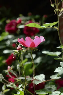
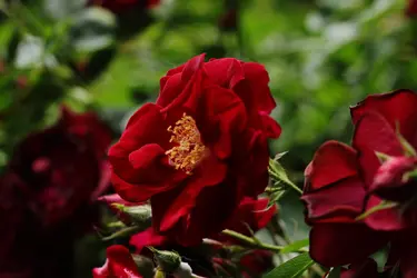
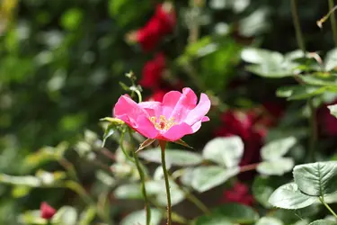
What do you all think of these pictures? Anything from techique to exposure problems to being perfect and wishing you were capable of such raw talent (latter not expected haha). really anything would be great though.. All were shot with t2i with 50mm1.8 except the beach scene which was shot with a 55-250. the yellow flower was taken day one of having the nifty 50, and i may have cranked it too wide to see the bokkeh. the rest were taken with minimal more experienc.. What do ya think? Thanks
You are using an out of date browser. It may not display this or other websites correctly.
You should upgrade or use an alternative browser.
You should upgrade or use an alternative browser.
Noob could use C and C
- Thread Starter tdunn06
- Start date
Joel_W
TPF Noob!
- Joined
- Dec 9, 2011
- Messages
- 2,211
- Reaction score
- 164
- Location
- Long Island, New York
- Can others edit my Photos
- Photos OK to edit
Just way too many pictures to CC. The best of the forals is picture #6. Nice composition and properly exposed. The simple bokeh background is by far the best of the set. It frames the subject and keeps our eyes focused on the subject.
- Thread Starter 🔹
- #3
Joel_W said:Just way too many pictures to CC. The best of the forals is picture #6. Nice composition and properly exposed. The simple bokeh background is by far the best of the set. It frames the subject and keeps our eyes focused on the subject.
I guess I tossed up a bunch looking for a kind of overall idea of if they are close or maybe a little under exposed or sloppy.. Trying to see if I'm on the right track with what I'm doing so far. Thanks for checking them out
- Thread Starter 🔹
- #4
tdunn06 said:I guess I tossed up a bunch looking for a kind of overall idea of if they are close or maybe a little under exposed or sloppy.. Trying to see if I'm on the right track with what I'm doing so far. Thanks for checking them out
Just giving a bump hope that's cool
Ernicus
TPF Noob!
- Joined
- May 18, 2012
- Messages
- 2,689
- Reaction score
- 337
- Location
- Old Town, ME
- Can others edit my Photos
- Photos OK to edit
- Banned
- #5
i concur on number 6 as best. I'll give my 2 cents only because I have been working hard on framing and these folks have helped a lot. 1 is right in the middle and kinda boring to me, although the flower in the middle is assumingly what you want us to focus on, nothing jumps out and says "look at me". number two I think you cropped too much to the bottom right corner...maybe if you had turned a bit so the blurry ones were in the upper right it might have balanced and worked better. Number 3 I think is ok as framed, just not very interesting to me for some reason. number 4 just not a good frame...again..just not interesting enough to hold the eye and make you look longer than a quick glance. number 5 is pretty much identical to my reasoning for number 1. and again number 6 i like. best of set.
None of them I clicked on to zoom in and get a better look, except six.
oh, one thing I do like about number three is that it forces you to look left instead of naturally looking to the right.
the last one looks ok exposed and the fog, clour, or large wave or whatever that is makes you look over there and say "what's that" but thats about it...then off looking for more pics.
Hope that helped some. I typed the initial asessment in a long run on paragraph to match the picture layout. :-D
I was jumbling my pics up all like that until recently too...lol. As I was told in a post...."they need to breathe"
- Thread Starter 🔹
- #6
Ernicus said:i concur on number 6 as best. I'll give my 2 cents only because I have been working hard on framing and these folks have helped a lot. 1 is right in the middle and kinda boring to me, although the flower in the middle is assumingly what you want us to focus on, nothing jumps out and says "look at me". number two I think you cropped too much to the bottom right corner...maybe if you had turned a bit so the blurry ones were in the upper right it might have balanced and worked better. Number 3 I think is ok as framed, just not very interesting to me for some reason. number 4 just not a good frame...again..just not interesting enough to hold the eye and make you look longer than a quick glance. number 5 is pretty much identical to my reasoning for number 1. and again number 6 i like. best of set.
None of them I clicked on to zoom in and get a better look, except six.
oh, one thing I do like about number three is that it forces you to look left instead of naturally looking to the right.
the last one looks ok exposed and the fog, clour, or large wave or whatever that is makes you look over there and say "what's that" but thats about it...then off looking for more pics.
Hope that helped some. I typed the initial asessment in a long run on paragraph to match the picture layout. :-D
I was jumbling my pics up all like that until recently too...lol. As I was told in a post...."they need to breathe"
I can appreciate that thanks. Flowers aren't exactly my preferred subject I wouldn't say I can tell you have more experience. I enjoy the landscapes and I have a few posted in another post. The flowers are more of a.. "ok I need practice what's around".
Do you think the contrasts and sharpness and all that is pretty good? I'm new tithe post process and really have no idea what in doing.. Usually make them as sharp as I can without giving me a headache to look at it lol.. Then I aimlessly slide bars around untill it looks decent enough.. Usually (I think because I've never been able to do it before and think its cool) I add a ton of shadow and decent amount of contrast. Looks ok to me, but I'm really clueless just going on foe instinct lol.
Thanks again though.. Illbtry and space out the pics haha.. Really trien to get as much feedback ASAP.. I guess I'll try and be more patient.......in a week or two haha
Jaemie
No longer a newbie, moving up!
- Joined
- Apr 27, 2012
- Messages
- 1,907
- Reaction score
- 340
- Location
- Puyallup, WA
- Can others edit my Photos
- Photos OK to edit
I like #3 best. The water drops, the moody tone, and the simple composition hold my attention very well. The texture is splendid.
Ernicus
TPF Noob!
- Joined
- May 18, 2012
- Messages
- 2,689
- Reaction score
- 337
- Location
- Old Town, ME
- Can others edit my Photos
- Photos OK to edit
- Banned
- #8
I can appreciate that thanks. Flowers aren't exactly my preferred subject I wouldn't say I can tell you have more experience. I enjoy the landscapes and I have a few posted in another post. The flowers are more of a.. "ok I need practice what's around".
Do you think the contrasts and sharpness and all that is pretty good? I'm new tithe post process and really have no idea what in doing.. Usually make them as sharp as I can without giving me a headache to look at it lol.. Then I aimlessly slide bars around untill it looks decent enough.. Usually (I think because I've never been able to do it before and think its cool) I add a ton of shadow and decent amount of contrast. Looks ok to me, but I'm really clueless just going on foe instinct lol.
Thanks again though.. Illbtry and space out the pics haha.. Really trien to get as much feedback ASAP.. I guess I'll try and be more patient.......in a week or two haha
I think some of my firsts...if not my firsts were my flowers too. All of mind were dead center and boring. exposure and saturation spot on but just boring. So I keep posting and asking. I am mostly regurgitating what was told to me that I learned on here, so I am not much more experienced.
as far as the other questions..to me six was great in that respect. I am still practicing on getting good quality blur rather than headache blur when bluring up backgrounds. My initial response is you're fine in that area...but I can't critique on that stuff too well yet.
Similar threads
- Replies
- 5
- Views
- 4K
- Replies
- 3
- Views
- 2K
- Replies
- 0
- Views
- 1K


![[No title]](/data/xfmg/thumbnail/37/37603-739c5d9b541a083a12f2f30e45ca2b7b.jpg?1734170731)
![[No title]](/data/xfmg/thumbnail/41/41930-3f8741ecabbbfd4d67ade3e339078814.jpg?1734176287)


![[No title]](/data/xfmg/thumbnail/33/33341-3a6934b6cdb015b5acf31087acdcd278.jpg?1734163236)
![[No title]](/data/xfmg/thumbnail/37/37605-90c8efaef5b7d1f52d4bf8e7dfd33673.jpg?1734170732)


![[No title]](/data/xfmg/thumbnail/41/41931-485b5f9a9f3736e9ed9d96ecdf639921.jpg?1734176288)

![[No title]](/data/xfmg/thumbnail/41/41929-26c4134c150c4c6befd5f544a5223aaf.jpg?1734176286)