burstintoflame81
TPF Noob!
- Joined
- Aug 7, 2009
- Messages
- 729
- Reaction score
- 0
- Location
- Arizona
- Can others edit my Photos
- Photos NOT OK to edit
Let me just preface these by saying that I have only had my camera for 3 weeks ( and only been able to shoot 1 day a week out of those 3 weeks ). I have never had any photography classes or anything and other than the typical point-and-shoot normal snapshots that everyone takes, I have never tried to take "serious" pictures. With that said, here are a few random first pictures....[ Note:All of these have had very minimal editing. Maybe just soft-light sharpening and a little brightness adjustment with PaintShop Pro.]
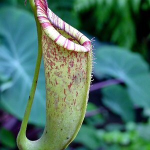
1)

2)

I didn't realize until later that this pic had a piece of petal laying in the center, but it was the best of all, so I kept it anyway.
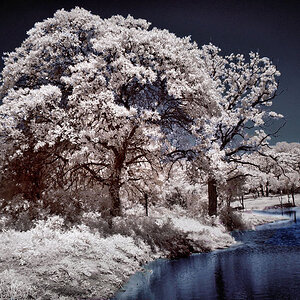
3)

Random shot of a bee. I know that the flower is dying but I liked the bright color. The bee just happened to come along, and I nearly swatted it away out of habit before realizing that it could be an opportunity.
4)

Random pic of my guitar focus on the logo. I now use this as my computer desktop. It wasn't intended as a B&W but I liked it that way.
5)

Random pic of a Duck and one of his feathers falling into the water.
WHOOPS I forgot one....
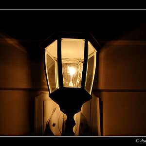
6)

1)
2)
I didn't realize until later that this pic had a piece of petal laying in the center, but it was the best of all, so I kept it anyway.
3)
Random shot of a bee. I know that the flower is dying but I liked the bright color. The bee just happened to come along, and I nearly swatted it away out of habit before realizing that it could be an opportunity.
4)
Random pic of my guitar focus on the logo. I now use this as my computer desktop. It wasn't intended as a B&W but I liked it that way.
5)
Random pic of a Duck and one of his feathers falling into the water.
WHOOPS I forgot one....
6)

") but rest are good too.
but rest are good too.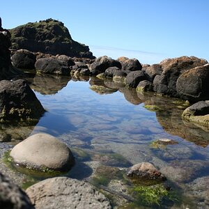

![[No title]](/data/xfmg/thumbnail/42/42057-1509913128bb1db2bc11235c05832fd4.jpg?1619739993)

![[No title]](/data/xfmg/thumbnail/39/39497-93752210dd49247220721e5ac8c61245.jpg?1619739055)

![[No title]](/data/xfmg/thumbnail/35/35947-ab35bfc67d8e12ce65dda301d3bf2b66.jpg?1619737255)