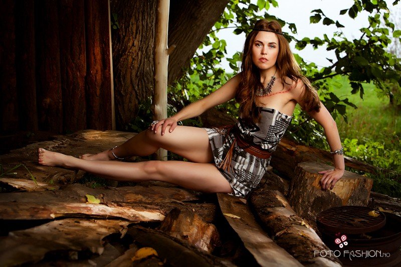
Hmm this isn't my area of expertise, but I'd say there are 3 things kind of standing out to me against what is otherwise a very well taken and processed photo.
The first is her face, not sure if she's trying for a serious look, but her eyes and mouth especially say "bored" to me rather than serious or stern. It kind of detracts from an otherwise fun shot and neat location since the face and eyes are where the viewer is going to first.
The second is the upright post, it clashes with the otherwise landscape composition of the model and I'd have tried to work with it into the composition or hide it totally from view (behind her without it appearing out of her head of course). Might be worth considering clone/heal tools to remove it from the shot if you want.
The third (and somewhat the least of the factors) is the sky in the far right, whilst the brightness helps further draw your eye to that corner (and thus her face) I can't help but feel that it looks like a drab sky, milky white and the leaves almost give that "overexposed" hint around their edges. Might have just been the day and the light you had to work with (being in the UK I know well of cloud cover!) though the exposure might have benefited if you'd been using controlled lighting for the foreground areas to allow you to more expose for the sky.




![[No title]](/data/xfmg/thumbnail/40/40305-2fbdc00adce4fac5e62dccb3f6f9c633.jpg?1734174713)
![[No title]](/data/xfmg/thumbnail/30/30887-70db98f68651b2f6c62119e611f707c0.jpg?1734158896)


![[No title]](/data/xfmg/thumbnail/35/35877-b537a0bce18fcb18b610d787610f3d3d.jpg?1734167621)