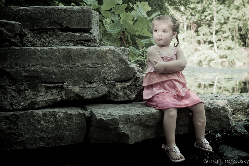
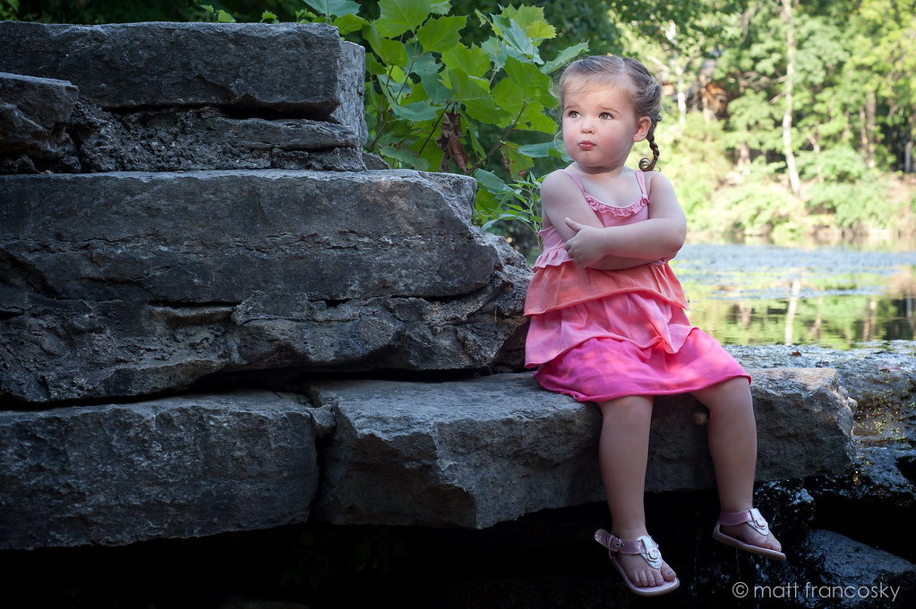
Cute pic...I like the title...her expression and body language really go with that title. My only nit would be that the lighting on her face looks a bit too strong, like an OCF aimed right at her face. The bright catchlights in her eyes and that crisp lighting effect with the strong-ish under-chin shadow just looks a slight bit out of place in that lovely naturalistic setting with its predominantly open shade lighting. The horizontal composition WORKS well because...well,it's an environmental portrait and it uses the entire space well. The large, stone slabs make a nice seating platform, and her "stone-faced" expression makes me kind of chuckle inside.I like her expression and the way she looks so small and child-like sitting there, arms folded,etc.. She's got spirit! I can tell by looking that the bright background patch on the far right was very strong in full color, and am guessing that's why you went with desaturation for the final image. Like The_traveler above, I'm not 100% digging this desat look--but I do think it's a cute picture.









![[No title]](/data/xfmg/thumbnail/32/32929-22e23acc63d6ecb25e5ee941be87121f.jpg?1734162700)

![[No title]](/data/xfmg/thumbnail/32/32933-a3726bc86a7c36fb222612f8aeab6b84.jpg?1734162721)
![[No title]](/data/xfmg/thumbnail/35/35952-55c8d42ec1c6ff0e13b45356cbf9c068.jpg?1734167758)