I would say both are very nice pictures. It's hard to believe that you are just a beginner
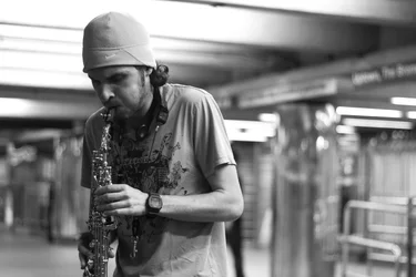
Here is what I would have done ( that's just me! ) for the 1st photograph: I would have composed it such that the man was on the right as he is facing the left. Basically give him some room to the side where he is facing.
Here is an excellent article on Street Photography by Cyrus Katrak on ShutterMonks.com, you might want to check it out: Street Photography Tips by Cyrus Katrak - Shutter Monks
I love the way he adds depth to his images.
Hope it helps!
I think these are decent street shots.
I wish that the first one would have a little more exposure of his face but it still works, as does the extra space giving a hint as to where he is. The unsharpness is ok since it fits the mood and gives the impression of a musician swaying with the music.
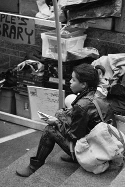
I wish that the second were also more face-on. We are looking at her, rather than the situation so much and so I'd like to see her face more but it still works as it is.
Good conversions, imo.
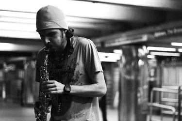
The first might look different with a little curves layer to add contrast. We really don't need the detail it blacks out and it gives a different impression.
thank you all! & Lew, i really like the darkness in the background of your edit, but the face is kinda getting lost in the shadows or is it just me? I guess thats why i needed more exposure on the face like you said lol. got it! :thumbup:






 Do settings need to be adjusted when using an adapted lens?


![[No title]](/data/xfmg/thumbnail/36/36132-5bd4fa365c199003273e0ff128bf42f4.jpg?1734168228)



![[No title]](/data/xfmg/thumbnail/32/32166-ddd2797e76a9226d289c2158c3cf7b67.jpg?1734161046)
![[No title]](/data/xfmg/thumbnail/32/32167-524b76a903731ff48d48682c9f9b0978.jpg?1734161046)