What's new

Ok guys..hit me with your best shot CC...looking to improve daily!

Montanamyst

TPF Noob!
Joined
Apr 10, 2012
Messages
118
Reaction score
6
Location
GA
Can others edit my Photos
Photos OK to edit
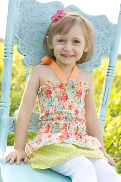
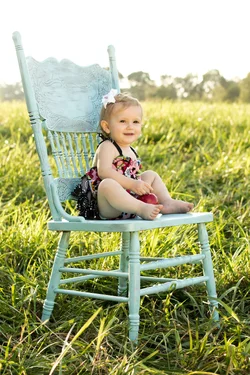
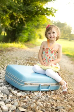
Hey Guys and Girls! Had a practice shoot with these two cuties. Let me know what you think. I know some dislike the props like chairs and suitcases, but the Mom's love them and request them. So with that said.....

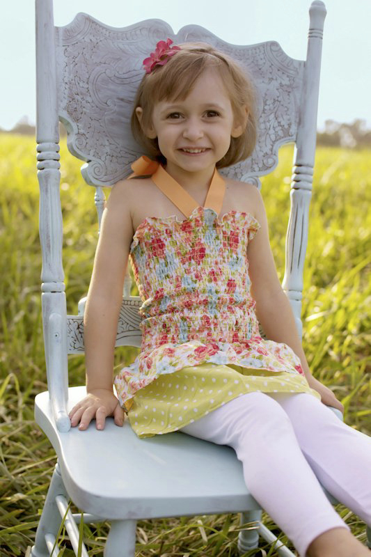
1. Not happy with the blown out sky, and of course the batteries died on site (and yes I have learned my lesson) on my flash and I was having no luck with the reflector. I had tried to mask a sky in, but it just didn't look good to me. I may post a couple more on a diffrent thread for editing cc.
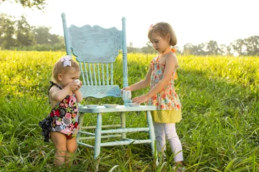
$DSC_0068.webp

2.

$DSC_0041.webp

3.

$DSC_0198.webp


4.

$DSC_0236.webp
5.

$DSC_0249.webp
 
I think shooting with the preview in highlight mode will help you out. You are seeming very predominant to blowing out. Turn your image preview to highlight mode, if you see any blinking white to black, reduce your exposure until you get an even histogram.
 
I think shooting with the preview in highlight mode will help you out. You are seeming very predominant to blowing out. Turn your image preview to highlight mode, if you see any blinking white to black, reduce your exposure until you get an even histogram.


Yeah I do, and it didn't help that my flash was dead, so I think I was trying to overcompensate for that, if tha makes any sense. I actually bump the exposure in pp. If you look at my images SOC they are much darker. And I see so many photogs doing this really bright look, which I'm not even sure if I like. hmmm...leaves me wondering what to do...
 
In some types of photography blown highlights are ok. Even in some portraits. However, I'm finding them to be over powering in these images and instead of focusing on your subjects, I'm looking at your blown sky. Another way to avoid this would be to change your location to a partially shaded area, or shoot from an elevated surface, such as a 4 foot step ladder.
 
In some types of photography blown highlights are ok. Even in some portraits. However, I'm finding them to be over powering in these images and instead of focusing on your subjects, I'm looking at your blown sky. Another way to avoid this would be to change your location to a partially shaded area, or shoot from an elevated surface, such as a 4 foot step ladder.


Ahh never heard the step ladder tip. Thanks...I'm gonna try that! It was partially shaded, but the background was very lit.
 
Yeah I do, and it didn't help that my flash was dead, so I think I was trying to overcompensate for that, if tha makes any sense. I actually bump the exposure in pp. If you look at my images SOC they are much darker. And I see so many photogs doing this really bright look, which I'm not even sure if I like. hmmm...leaves me wondering what to do...

If you have to wonder whether or not you like the latest fad then you probably don't. Trust your instincts and not the fads of a bunch of Facebook Pros.

Those are all overly bright. Look at your histogram, that's what it's there for.
 
Agree with Scott, again.

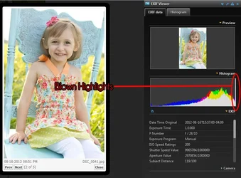
If you view your histogram, and the far right side has a fine line shooting up the edge of it, your highlights are blown. If you have a fine line shooting up the left side of it, your shadows are plugged. You should have a decently arched graph decending to near zero on both the right and left sides of the histogram, with the high point preferrably in the center. It won't always be in the center, because tones are different in every image. However, make sure that you don't have a line shooting up the right or left side of the histo.
 
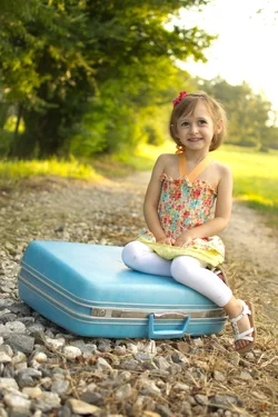
Is this edit any better? I brought the exposure down and tweaked the brightness.

$DSC_0236.webp
 
Agree with Scott, again.

If you view your histogram, and the far right side has a fine line shooting up the edge of it, your highlights are blown. If you have a fine line shooting up the left side of it, your shadows are plugged. You should have a decently arched graph decending to near zero on both the right and left sides of the histogram, with the high point preferrably in the center. It won't always be in the center, because tones are different in every image. However, make sure that you don't have a line shooting up the right or left side of the histo.

Look at the histogram of shot #2. It shows an almost perfect distribution of luminance values, however they are shifted well to the right of center. When everything is shifted left (darkened) the image looks much better to me.
 
Agree with Scott, again.

If you view your histogram, and the far right side has a fine line shooting up the edge of it, your highlights are blown. If you have a fine line shooting up the left side of it, your shadows are plugged. You should have a decently arched graph decending to near zero on both the right and left sides of the histogram, with the high point preferrably in the center. It won't always be in the center, because tones are different in every image. However, make sure that you don't have a line shooting up the right or left side of the histo.

Look at the histogram of shot #2. It shows an almost perfect distribution of luminance values, however they are shifted well to the right of center. When everything is shifted left (darkened) the image looks much better to me.

Yeah you are so right..I'm gonna go back thru and pull it down a little. When you guys were starting out did you just feel like you would never get it right? Ugh sometimes I think I should just quit, but I really enjoy it!
 
Some of them appear crooked and might benefit from a new crop. (big kid alone on suitcase, and one of the chair ones especially).
 
Agree with Scott, again.

If you view your histogram, and the far right side has a fine line shooting up the edge of it, your highlights are blown. If you have a fine line shooting up the left side of it, your shadows are plugged. You should have a decently arched graph decending to near zero on both the right and left sides of the histogram, with the high point preferrably in the center. It won't always be in the center, because tones are different in every image. However, make sure that you don't have a line shooting up the right or left side of the histo.

Look at the histogram of shot #2. It shows an almost perfect distribution of luminance values, however they are shifted well to the right of center. When everything is shifted left (darkened) the image looks much better to me.


I like my images on the lower side of the histo as well... but this is what I'm talking about:

$histo.webp
 
Yeah you are so right..I'm gonna go back thru and pull it down a little. When you guys were starting out did you just feel like you would never get it right? Ugh sometimes I think I should just quit, but I really enjoy it!

Your edit looks much better to me. If you could crop it a little to limit that big white upper right corner I think it would help some to, but I don't know how much room you have in the original.

I mentioned somewhere tonight that cameras have evolved so much since the late 60's that there is really no comparison. When I started in photography we didn't even have built-in light meters much less something that could compute and adjust the camera for a proper exposure. So, to answer your question, Yes! I frequently felt like I'd never get it right. The other advantage you have is that we had to shoot on film, not digital, so it wasn't virtually "Free". We had to pay for every shot we took, good or bad.

People starting out in photography today truly don't realize the benefits they have over the "Bad Old Days". Whatever camera you have it's probably better than what many of the Old Masters of photography had to work with. Your camera will assist you so much and tell you so much that it allows you to focus more on composition and getting the appearance right. Use those features. Take advantage of everything that your camera will do for you and enjoy the learning curve.

Trust me that at some point it will all start to make sense and you'll honestly wonder why you spent so much time worrying about it. If you apply yourself to learning what is happening and what is going on you'll see the shot, the way you want it to look, before you trip the shutter. You'll understand what the light is doing for you, and what it is doing to hinder you. You'll understand how to avoid the pitfalls before they happen because you'll see everything you need to see in a split second and know what you have to do to make everything work they way you want it to.

Also, please don't fall into the rut of making your photos look like someone else's simply because that's the way "They" (whoever "They" may be) do it. There isn't anything wrong with emulating other photographers but adding tint or overexposing or tone mapping simply because others do it isn't the way to learn. Learn the way to make a proper exposure, and THEN develop your own style from that. Forget about the fads and the fauxtographers until you have learned the proper methods. If you want to deviate at that point then go right ahead, but learn the right way first.
 
Agree with Scott, again.

If you view your histogram, and the far right side has a fine line shooting up the edge of it, your highlights are blown. If you have a fine line shooting up the left side of it, your shadows are plugged. You should have a decently arched graph decending to near zero on both the right and left sides of the histogram, with the high point preferrably in the center. It won't always be in the center, because tones are different in every image. However, make sure that you don't have a line shooting up the right or left side of the histo.

Look at the histogram of shot #2. It shows an almost perfect distribution of luminance values, however they are shifted well to the right of center. When everything is shifted left (darkened) the image looks much better to me.


I like my images on the lower side of the histo as well... but this is what I'm talking about:

View attachment 17492

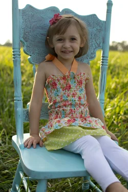
ok, here is the same image SOC uncropped. It needs fill...I had the reflector, but I was having a hard time...in hindsight I should have changed locations. How would you fix this in pp?

$DSC_0041.webp
 

Create an account or login to comment

You must be a member in order to leave a comment

Create account

Create an account on our community. It's easy!

Log in

Already have an account? Log in here.

New Topics

Back
Top Bottom