Ok... Here's some of my pics...

Chamelion 6

TPF Noob!
Joined
Oct 30, 2010
Messages
236
Reaction score
1
Location
Texas
Can others edit my Photos
Photos OK to edit
After all this discussion, I thought it only right I toss something up.


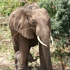
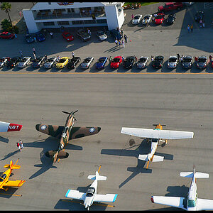
IMG_0968.jpg by chamelion65, on Flickr


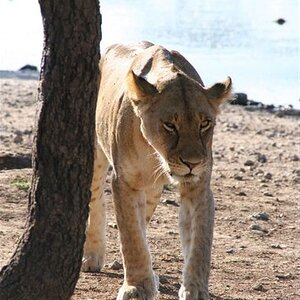
IMG_2239.jpg by chamelion65, on Flickr


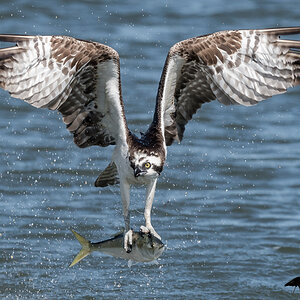
IMG_1706.jpg by chamelion65, on Flickr

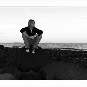
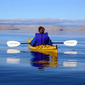
And here's one of those dark, soft enigmagtic things I referred to...


IMG_1731.jpg by chamelion65, on Flickr

These aren't my best, certaintly not my worst. All were shot using the medium JPRG setting cause that was a requirement for the class, I've now moved to shooting in RAW...

All hand held, the tripod usually stays in the trunk. Feel free to comment. :sexywink: Now's your chance to kinda judge what I do.


BTW, sorry for the links and not the pics. I tried to toss up the images but all I got were red x's. Don't know if it's me or what, but it says I can't make attachments... If I need to fix something let me know and I'll change it. (EDIT: Ok... got it figured out...)
 
Last edited:
At the top of the picture, click Share this, click grab html, click bbs code, choose a size, copy the text box and past it here.

I love shot 1731. The only (opinion) thing I would change is I want to either see more or less of the sign up top. I love the mood the image sets. I LOVE the hydrant. Many will probably disagree. It kinda is contrary to the solemn mood the image sets, by saying HELLO! HERE I AM! Right here! you can't ignore me. It makes me giggle a bit. Whether thats what you intended or not, I like it.


The other one than I like would be 1706.
Nice lines leading to, who I believe are the stars of the shot...the couple (woman in red). Nice textures, and nice lighting.

Thanks for sharing.

LoL! That hydrant! There is a story behind that stupid hydrant. When I was shooting the stupid thing was right smack in the middle of my shot and I kept moving around trying to loose it in a shadow or something. All that drama caught the attenting of the guy smoking and he started watching me trying to figure out what I was up to... Finally I just decided worry about the rest of the shot and deal with the hydrant in PP. When I got home I sat there trying to decide what to do with it and more I looked at it the more it just seemed to belong in the shot, so I left it. I like to claim it was on purpose, but it was more of a happy accident. As for the sign, I feel the same... When I cropped more into the shot the sign seemed to become too dominant, less seemed too tight on the main figure and kinda put a roof over him. I may play with it some more and toss them up later.

1706 reminds me of Hopper's Nighthawks. Yeah, the woman in red was what caught my eye in the first place. She just commanded the attention no matter where she stood. I managed to get off three shots before everyone shuffeled around and the scene disolved. That was one of those that was there for a moment and was gone. I don't think I could have posed it that well...

Thanks for the kind comments! ;)
 
What do you have against the hydrant? It's just standing there on the corner like everyone else, probably wishing it could have a smoke too.

I like the Hopper-esque one a lot. A couple of times I've gotten an image that reminds me of Hopper, but nothing quite this good.
 
I like the theater scene too. Not too sure about the angel. It looks like she's drunk, leaning on the cross ready to hurl. That has more to do with the sculpture than your shot though.
 
4 is boring to me. Too much junk; not sure what to focus on other than the man, but he's so small in the frame.

3 is ok. I'd crop the left side so the guy on the phone is gone, and the top so it's just black.
 
Something like ths; needs more space on the top, but w/e:

edit-11.jpg
 
drunk angel, hehe. i don't like #1 either. the lighting on it seems too intense.

the theater is by far my favorite, very nice shot.
 
Something like ths; needs more space on the top, but w/e:

edit-11.jpg

This is kinda close to what I was thinking when I first pulled it up.

The image I posted is full frame. I chose to leave the guy on the phone in because I fel;t he balanced the couple on the right because they are, I believe the center of attention in the shot. I kept him in the shadows so he wouldn't distract from the main focal point. I kept the windows into the theater for a similar reason, feeling they brought a balance to the manhole in the foreground. It becomes more dominant in this crop, at least to me.

What does everyone else think between the crops?

#4 was mostly about atmosphere and mood. The original exposure was already harsh and I pushed it a bit more and slapped it with even more contrast. For me a big part of the attraction to these kinds of shots is what you don't see... or what you almost see. It's like it challenges you to put a story behind it. In a lot of the old journalism mags, especially during the 60's these things showed up a lot, usually tucked away and very small in a corner and surrounded by text or blurbs and ads. I was always drawn to them cause they seemed like they were hiding something.
 
I like the theater scene too. Not too sure about the angel. It looks like she's drunk, leaning on the cross ready to hurl. That has more to do with the sculpture than your shot though.

She's part of a series I did for my photo class. The lighting was pretty harsh that day and the sun was setting. The only fill I had was the pop up on the camera...

I was pretty happy with her 'till ya mentioned the drunk thing... :lol:

Now I'm gonna see that every time I look at her.

:D

Here she is in a straight and untouched shot with no fill...


IMG_0963.jpg by chamelion65, on Flickr
 

Most reactions

Back
Top