- Joined
- Feb 1, 2004
- Messages
- 34,813
- Reaction score
- 822
- Location
- Lower Saxony, Germany
- Can others edit my Photos
- Photos NOT OK to edit
I have come back and now see them all.
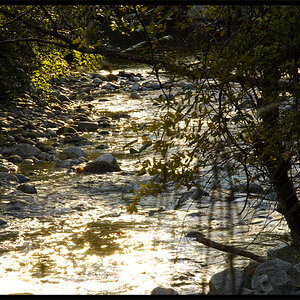
I must agree that the original colour version is the weakest of the three, per part because of the distracting hut on the right, which gets so nicely lost in the monochrome or duotone versions (am I using the correct expression here?) and no longer distracts in those at all.
After I have read JonK's comment on the loss of detail in the stone texture parts, I went back and forth to see what he sees, and am seeing it in the under-the-bridge-part of the bridge, but then the fern on the river bank outbalances that in the sepia version, and I like that! All in all they are on par, I think.
") I will give some different adjustments a go before converting it.
I will give some different adjustments a go before converting it.
![[No title]](/data/xfmg/thumbnail/34/34041-c8aed4d2c55b167d1ec03d9cfbaca453.jpg?1619736250)

![[No title]](/data/xfmg/thumbnail/34/34042-f37784c4a5db3d0cf34059cad22b288c.jpg?1619736251)