Haven't stumbled upon any photogenic stumps as of yet. Hehe. Still very much a noob, but I'll toss my .02 in.
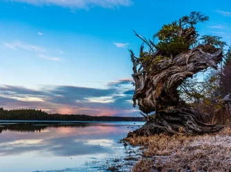
Original version: Have to agree the blue is fighting for attention. With those great colors and reflection off the lake, it's hard not to include. But, just as distracting is the dead tree on the right. To me, anyway. Maybe a step or two to the right.........
Portrait version: I really want to like this one. Shows more detail of the new growth. Gets rid of the dead tree. Also includes those great colors. But, as you were afraid of, it takes up too much of the frame. And all that dead grass on the bottom. Maybe a square crop to get rid of it. I would probably do that and keep it just to show the details to my friends.
Cropped version: This one slightly edges out the others for me. Only because of the above issues. Fixes all of those.





![[No title]](/data/xfmg/thumbnail/32/32711-b57dd72845f94aa34b3bd7207b07f98c.jpg?1734162320)




![[No title]](/data/xfmg/thumbnail/32/32719-7d42e7d7077540fabb3fa0275a99899a.jpg?1734162364)
![[No title]](/data/xfmg/thumbnail/32/32709-80f0f0432fd5ec548a3efdb60ef77d46.jpg?1734162305)