

- Joined
- Sep 2, 2005
- Messages
- 14,457
- Reaction score
- 3,329
- Can others edit my Photos
- Photos OK to edit
- Moderator 🛠️
- #16
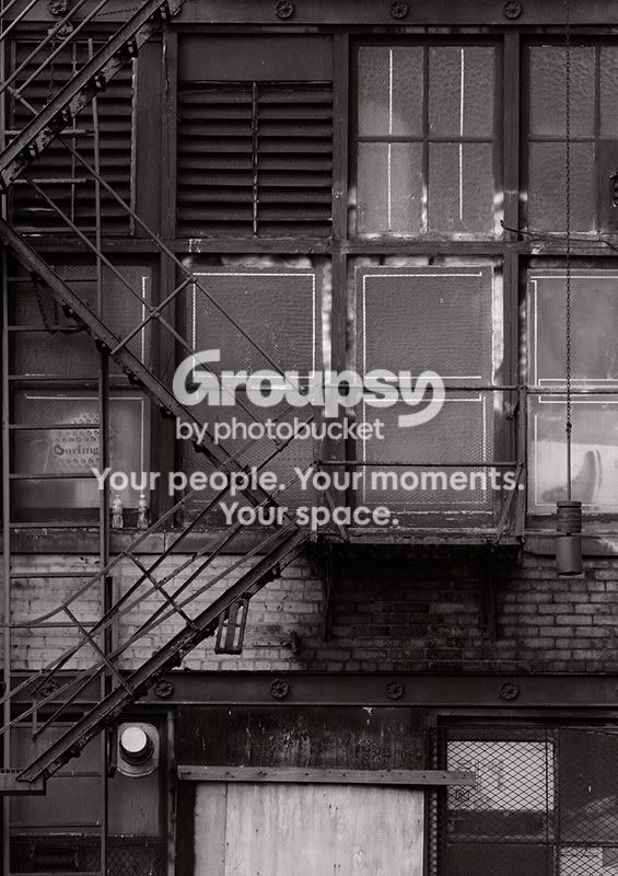
I suspect (though I haven't tried it to see) that the colors are distracting a bit from the patterns... and there aren't enough of them there to really hold their own. Thus the try b/w option.
However, it needs to be the right b/w treatment. A simple conversion will not work here because the lighting is too flat. You're going to need to work on the contrast and brightness of the image as well.
To be honest... I think the image isn't just QUITE there. I see why you were drawn to it, but I think the lighting is going to kill you in the end. It's just too dull, and that takes away a lot of the potential drama you could have pulled from the scene. I also suspect taking it from an angle and not dead-on might have added some interest, but I also see and appreciate why you took it the way you did, and I think you would lose something from that composition if you had moved.
As I say, in the end I think it's just an "almost but not quite", but perhaps the b/w will make it click.
However, it needs to be the right b/w treatment. A simple conversion will not work here because the lighting is too flat. You're going to need to work on the contrast and brightness of the image as well.
To be honest... I think the image isn't just QUITE there. I see why you were drawn to it, but I think the lighting is going to kill you in the end. It's just too dull, and that takes away a lot of the potential drama you could have pulled from the scene. I also suspect taking it from an angle and not dead-on might have added some interest, but I also see and appreciate why you took it the way you did, and I think you would lose something from that composition if you had moved.
As I say, in the end I think it's just an "almost but not quite", but perhaps the b/w will make it click.



![[No title]](/data/xfmg/thumbnail/42/42484-fe2beb05d743deaf21681664722538d4.jpg?1734177008)

![[No title]](/data/xfmg/thumbnail/35/35946-771bfce9b2727c9126587d96c471da80.jpg?1734167737)
![[No title]](/data/xfmg/thumbnail/35/35948-700e0d840da0ca73727b1bd6d99b4142.jpg?1734167751)
![[No title]](/data/xfmg/thumbnail/42/42485-78d600ec012514df268a482c4c59bb62.jpg?1734177008)