What's new

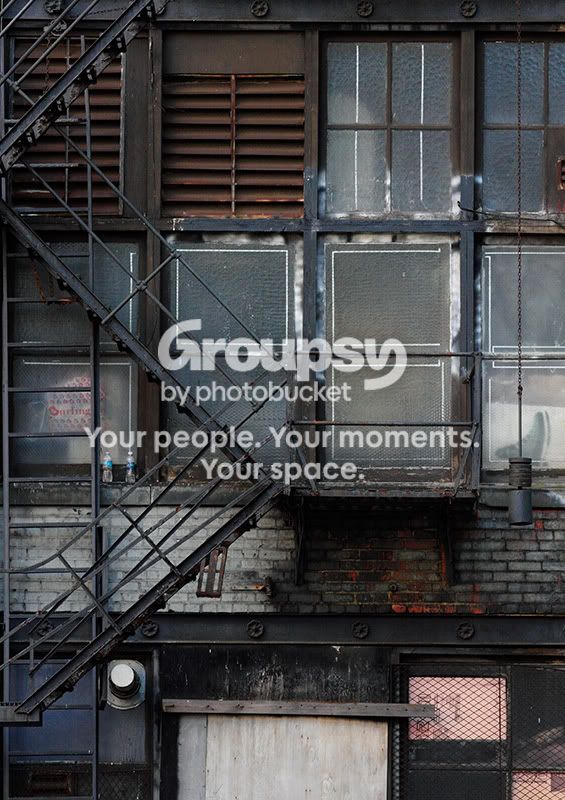
old windows & fire escape

KenC

Been spending a lot of time on here!
Joined
Jan 18, 2010
Messages
5,699
Reaction score
1,472
Location
Philadelphia
Can others edit my Photos
Photos NOT OK to edit
wall032112.jpg
 
I like the patterns, the geometry. I really like the fire escape's influence. It does seem a bit dark, lacking on my screen at work.
 
Thanks everyone! It doesn't look overly dark on my monitor here at home, but my work monitor doesn't show shadow detail well, so perhaps that's what's happening on yours, Trever. I didn't consider B&W because I really liked some of the subtle color in this one, but perhaps I'll try it and see if it works for different reasons.
 
Liked this...actually it is better remain dark to suit a real fire escape incidence .....Since it is dark, i think B&W won't do any good; but if this is brightened up, B&W may work...but yet to see that :D
 
nice shot i like the remains under the fire escape from a recent or older fire that look like happened from the detail of the brick i say maybe a year or two old on that building
 
I love urban decay in situ.

I love that you can kind of get a glimpse of the residents too, from the Burlington bag to the two bottles to the ice skate poster; gives it a sense of personality and ownership. get what i mean? :lol:
 
You might find it interesting in black and white.
 
I like this!
And I agree, this is one of those shots that can also work well in B&W.
 
Nice. I think I prefer it with everything below the bottom of the lower I-beam cropped off though.
 
Love this, Ken. I wouldn't change anything about it (other than maybe trying to correct the slightly tilted lines at the bottom – likely a bit of distortion caused by the lens).

I'm not sure how good a candidate this one would be for a B&W conversion. Although the subject matter does scream B&W, the lack of natural contrast of the scene might make it difficult for it to work. Colour plays too big a part in compensating that lack of contrast so it might be a challenge to work without it and keep the image as compelling.
 
Thanks all! I will try it in B&W, although I tend to agree with the comments about the color contrasts being important to the image.

As for the lower part of the image, I like its collection of rectangular areas that contrast with those of the windows, and I don't think the tilted lines result from distortion. I took this from across a parking lot with a good telephoto and did a little perspective correction because I wasn't 100% dead center to it, and most of the "solid" horizontals and verticals (brick lines, window frames, that hanging chain) lined up OK, but some of the stuff lower down (wood panels, wire grates) is just not straight.

 
Very nice Ken, I disagree on the black and white, the colours help draw my eye around. I think it would lose a lot of its depth and interest.
 

Create an account or login to comment

You must be a member in order to leave a comment

Create account

Create an account on our community. It's easy!

Log in

Already have an account? Log in here.

New Topics

Back
Top Bottom