What's new

One for C&C, please

crimbfighter

Been spending a lot of time on here!
Joined
Jun 4, 2010
Messages
2,219
Reaction score
1,784
Location
Wisconsin, United States
Can others edit my Photos
Photos OK to edit
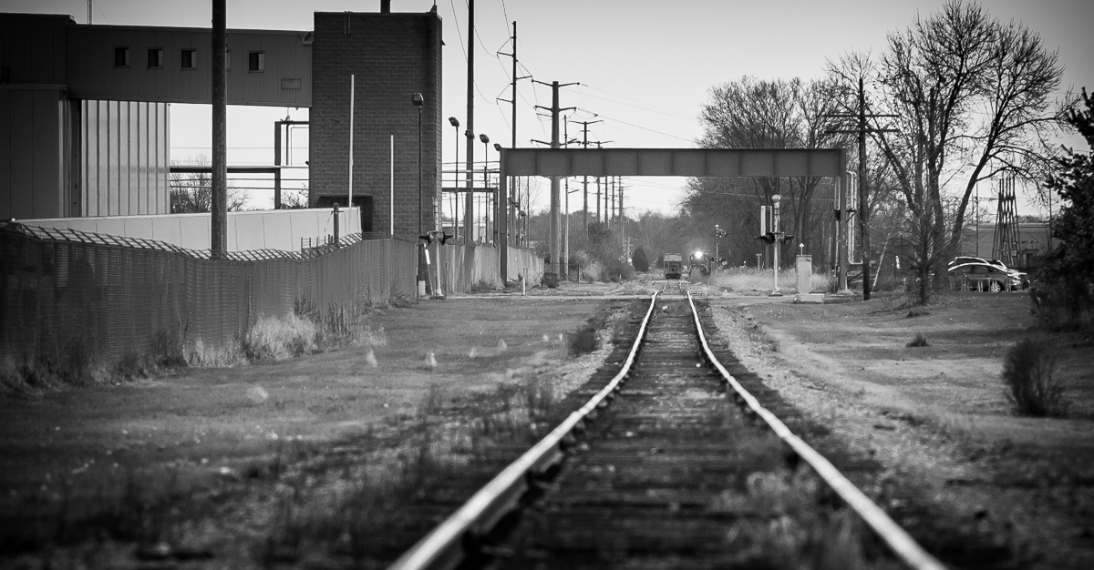
Took this while out and about the other day. My own critique, would be the cars along the right hand side of the frame. They don't seem to fit in the feel of the image. There's something about the way the tracks bobble up and down that I liked about this one. And it wasn't long before the incoming train horn blasted me off the tracks..

10879621576_93ec211ed0_b.jpg
 
I like it. It was shot with an high focal lenght I guess, isn't it? I agree with you about the cars on the right and maybe also the white particular on the left doesn't fit on the image. Anyway the global effect is quite good to me.
 
I kinda like it.

Symmetry like this rarely works without more symmetrical subject matter, and this picture suffers from that to be sure. I do like the way the ripples in the tracks are revealed, though, and since I think of that as kind of the point of the shot, I get the centered/symmetric approach. Nice little spot of high contrast (bright light, against darker background) right where the tracks lead, so that's good. It feel a little too loose and open to me. I might just crop the sides off. Maybe crop sides so the foreground rails leave the frame on the corners, or even a little tighter. I don't see that the stuff on the sides is adding anything.
 
I like it. It was shot with an high focal lenght I guess, isn't it? I agree with you about the cars on the right and maybe also the white particular on the left doesn't fit on the image. Anyway the global effect is quite good to me.

Thanks for the feedback! It was kinda shot at a long focal length... 100% crop from my 85mm..

I kinda like it.

Symmetry like this rarely works without more symmetrical subject matter, and this picture suffers from that to be sure. I do like the way the ripples in the tracks are revealed, though, and since I think of that as kind of the point of the shot, I get the centered/symmetric approach. Nice little spot of high contrast (bright light, against darker background) right where the tracks lead, so that's good. It feel a little too loose and open to me. I might just crop the sides off. Maybe crop sides so the foreground rails leave the frame on the corners, or even a little tighter. I don't see that the stuff on the sides is adding anything.

I think both of you were right on the money. Thanks for the suggestions! Try and try as I might, symmetry is a habit I'm still trying to break.. Anyway, I took your feedback and cropped off the sides. I think it brings the focal point more to the tracks and the two trains, which is what I wanted to begin with. Does this crop help rectify the issues?

10907594913_5d1803d3c0_b.jpg
 
I do not mind the cars at all. Why? The first shot shows us a modern urban landscape. Your photo is in a genre that I actually like to shoot in, and is what I have started calling the new urban landscape genre. The cars parked down by the tracks are a logical element, and they hint at the roadway crossing of the tracks. The second shot, the tightly-cropped vertical, removes the majority of the urban landscape element, and is now just a shot of...some train tracks. If the goal of the shot is to show a locomotive with its light on, and a box car, then the second shot is "okay". The first shot shows us a scene, and entire "scene", and shows the location of the tracks within a modern, urban context. The cropped version throws away all the context, and the visual payoff is a point of light way down some railroad tracks.
 
I do not mind the cars at all. Why? The first shot shows us a modern urban landscape. Your photo is in a genre that I actually like to shoot in, and is what I have started calling the new urban landscape genre. The cars parked down by the tracks are a logical element, and they hint at the roadway crossing of the tracks. The second shot, the tightly-cropped vertical, removes the majority of the urban landscape element, and is now just a shot of...some train tracks. If the goal of the shot is to show a locomotive with its light on, and a box car, then the second shot is "okay". The first shot shows us a scene, and entire "scene", and shows the location of the tracks within a modern, urban context. The cropped version throws away all the context, and the visual payoff is a point of light way down some railroad tracks.

Well, as usual Darrel, you manage to make an excellent point right about the time I had things figured out... I like your contextual insights into, well, on context. I didn't really think about it that way, but now that you bring it up, the context of THIS photo does play into it's appeal. This is one of the things I like about photography; one small change in a viewers perspective can have a huge impact on a photos meaning. P.S. The building to the left is part of a GIANT Oscar Meyer plant. At the right time of the day, the whole area smells like hotdogs...

Ok, so since I can't really do anything with this photo besides change the crop, here's what I've come up with. I think it helps address the issue of symmetry, maintains what I feel is still an obvious focal point, as well as bringing back some of the context. Thoughts?

10920756266_e19b545a69_o.jpg
 

Create an account or login to comment

You must be a member in order to leave a comment

Create account

Create an account on our community. It's easy!

Log in

Already have an account? Log in here.

New Topics

Back
Top Bottom