Well, to answer your question... It depends what your portfolio is for. What's your niche, what are you trying to present yourself as?
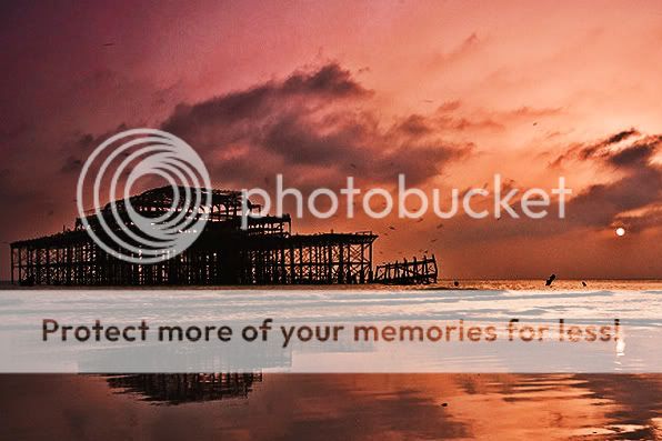
As for the image... It has some nice colors in it, and I find the structure interesting. But for whatever reason, the image doesn't do much for me, and doesn't really hold my attention. It feels very static and out of balance to me. The horizon is pretty close to the center, and even though the pier is what I would assume is the subject, the whole left half of the image is significantly darker than the right half, making it hard for my eye to be interested in what's over there.
")
")


![[No title]](/data/xfmg/thumbnail/39/39470-ad2036a502fde3b73f73e2b45e674866.jpg?1734173561)
![[No title]](/data/xfmg/thumbnail/34/34129-d703825af0884060da6dd68f74046ef3.jpg?1734164643)
![[No title]](/data/xfmg/thumbnail/38/38724-0b9c26c57726c91c6c504310e4428e55.jpg?1734172598)

