
DeepSpring
TPF Noob!
- Joined
- Jul 12, 2006
- Messages
- 1,451
- Reaction score
- 0
- Location
- Los Angeles
- Website
- www.joshualights.com
- Can others edit my Photos
- Photos OK to edit
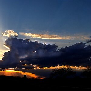
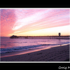
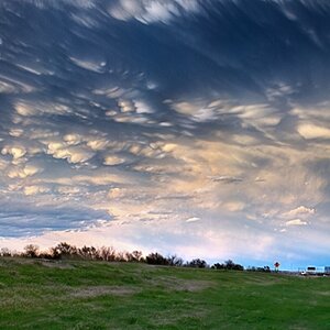
I just created this to show people who might potentially interested in me. Please feel free to tell me what you think
http://www.freewebs.com/deepspring/
http://www.freewebs.com/deepspring/
") .
. 

![[No title]](/data/xfmg/thumbnail/37/37603-739c5d9b541a083a12f2f30e45ca2b7b.jpg?1619738147)


![[No title]](/data/xfmg/thumbnail/37/37602-1ef8dbb1c2d0e4ff347ee65d328c3603.jpg?1619738147)