Austin Greene
Been spending a lot of time on here!
- Joined
- Jan 6, 2012
- Messages
- 1,472
- Reaction score
- 855
- Location
- Mountain View, California
- Can others edit my Photos
- Photos NOT OK to edit
UPDATE UPDATE: Done! Scroll to the bottom to give me your opinion on the new logo 
UPDATE: We're on round two now, scroll down please")
Hey All,
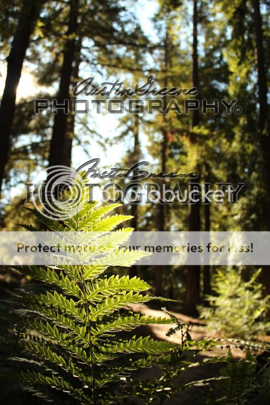
So I've just been messing around between winter storms, and I thought it wouldn't hurt to come up with a logo/watermark to place over photos. I think its important to note that when actually in use, they won't be nearly as big as they are in the following image, thats just so you can inspect. So, tell me what you think! I'm not looking to do anything fancy, I'm just looking for a simple image that I can overlay on most any of my photos without it being too obtrusive, hence the low opacity. If you have any comments, including which font you think would go best together, just let me know.
I appreciate your CC")

UPDATE: We're on round two now, scroll down please
Hey All,
So I've just been messing around between winter storms, and I thought it wouldn't hurt to come up with a logo/watermark to place over photos. I think its important to note that when actually in use, they won't be nearly as big as they are in the following image, thats just so you can inspect. So, tell me what you think! I'm not looking to do anything fancy, I'm just looking for a simple image that I can overlay on most any of my photos without it being too obtrusive, hence the low opacity. If you have any comments, including which font you think would go best together, just let me know.
I appreciate your CC
Last edited:


![[No title]](/data/xfmg/thumbnail/30/30992-773558233723ab0d28c307a97a1a2427.jpg?1734159059)
![[No title]](/data/xfmg/thumbnail/39/39271-04ff6ce1fbcda2b0d41ad7ee08cff91a.jpg?1734173231)

![[No title]](/data/xfmg/thumbnail/41/41922-e7a483d91c9d307d9bb8d6143d03889b.jpg?1734176283)


![[No title]](/data/xfmg/thumbnail/30/30993-7c6dca4375064e92f2ea6cbfabf9b59e.jpg?1734159063)
![[No title]](/data/xfmg/thumbnail/41/41920-c7de4d93604fb89eb48454f9e5dba8a0.jpg?1734176282)