#1 has too much going on in it for me, might be better in b&w
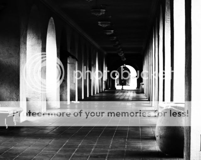
#2 I think would be better IMO if your vantage point was from the center of the hallway lol must be my OCD...and I don't like the closest garbage can in the shot
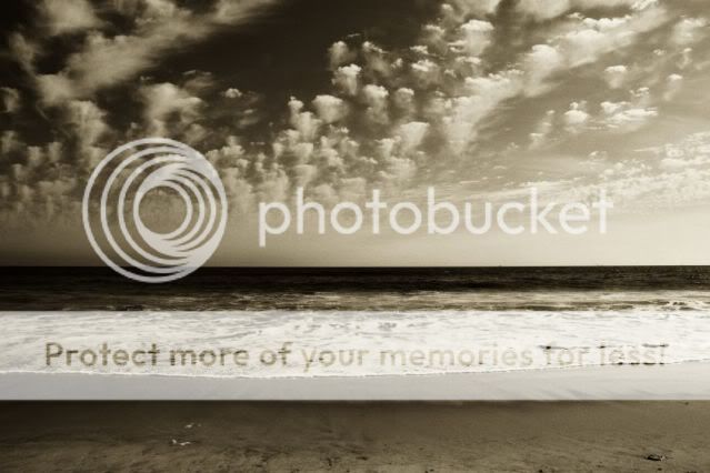
#3 I love. The could formations look awesome, and I think it looks great in b&w great shot
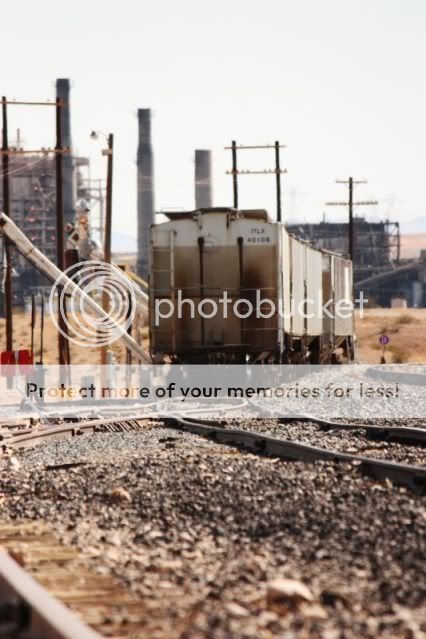
The first clearly lacks in sharpness.
And I agree with the big twinky, that the one, the most prominent rail, should have remained within the frame from bottom to where it leads to (the carriage). But all in all there is no real focal point for me there.
I do like the second with its elements of repetition and light & shadow. Repetition helps to create depth, and I like how the point where it all leads to is so clearly off centre. Well seen and done.
1. A very busy shot because of all the poles, smoke stacks, rails, stone....way too much for the eye to follow. The blown out sky doesn't help the shot either. I agree with what others have said about the rail on the left. Its the leading line into the photo, but it gets cut off half way there.
2. Very nice image and your best of this set. Love the patterns and lighting here.
3. I think this would have been better in color than in the sepia tone/ The light sky and the light foam in the forground then separated by that thick black line [water] in the center, throws the shot off. In color the water sky and foam, would be better defined....I think.
Pic #1 - the point of focus seems to be on the 'bent' track in the mid-ground - whereas your 'subject' appears
to be the trucks... IMO - the point of focus ought to be on the 'subject'
An interesting commercial shot though (better than a duck/tree/stone)... maybe the red "things" on the left are
also distracting...
Pic #2 - Arches and Pillars... I like leading lines - but they need to lead somewhere...
In this pic, my eye is drawn towards the upright rectangular object (what is it..?? - a Coco Cola machine..?),
but punctuated by the ?palm leaves growing out of the arches on the left, and the urns (forefront and beyond).
Looks "blown" in arches 2 and 3...
Pic #3 - Sorry - but bores me...
Good straight horizon... Kinda-interesting clouds... Typical "surf"
I like that your pics are not ducks/trees/stones/flower-heads...
Are you gonna try photographing people...?
Jedo
I think there has been enough C&C, any thing I might add would only be repititisious so I'm just going to say this. Really like number 2, but #3 seems almost sureal to me, very cool shot.
Thanks everyone for the opinions and compliments I appreciate them. Yes, the first one was taken in the desert (where I live). In Overton, Nv. Right next to Las Vegas. I have taken some photos of people, I will have to post them, and get everyones opinions. Thanks again.


![[No title]](/data/xfmg/thumbnail/32/32701-51bacbc6ea9d40683123c14f053d4742.jpg?1619735603)
![[No title]](/data/xfmg/thumbnail/37/37604-7ad625e983f92f880eb65a264eeef5e4.jpg?1619738148)
![[No title]](/data/xfmg/thumbnail/37/37605-90c8efaef5b7d1f52d4bf8e7dfd33673.jpg?1619738148)