the bright light and low quality of the pix is killing these imo.
I disagree. The light is bright, yes, but it's not blown; otherwise you wouldn't be able to discern the shadow of the bars. There are black points and white points, and good tones in between. I don't think the grain detracts from these images, either.
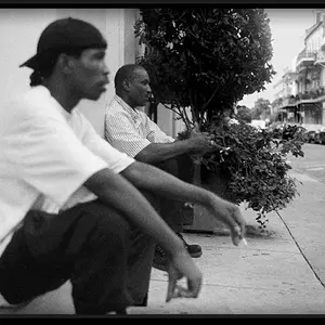
My favorite composition is the third one. It might do with bringing up the highlights a bit for more contrast. The light present in the other two provided a white point to balance the blacks and greys, but it is absent in the third picture, so it looks more midtoney than the other two.
i think it is just a matter of my eyes keep being drawn to the light and it makes the frame seem unbalanced. Also organ pipes i would like to see crystal, glorified, amazing. This is striking me of more of a abstract of organ pipes than really showing the pipes in a amazing way. just my perception, don't mean much.the bright light and low quality of the pix is killing these imo.
Thanks, bribrius.
These are from my first roll of self-developed film and I've had a lot of good advice regarding agitation/grain. I'm not sure about the grain here being too much but I'll take similar shots with the same film to be able to compare results.
The light on the right wall, do you mean? This being a bit bright might have been added to by my scanning skills, or lack thereof. I tried to tone it down in post and it looks quite decent on my screen, with details of the fenestration being discernible for example.

i think it is just a matter of my eyes keep being drawn to the light and it makes the frame seem unbalanced. Also organ pipes i would like to see crystal, glorified, amazing. This is striking me of more of a abstract of organ pipes than really showing the pipes in a amazing way. just my perception, don't mean much.the bright light and low quality of the pix is killing these imo.
Thanks, bribrius.
These are from my first roll of self-developed film and I've had a lot of good advice regarding agitation/grain. I'm not sure about the grain here being too much but I'll take similar shots with the same film to be able to compare results.
The light on the right wall, do you mean? This being a bit bright might have been added to by my scanning skills, or lack thereof. I tried to tone it down in post and it looks quite decent on my screen, with details of the fenestration being discernible for example.