What's new

Out Of My League

JacaRanda

Hobbyist Birdographer
Joined
Mar 20, 2012
Messages
5,472
Reaction score
2,628
Location
Orange County California
Can others edit my Photos
Photos OK to edit
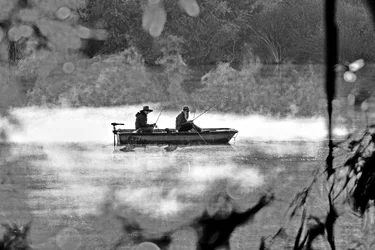
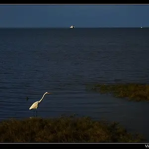
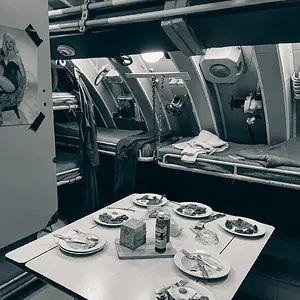
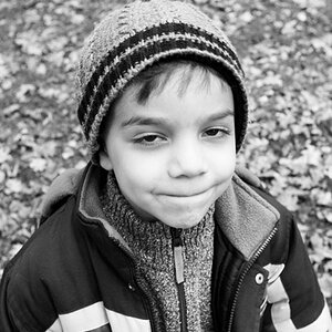
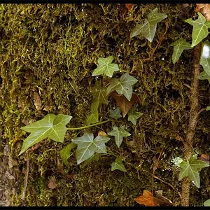
I have been thinking about taking a shot at b/w for a while. It's time to put my toes in despite feeling out of my comfort zone.
C&C please, the good (if any) the bad and the ugly.

If you are so inclined please feel free to edit at will to help show me the way. I left one in color if it's worth playing with from scratch.

I will also throw any of them in dropbox or e-mail the raw file - whatever it takes.

#1

#2

#3

#4
 
2 is great 4 a maybe, closer crop
 
Thanks Mr. Hipster. Are you saying I should keep the color in it?
 
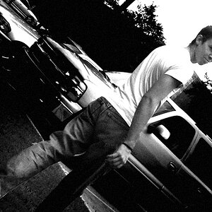
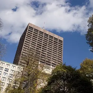
I think #3 and 4 have a surreal look that I like. The grasses look as if they would be the size of grass in a yard so the ducks seem miniaturized, at least that's how it struck me. I thought it was a cool effect, because the size seems like there are Lilliputian animals on the water - I think the rising mist from the water helps make it surreal or a fantasy. I think the B&W works, it makes you see the shapes and patterns etc.

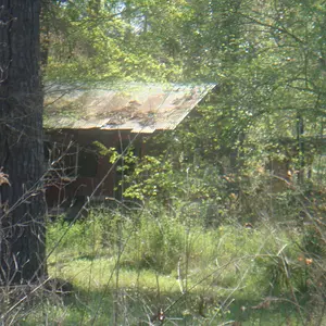
#1 might have been better without so much detail in the people to make it more of a silhouette, and the grass in the foreground to me seems distracting more than framing them. #2 might have a little too much foliage framing the scene too. Overall interesting images for B&W.
 
#2 is interesting...I messed around with it in the largest JPG from Flickr...the highlights are troublesome in 8-bit...I like it in COLOR though...that OOF foreground bokeh effect of the leaves in the top right section...THAT is tough to render in monochrome! $137_B&W.webp

I'm not so sure I like the way the background at the top area of the lake shore is rendered...I think it's too light, but I was more interested in their big hats and sort of bored expressions...now that I look at it, this is a horrible rendering I think.
 
#2 is interesting...I messed around with it in the largest JPG from Flickr...the highlights are troublesome in 8-bit...I like it in COLOR though...that OOF foreground bokeh effect of the leaves in the top right section...THAT is tough to render in monochrome!View attachment 70535

I'm not so sure I like the way the background at the top area of the lake shore is rendered...I think it's too light, but I was more interested in their big hats and sort of bored expressions...now that I look at it, this is a horrible rendering I think.

Oh thanks for trying D-sizzle. You still give me things to think about - exactly what I want.

And....I also do not like the upper shore behind them. The lighter I've gone, the more I want to crop.
 
Last edited:
I think #3 and 4 have a surreal look that I like. The grasses look as if they would be the size of grass in a yard so the ducks seem miniaturized, at least that's how it struck me. I thought it was a cool effect, because the size seems like there are Lilliputian animals on the water - I think the rising mist from the water helps make it surreal or a fantasy. I think the B&W works, it makes you see the shapes and patterns etc.

#1 might have been better without so much detail in the people to make it more of a silhouette, and the grass in the foreground to me seems distracting more than framing them. #2 might have a little too much foliage framing the scene too. Overall interesting images for B&W.

Thank you Snaps-crackle-pop. Love the Lilliputian reference :)

I reduced the clarity in a few of the boat shots - I will revisit that on #1. Glad you mentioned the shapes also. My thoughts are so much on white whites, gray grays and black blacks that I have ignored some other aspects like the shapes.
 
Reworked 1 & 2. Hope mods don't mind that #2 is still in color.


#2 is interesting...I messed around with it in the largest JPG from Flickr...the highlights are troublesome in 8-bit...I like it in COLOR though...that OOF foreground bokeh effect of the leaves in the top right section...THAT is tough to render in monochrome!View attachment 70535

I'm not so sure I like the way the background at the top area of the lake shore is rendered...I think it's too light, but I was more interested in their big hats and sort of bored expressions...now that I look at it, this is a horrible rendering I think.

Just in case, here is a link to the dng file https://www.dropbox.com/sh/ruqox2dnazoxtq0/wONK-w2YEC
 

Create an account or login to comment

You must be a member in order to leave a comment

Create account

Create an account on our community. It's easy!

Log in

Already have an account? Log in here.

New Topics

Back
Top Bottom