Over doing the orton effect!?

UUilliam

TPF Noob!
Joined
May 28, 2009
Messages
1,717
Reaction score
2
Location
Glasgow
Can others edit my Photos
Photos OK to edit
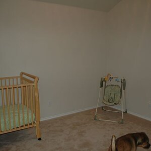
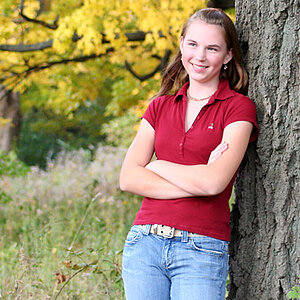
Model is my cousins friend, She was modelling for my aunt (she is to be the face of her Little Cuties line, Which is a beauty package for under 12's (although she is 13. but she is also doing teen cuties.)

How do i make it a little more mild?
i want it dreamy, but not over powering...
When i mess with layers it makes it too dark,
Mess with opacity, it makes the effect too subtle/bland

Hm.. nvm, I desaturated the image, It isn't the orton effect that is overdone, it is the chair is far too saturated for the room...
it really messes with the eye as it is such a bright pink...

Here is my fix (Just filled a layer with black, set to softlight at 50% opacity)

Edit 3:
fixed i think

(left original messsage just for anyone reading) 03:52 23/08/09

IMG_0011.jpg
 
Last edited:
IMHO, people aren't a good subject matter for this technique; but then again that is just my 2 cents
 
The only thing I know about this effect is its name so I can't comment about technical stuff but the photo looks nice to me.

Except for the left side where you can see beyond the curtain. That should be cropped out. Including the light thing on the floor at the bottom of said curtain.
 
I guess C&C then...
IDK wither to keep it sharp or not, i really like the orton effect on it, as shots were hand held in a dark room, there are some under exposed and some over exposed but shaky (but exposure was fixed in photoshop Camera Raw.)
 
Use a layer mask and mask out the eyes and lips to give them a sharper pop, cuz as they are now, they look a bit too blurry. I think the "dreamy" effect is fine for that type of pic, there just doesnt seem to be enough detail in the face. What method did you use to do this? I generally duplicate the image, use filter -> other -> high pass. Set the blend mode to overlay, invert that layer, create a layer mask, and paint out parts I want to remain in detail. From there, opacity can be adjusted for how much of the stuff you want. The levels of the high pass can also be played with.
 
I prefer the first one. The pink is intense but, because it surrounds the kid, I feel it brings the eye to her so is not that much of a problem.
 
I done,

duplicate x2
Set top to screen
Merge down
Duplicate
Blur > Guassian blur until it is almost (but still can) unrecognizable but only enough to tell what it is
then set to multiply
then go back to my 2nd layer (the merged down one) and done a levels adjustment to brighten the image.
 
Try doing it using the high pass and overlay. I think you'll be pleased with the results. Do you have a copy of the image to post without the blur on?
 
edited again (figured out a way to get sharpness back without weirding up the colour..)

Removed now

there it is without the effect

I done the highpass way, it just seems to eat up all the contrast, makes it look flat.
 
Last edited:
well here's what i could come up with (and the layers used):

testfortpf.jpg


settingsd.jpg


jpg compression is a bit wonky, but i didn't want to post a huge file size.

The White Glow layer is just an inverted circle selection filled with white and blurred.

Is that the kind of look you're going for?
 
I do not think the effect looks very good with this subject matter and her clothing. The girl's clothing itself is a poor match for this type of ethereal effect: the black top and black leggings are just a poor choice against yellow and pink.

I myself often go with a post-processing soft focus type effect much like yours--but the choice of Multiply is what is absolutely killing the effect...try another blending mode that will not hit the blacks so hard....

Or better yet, try the effect on an image that has appropriate clothing for the desired end result and image processing--BLACK clothing is completely the antithesis of light,and airy post work. The black curtain in the left background is also another area that really ought to have been addressed at the shooting stage.
 
yeah, I was stuck at 18mm... that is how small the room is xD
Well.. i got to about 35 mm (1.6x crop sensor tho) but yeah, space wasn't much and was quite tight (to the left of her/ right photo there is a 5 ft long desk, to the left there is a desk about 5 ft that protrudes from the wall about 4 ft so thats already 14 ft of space being used up, in a room only about 20ft (10x 10)
Beyond the curtain is another room (would have been better to take pictures in that room, more room in there.)
 
if you open it in a raw editor the "clarity" slider, to the right will sharpen but to the left makes it a bit more "dreamy" but nothing drastic.
 
I think i figured it out now
(
IMG_0011.jpg
)
I done it the same way as earlier, but paid more attention to Opacity and masking, and added a spotlight + a vignette
 
I find it difficult to accept the bright, yellow forehead that the girl has; the color and saturation level of her yellow forehead is just a touch below that of her shirt; the yellow forehead just ruins it for me.
 

Most reactions

Back
Top