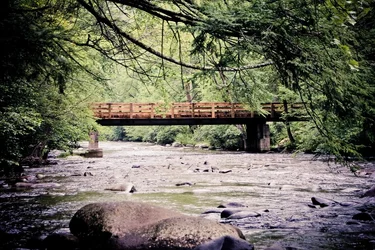
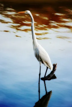
Not sure what you mean by "over edit", but left one looks oversharpened, or maybe the contrast is just too high, similar thoughts on the right one. Other than this as a first impression, they don't look that bad. From a composition perspective: Left one has the bridge right in the middle (more or less) - I would have placed it either above or below the centre depending on whether or not you want to emphasize the trees or the water. Right one - again the same situation, the egret is right in the middle of the image - I would have placed it in the right thirds position so that it is looking into the other two thirds of the image ( I am assuming you have cropped these a bit.) Also, in the right one, the piece of wood, or what ever it is, sticking out of the water tends to detract from the overall image - because it is quite dark, the viewer's eye tends to fix on it, rather than on the bird. You might want to check out the "rule of thirds" regarding the placement of objects in an image.
My 0.02¢ FWIW.
WesternGuy