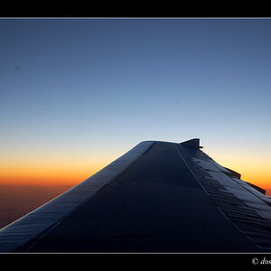
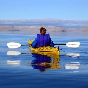
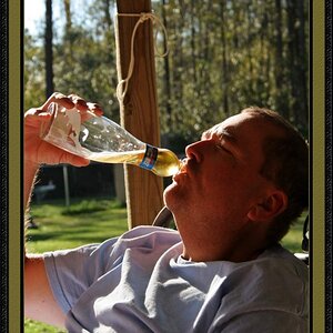
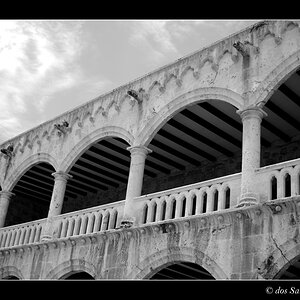
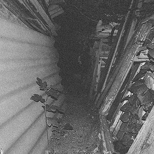
Nice memories from your trip. I really like the atmosphere in #3 just I would keep this pic 100% sepia or if all the stones had such a colors it should be a color picture. #1 needs to be straight, lifting lens up works only in close quarters, if at all, but stuff in such a wide, open vistas should be in balance. In #4 I think you should use a spot metering on the figure in the front. #5 is very nice, looks like very good place for b&w photography to. Maybe you should work over such a places little more, looking for best angles of view to extract more drama and romance from it. The last one; I have no idea why you made it b&w. It is very "greyish" and lacks any dynamics. Color might have been much snappier. Also composition there is not very interesting.



![[No title]](/data/xfmg/thumbnail/35/35264-5ade32b7036391926536661aeb7491c3.jpg?1734166921)
![[No title]](/data/xfmg/thumbnail/38/38263-ad5e4c9e677626ddb5b1e7cdf9ebe40e.jpg?1734172152)
![[No title]](/data/xfmg/thumbnail/38/38261-db20f6f92ee8f0d4c5cf1536e308638b.jpg?1734172147)
![[No title]](/data/xfmg/thumbnail/39/39185-29433e4f46e4b0bd394d10962886594c.jpg?1734173059)

![[No title]](/data/xfmg/thumbnail/39/39183-f229dae0963376879140c9959e33f935.jpg?1734173057)
![[No title]](/data/xfmg/thumbnail/39/39187-9ec2507d9e5ef2843f7f00127c7abb4c.jpg?1734173062)