What's new

Paid Pumpkin Patch Session For C&C (Warning: 10 Photos)

MikeBookPro

TPF Noob!
Joined
Aug 12, 2009
Messages
210
Reaction score
0
Location
New Website Is Up!
Can others edit my Photos
Photos NOT OK to edit
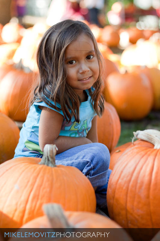
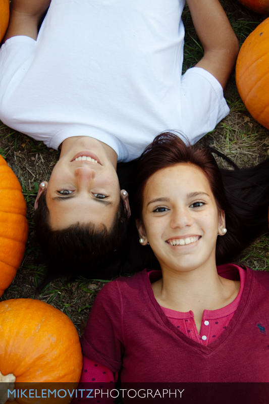
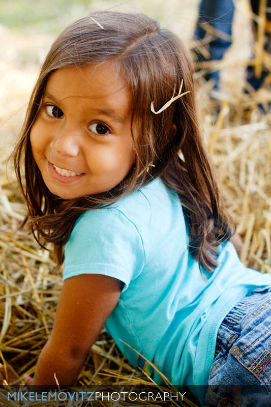
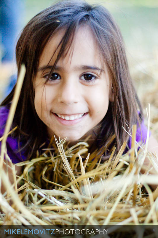
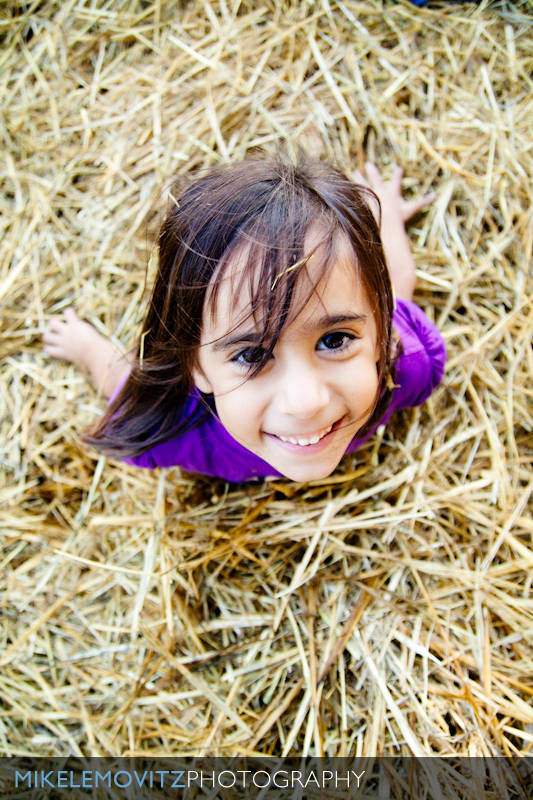
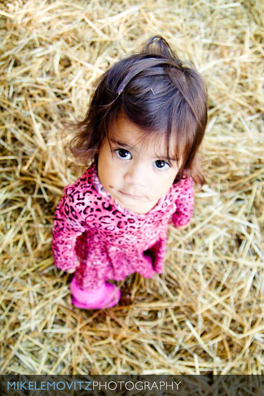
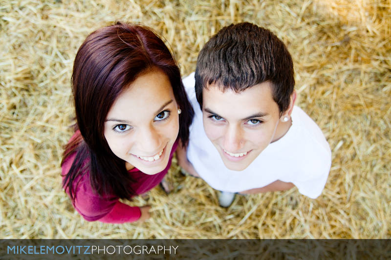
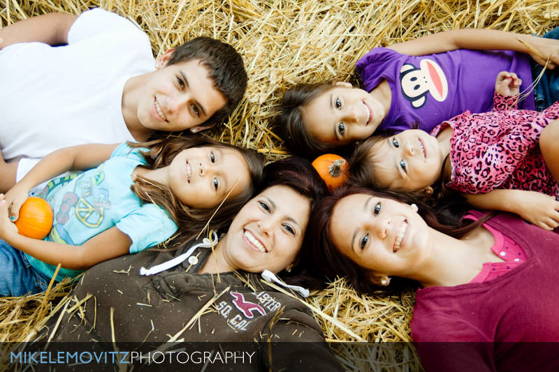
Here's some shots from a pumpkin patch shoot I did for a client. Should probably go in the pro gallery, but whatevsies. ;)

Comments, critique, and brutality appreciated!

#1
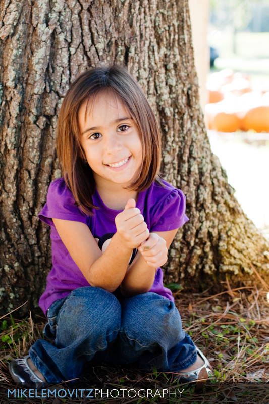
4026261342_26e22bdda7_o.jpg


#2
4025508615_94f50b9806_o.jpg


#3
4026261534_01218524a8_o.jpg


#4
4025509415_c60ea480b7_o.jpg


#5
4025509521_73c0119b03_o.jpg


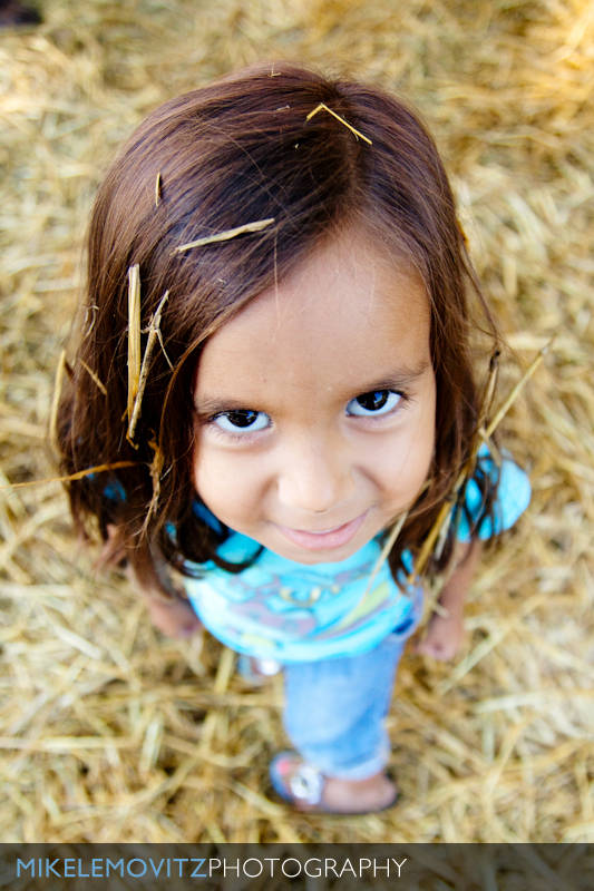
#6 - This one, and the following 3 were shot to fill up a frame I bought for the client. I wanted them all to be similar.
4025510037_650f2880cd_o.jpg


#7
4025509933_5cf9e9be24_o.jpg


#8
4026262094_b97610276d_o.jpg


#9
4026261992_b777e11971_o.jpg


#10
4026261466_da78b394da_o.jpg
 
Just realized how inconsistent the white balance is on #4. ;)
 
I dont understand why you put this in the beginners section, i mean, ill say that it's good, and so will many others, but you wont get real feedback..

one thing that annoys me is all of this is way too whitewashed IMO, doesn't have real colors IMO

also the straw in their hair is REALLY distracting

idk wether thats a guy or a girl in the white, cause in the first 2 of him it looks like its a she, then it looks like its a he, the angle kind of is one that exagerates his femininity
 
I dont understand why you put this in the beginners section, i mean, ill say that it's good, and so will many others, but you wont get real feedback..

one thing that annoys me is all of this is way too whitewashed IMO, doesn't have real colors IMO

also the straw in their hair is REALLY distracting

I post here to receive more feedback. Plus, most of the pros read this section, too, so I'd imagine they're likely to comment.

I agree about some of them resulting in a very pale complexion. As for the hay in the hair, I wanted to go the "fun" route, so I didn't clean them up while they were playing. Most of my work is done by letting the kids do their thing, and then saying something along the lines of "Hey, (insert name here), look at me!".
 
Yea, i apologize, im not in a great mood, i did think the smiles were great, and where the family was photographed was well chosen. Except for the guy, i felt the angles were creative, and i did not feel the pictures were repetitive.

I think #7 is my favorite as it doesn't have too many distractions, however #6 i feel like the hay is a little over done, but obviously it would have been a little sketchy to tell them to take out only some pieces of hay while keeping some in there.

But overall gj :)
 
1. Like the composition, but the white balance is off. Seems like to exposed for her/tree and had the background blow out. Maybe off camera lighting for a shot like this to expose for the background and fill light for her.

2.Same

3.Cool if is was just one (right), but the upside down girl makes me want to flip the monitor over to see her better.

4. Cool... except for the straw, but I realize that was probably a candid pose. What about the ISO for this shot, is there a bit of noise (seen on her arm) that be taken out?

#10 is my favorite, and it wasn't until this photo that I realized the one in white was a boy.
 
I'm curious to know the equipment you are shooting with.

I find that the pictures to me don't look crisp. Now that could be a product of bad conversion when posting to the web, but I see photos on Flickr all the time that are very sharp, which these seem to be lacking in my opinion.

Are you using good glass, fast quality lenses?
 
I'm curious to know the equipment you are shooting with.

I find that the pictures to me don't look crisp. Now that could be a product of bad conversion when posting to the web, but I see photos on Flickr all the time that are very sharp, which these seem to be lacking in my opinion.

Are you using good glass, fast quality lenses?
Exif data is in tact, 50D with a 50mm focal length (guessing a prime) in most of them. I didn't check them all, but I did check 4 or 5 of them.

I agree they look a little soft, not as sharp as they should be. I also don't think the colors look right in most of them. It almost looks as though they were under exposed, saved as JPG's, then had the exposure/brightness increased... something is making the skin tones look whacky.
 
All but one of these were shot with a Tamron 17-50mm f/2.8, most of them at f/2.8. That could explain some of the softies. Shot in RAW, with some heavy contrast boost and brightness alterations, although none of them were underexposed more than 1 stop out of the camera, IIRC.
 

Create an account or login to comment

You must be a member in order to leave a comment

Create account

Create an account on our community. It's easy!

Log in

Already have an account? Log in here.

New Topics

Back
Top Bottom