Thanks for your replies!
I can imagine some people don't like the vignetting, it looks a bit overdone maybe and for my other photos I heard not everyone likes it.
But I personally like it, and I'm going to leave it this way, it puts in my dark touch a bit.
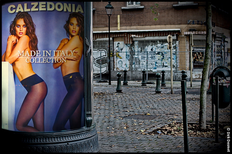
@deeky: yes indeed, I have made several photos from that poster, with the street on the left aswel, but what's seen on the left is not the same as on the right, on the left you'd see the street more further down, making the photo not so pretty anymore, that's why I cropped it there.
A nice fact to know: there are 2 same posters above each others on that advertisement column. Even putting those 2 on one photo is even more overdone

I walk by there mostly every day.... on the other side of the road, there's the same poster, totally distracting car drivers passing by
")
Anyway, to cheer you guys up, another Calzedonia poster from last spring:
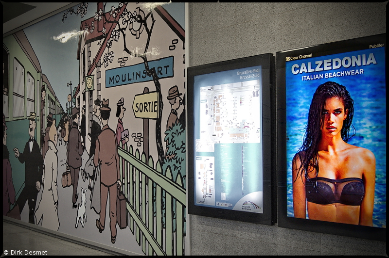
TinTin ! by
Dirk Desmet, on Flickr
The whole railway station was filled with these, at some point in the main hall, you could view +20 photos of this babe at once, for each stairway entrance to the platforms/tracks there was a poster popping up. But it was a little too difficult to get a neat picture of that view. Standing there, was like O-ooh


![[No title]](/data/xfmg/thumbnail/32/32930-09414fc020c2a60a456ff59a05c5ef8f.jpg?1734162706)


