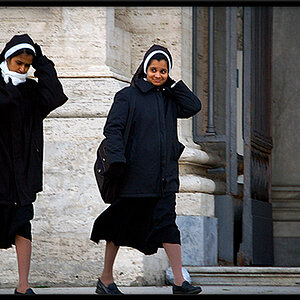
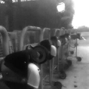
This one is kind of missing for me.
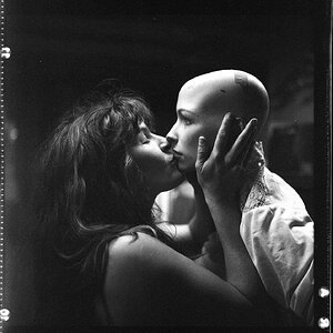
It feels too closely cropped and loses context for me as a result.
The title enhances this feeling because I get no sense of why the title may be relevant.
I don't know if pulling back more would have helped, but that's the feeling I get from this image.
It also appears rather underexposed. The skin tones seem unnaturally dark to me as a result.
Maybe that was a creative choice with how you processed for mono.
Kind of subjective critique, but thought I'd offer it up anyway.




![[No title]](/data/xfmg/thumbnail/37/37604-7ad625e983f92f880eb65a264eeef5e4.jpg?1734170732)
![[No title]](/data/xfmg/thumbnail/37/37603-739c5d9b541a083a12f2f30e45ca2b7b.jpg?1734170731)