Lightsped
TPF Noob!
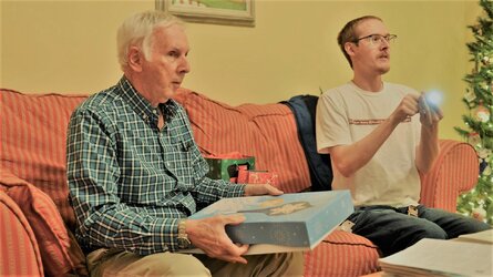
My parents living room has pale yellow walls and kind of pinkish/red sofas. I am not crazy about the color scheme....
Anyways, every time I shoot in their living room my photos always come out overly red with somewhat heavy saturation. I have tried reducing the red/orange tones using lightroom. I have also tried reducing the saturation.
Never can get the photos to look good. Attached is an edited photo that I tried reducing the overly red/orange tones.
Using full frame Nikon with Pro grade 2.8 lenses.
Any ideas?


![[No title]](/data/xfmg/thumbnail/34/34122-fb99897e57c9440aede4be4fdc5f1352.jpg?1619736292)