It seems that you have a good eye, especially for a beginner. The framing is pretty good in all of them.
Here are a few critiques/opinions. Going to say what I didn't like or what could improve the pictures.
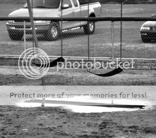
1. The background is distracting.
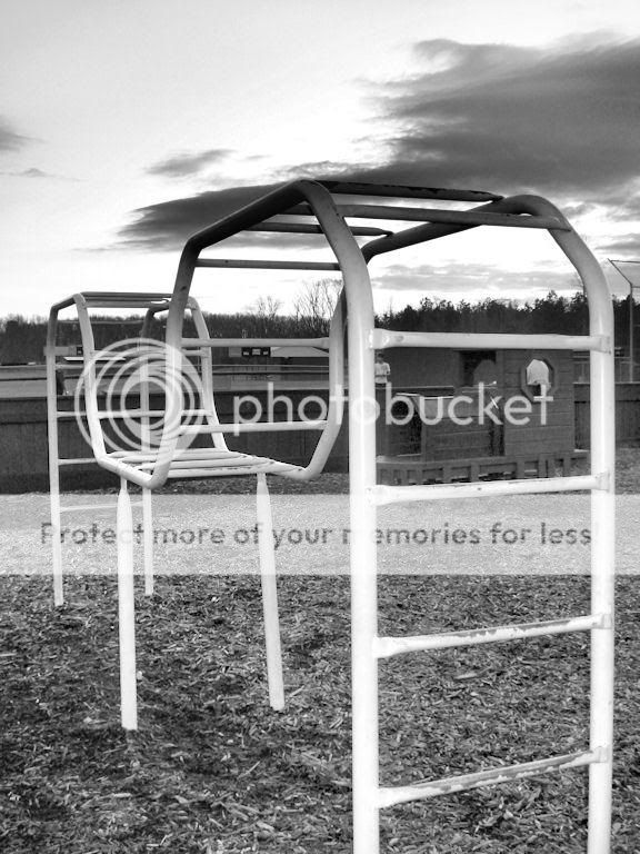
2. Same as above, the background/overcast is a little too dark imo
3. Over exposed/saturated on my monitor.
4. I like this picture all in all. Could do without the border though : p
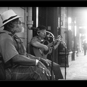
5. Looks like a great candid shot, again background though.
6. Another good shot, great framing. The child on the left is a bit soft focused though.
I also think you have a good eye, but I agree with the previous poster that the background in number 1 is distracting. I really like number 2 and number 4 although I also think the borders should be left off. I think number 5 would be great if not for the person in the background. It would be a nice profile with a completely dark background. I love the composition on the last one, and like the previous poster, I think it would have been really good if you had gotten both people in focus. The only one that doesn't do anything for me is number 3. there is no detail in the foreground which leaves only the sky as the subject and it is just not particularly interesting. I am also a beginner though so take this with a grain of salt.
I think #4 will be everyones favorite haha.
But as for #1 the cars in the background just don't belong.
#2 the clouds being so dark are just distracting and the top of the monkey bars get really dark.
#3 the clouds are over exposed and you can barely see anything on the bottom of the picture.
#5 It is a great shot just that top left of the background. But other than that it's great.
#6 Looks like the woman is focused and the child isnt.


![[No title]](/data/xfmg/thumbnail/39/39224-aa3271aa220fe57f37caf898b6984846.jpg?1619738926)


![[No title]](/data/xfmg/thumbnail/32/32782-7f10503454a2a8eeff8b554e3b081c86.jpg?1619735661)