What's new

Photo's with wording CC

gigiphotography

TPF Noob!
Joined
Feb 3, 2010
Messages
103
Reaction score
0
Can others edit my Photos
Photos NOT OK to edit
I realize some people won't like this but my customers seem to really like it. Just wanting to get your opinion.
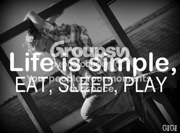
autumn12.jpg


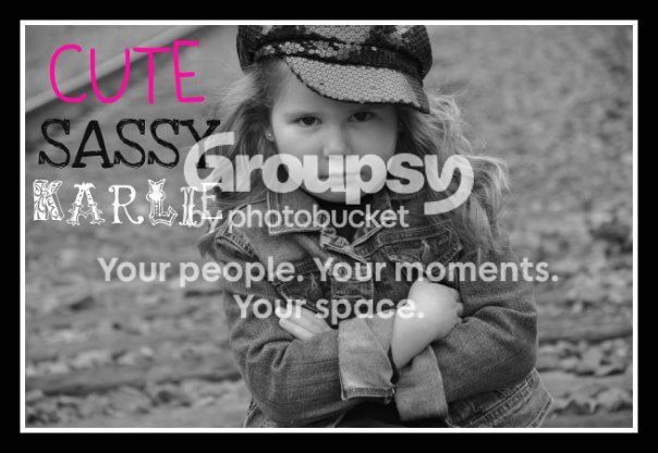
karlie2.jpg


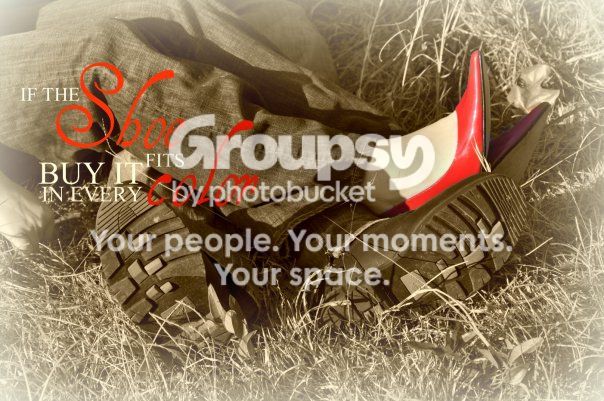
erin.jpg
 
Photos with wording look like they are for product placement and ads. If that is what you are going for they look great, otherwise take the words off as they ruin perfectly good pictures.
 
^+1

maybe you could move the text away from the centre, and make it smart and modern, so you can still see the picture, and you have a little bit of wording to enhance that
 
Photos with wording look like they are for product placement and ads. If that is what you are going for they look great, otherwise take the words off as they ruin perfectly good pictures.
Agree completely. the pictures are great and the wording distracts from them tremendously. Number 2 is a little too centered for my tastes, but it's still a good picture.

If you're simply trying to enhance the pictures, then unfortunately you did the exact opposite. The words take away from the shots. However, if these are for a specific project/assignment and the words are needed then I guess they're fine.

IF the words are a must, I like numbers 2 and 3. I'm not a huge fan of selective coloring, but it fits #3 perfectly and was well done. The words on #1 are too intrusive.
 
Thanks for your input! I also sale uppercase living which is vinyl lettering. A lot of customers like the sayings from ul on the pictures so I offer both with and without. If it's on there they don't purchase ul and then some like to purchase the ul to put around the photos. Just a little history of why I do it.
 
i find the first one all you really see is the wording, it is hard to see the image underneath, the other ones I don't mind.
 
IMO the wording should be part of the composed image. It should balance the overall image.

#1 - The "f" is poking him in the head. The words are the brightest thing on the image and it's so intrusive I didn't even see the boy.

#2 - The words look too cramped. It tips the balance of the image, especially since the girl is already slightly leaning to the left. It's left-heavy.

ummm, also the line is crossing the word "cute", as if to subliminally say "not cute" ...I'd fix that!

#3 - I kinda like it :mrgreen:

 
I never noticed that about number 2 thanks for pointing that out!
 

Create an account or login to comment

You must be a member in order to leave a comment

Create account

Create an account on our community. It's easy!

Log in

Already have an account? Log in here.

New Topics

Back
Top Bottom