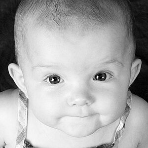
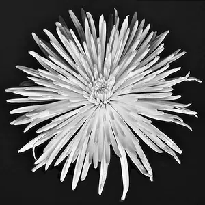
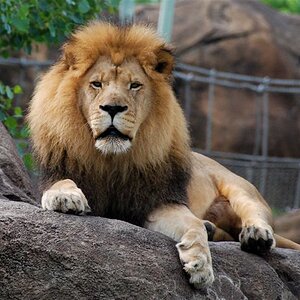
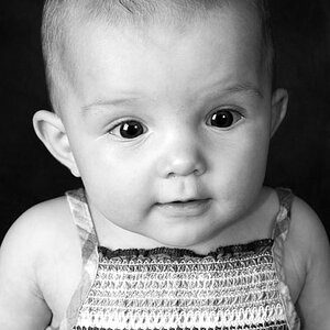
Strictly in terms of compositions, the first one and last one have potential. The second one gives no reason for cutting off the plant: you have it centered and it's clearly the subject, and yet we don't get to see all of it. In contrast, in the last one, you have the pot in the corner of the image on the edge of some shadows, which makes it more likely and reasonable that you'd cut part of it off because you're only suggesting, creating mood or something and not just presenting a portrait of a potted plant. As for the third image, it's just far too cluttered.
In terms of lighting, they are all too harsh, but the last one is closest to achieving an effect. It's more isolated on the subject and the deep shadows gives a moodiness to the image. The first one would be better with more directed light to create more distinct shadows.





![[No title]](/data/xfmg/thumbnail/37/37121-fda7b1957cb0d0be7bab1ddd3ec87847.jpg?1734169832)