First of all, wonderful photos! However, a few things I would like to point out:
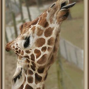
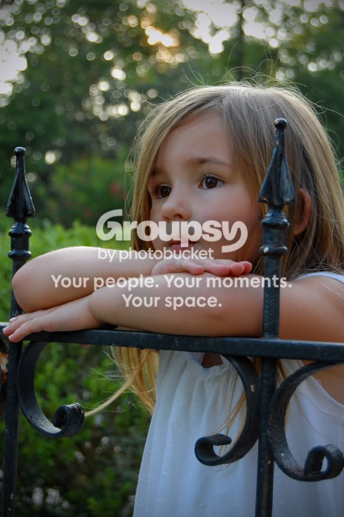
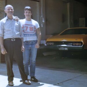
#1, This is a bit underexposed. You can check this by looking at the Levels histogram in photoshop, and adjust accordingly. Also, the fence is a little crooked. I would straighten so that the fence posts line up vertically. Depth of field is great. Neat pose and perspective on this one IMO.
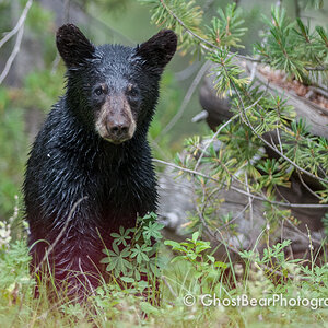
#2, Beautiful color. Very sweet smile. But in this one, the pillar is a little crooked as well. I would straighten this one also. You might also want to dodge the eyes just a bit to bring out the brown color. Same with #1.
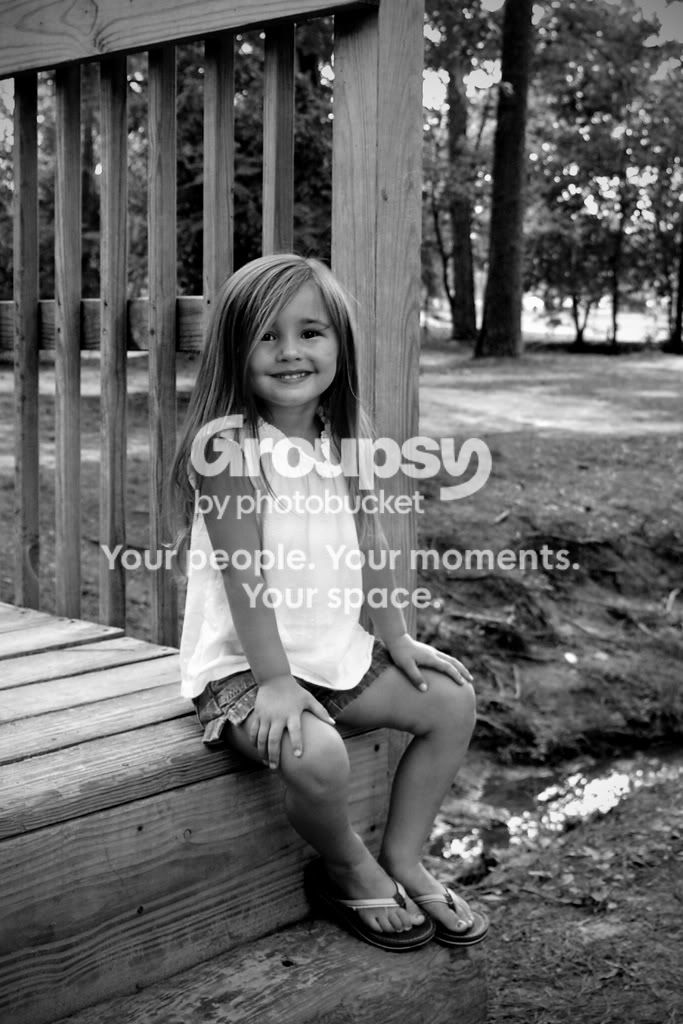
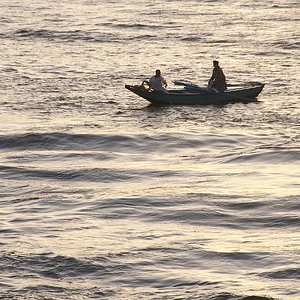
#3, The B&W conversion is awesome! Contrast is great for black and white. But there is too much space above the head. This one might benefit from a tighter crop, in which you can take out some more of the area on the top, right, and left, so that the viewer focuses more on the subject. Just my opinion.
These are just things I notice and pick up from other examples by looking at previous posts. I dont claim to be an expert. ;-)
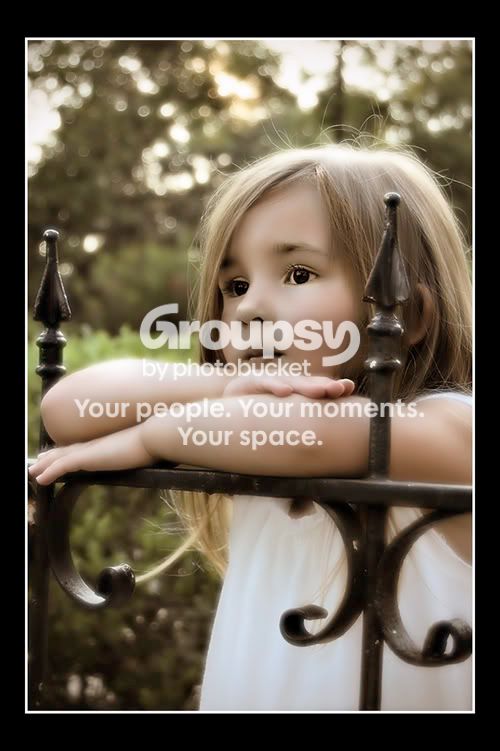
The vignette works well in all of them. Very lovely subject!
Nice job! :thumbup:
NJ


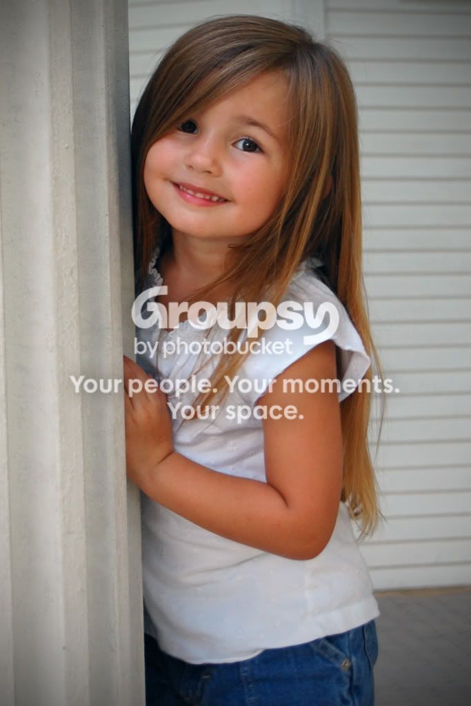

 I love #2.



![[No title]](/data/xfmg/thumbnail/35/35957-c79b37130dc06cbdee3b56de92a35fe6.jpg?1734167784)
![[No title]](/data/xfmg/thumbnail/38/38745-268bf5126e563d77957d73c4fb17dc83.jpg?1734172603)
![[No title]](/data/xfmg/thumbnail/38/38746-205d04e58b9f6c2f0e464742d3372d19.jpg?1734172603)
![[No title]](/data/xfmg/thumbnail/38/38747-bbe463248feefb7affb6b5e00efb70c6.jpg?1734172603)
![[No title]](/data/xfmg/thumbnail/35/35955-01e9c8140cdcaac10d227d68e42ac0d4.jpg?1734167771)