Photoshop Editing for Comparison and Critique

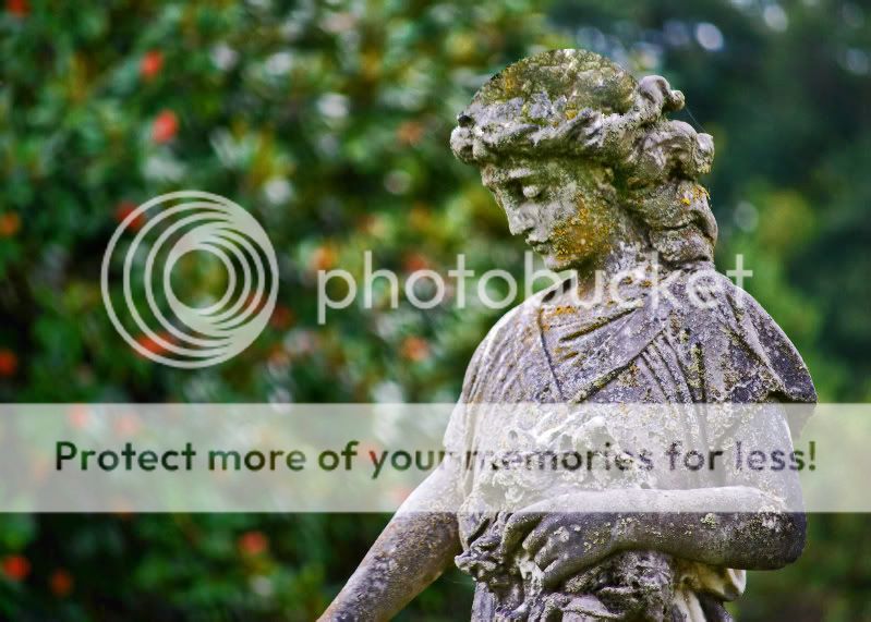
Great job on the shoulder, not so much on the top of the head. I'm not saying I could do better but I'm just stating that from an observer's perspective.

As was said if you could reshoot it, with more desirable light or some sort of diffuser, then you wouldn't need to do the pp work to it.
 
The white is from the statue itself. That is how it actually looks. It's like it has been worn down in those areas. Just clairfying that it is not a blown out portion of the picture from excess light or sun.
 
You would have to know something was used. The image just doesn't change on it's own. I have no problem telling people how I did it, that way maybe they can share a better way to do it.

No doubt about that and you shouldn't have a problem telling people what you did. I guess what I was trying to say was if there was no mention of clone stamping the power of suggestion might not have been in order that that the clone stamp was actually performed. I would've been curious on the outcome of the C&C was if it wasn't mentioned...I mean that white stuff looked more unnatural then the edited version with the clone stamp.

But what do I know your the OP :D
 
Yeah, I understand what you are saying now. I am just having a real hard time getting rid of the white on the head. There is just so much of it.
 
This is one of mine and my wifes favorite pictures. Unfortunately the white on the statues head and shoulders practically ruin the image for me. Its just too much. I tired to clone stamp and heal brush the white out. What do you think?

PictureorVideo054-1.jpg
Oh fun, I love trying new things.

I gave it a quick whirl. Small image.

I wanted to keep the pattern, well, not a pattern. So I pulled from different areas. I also did a couple things with the stacking of layers to make it easy to "keep in the lines".
PictureorVideo054-1-1.jpg
 
Last edited:

Most reactions

New Topics

Back
Top