What's new

Pick 1 (out of 3)

DGMPhotography

Been spending a lot of time on here!
Joined
Mar 23, 2012
Messages
3,160
Reaction score
717
Can others edit my Photos
Photos OK to edit
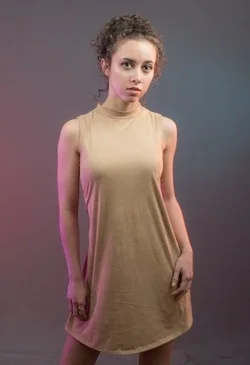
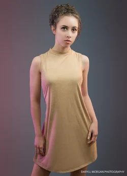
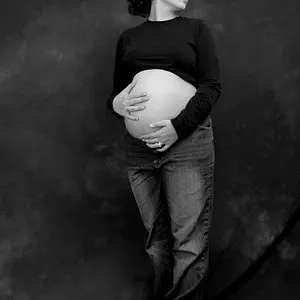
So I have this image here from a recent shoot, and I'm not sure which one I like the best. Tell me which you prefer, and why!
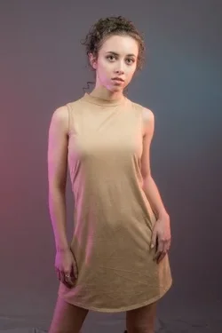
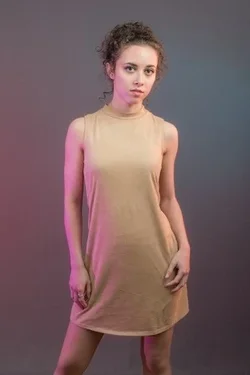
Screen Shot 2016-12-13 at 1.49.33 PM.webp Screen Shot 2016-12-13 at 1.49.39 PM.webp Screen Shot 2016-12-13 at 1.49.44 PM.webp

And no, these haven't been edited yet aside from basic adjustments.

Thanks for your help!
 
I don't like the colored lighting on this shot. 3 is the least noticeable. Try using the colors only on the background and keep them off the subject, it makes her look unappealing.
 
Agree. I like gelled lighting. A lot... BUT... IMO it belongs on background and not the subject.
 
I kinda like having a little bit of the light splash onto the model. Thanks for your feedback.

Just looking for your favorite of these 3, though. Or least least favorite, I guess.
 
Tell me which you prefer, and why!
I'll choose #2 because there is better balance between the model's clothing and her skin.

Yes, I'm sure somebody is going to not like it because you've cropped the bottom at her knees, but to me that is not objectionable.
 
I agree with the previous posts, however if I had to choose one of the three it would be #2. The more even light on her face is more appealing for her build and the look of the shot.
 
Trying to put my finger on why I was leaning toward the 3rd one was tough. It was more a process of elimination I think. The first one the pose seems too tense. The 2nd one is better but the cut off at the knees bothers me so that leaves #3. However, if you re-cropped #3 at the same place on the bottom as #3, that would likely be the best one, IMO.
 
#2 and #3 are both very similar and I like them better than #1. In the first photo, the model's mouth is slightly open, looks like she's breathing out of her mouth..not my favorite face. It's least noticeable in the third shot.
 
2. Because it's better than 1 and 3.
 
3. it has less tummy bulge than the other 2.
 
I like 2 best, but crop in a little above the knee like 3. I'd like 3 more but the shirt under her bust is a little to dark.

Sent from my SAMSUNG-SM-G890A using Tapatalk
 
Thanks for your feedback, everyone. I think I like #3 the most. But it's close with #2.
 
Final product!

HAN_5480f2.webp

I'm thinking of having some sepia or split tone variants. Thoughts?
 

Create an account or login to comment

You must be a member in order to leave a comment

Create account

Create an account on our community. It's easy!

Log in

Already have an account? Log in here.

New Topics

Back
Top Bottom