Pick one please - c/c/ welcome

The_Traveler

Completely Counter-dependent
Supporting Member
Joined
Dec 11, 2006
Messages
18,743
Reaction score
8,047
Location
Mid-Atlantic US
Website
www.lewlortonphoto.com
Can others edit my Photos
Photos NOT OK to edit
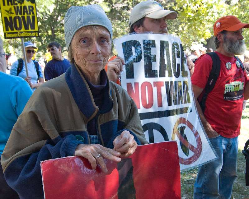
Peace rally in DC
to be part of essay but wanted to get reactions first.
difficult lighting situation
BW or color

taken with 12-24 Tokina (wonderful lens)

Image Date: 2007:09:15 12:16:50
Focal Length: 24.0mm (35mm equivalent: 36mm)
Exposure Time: 0.0050 s (1/200)
Aperture: f/7.1
ISO equiv: 500
White Balance: Auto
Metering Mode: Matrix
Exposure: program (Auto)
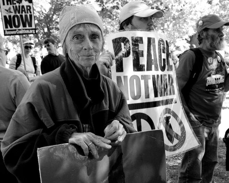
dcpeace702007091546xd3.jpg


dcpeace7020070915462se1.jpg
 
Ooooooo.............I love the black and white conversion!! It really brings out the character in her face. This is a very interesting picture. Title suggestion: "With Age Comes Wisdom."
 
For me the B&W version works better. My eyes were first drawn to the yellow sign in the background of the colour shot, whereas I tend to look at the lady's face first in the B&W shot. Maybe you could tone down the highlights in the background. They seem brighter in the B&W version than in the colour version and I found them slightly distracting.
 
While I am not drawn to anything BUT the lady's lovely blue eyes in the colour version, I still think the black&white one is better for photojournalistic use, and more things succeed in getting my attention - but the lady IS the subject (clearly!) and remains the subject also in the conversion. Only do I look at her entire face more in the converted photo and into her eyes mostly in the colour photo. Do I express myself?
 
My pick is the color one......the b&w has a bit too much shadowing in it. Also, the green leaves are blown out .....it appears you tried to brighten the b&w, but with limited success.

BTW.....the shot is good!
 
BW its more striking and more hard hitting somehow :)
 
Thanks for all your input.
Except for the conversion (in Lightroom) these were unmodified.

The lighting was problematic because there was bright overhead sun and patchy foliage above, thus some areas were very very bright and others were in dark shade.
 
I like the B&W, but also like the idea of desaturating the background to allow her eyes and sign to pop. kdb
 
Definately the black and white.
 
The B+W one is great, I'd try cropping out the guy on the right, he adds nothing to the shot and it would eliminate most of the blown out leaves.
Whilst this would leave the old lady slap bang in the centre I think it still works.
 
Thanks for all comments.
My motive for cropping as it is was that I wanted both the sign on the left and her hands holding the folder. I virtually always crop to a standard size, my own little quirk, and so the crop sort of arranged itself. Additionally the two men looking in the same direction made it clear that there was something else going on that 'people' were looking at but she was looking at me.

Thus, all in all, the content forced the crop.

Thanks again for all comments.
 
Colour with a slight bump in Contrast.

The colourful banners play an important role in this image. The 'cause' is the main subject here.
 

Most reactions

New Topics

Back
Top