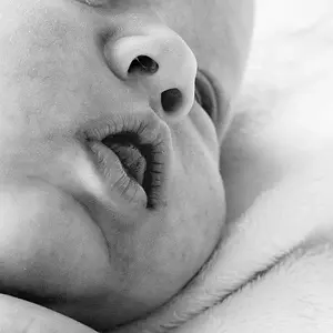
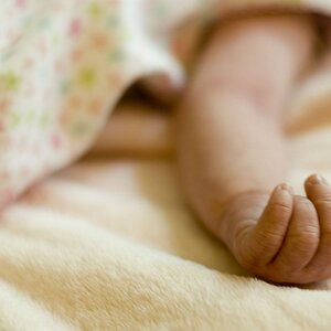
Hi Montanamyst, first of all, cute kids! That is a great place to start.
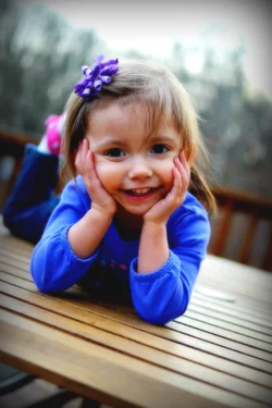
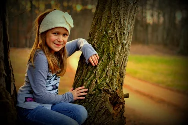
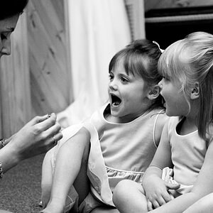
I like #1 although it is just a tad unbalanced. You have placed the eyes right in the centre (left to right), but the feet are perilously
close to the edge of the image on the left. I would leave a bit more in on the left, or take a bit out on the right. The vignette is
probably unnecessary. A bit of a catch light in the eyes would be good too.
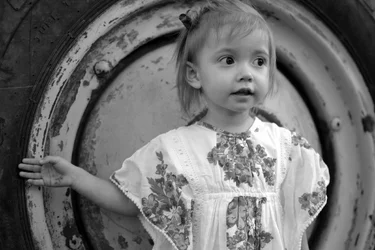
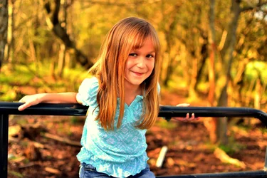
#2 and #3 are good, although the crop on #3 is a little tight on the top. I assume you have more space in the original shot. (If not,
beware of composing too tightly when you are taking the shot, you can always tidy up in post if there is extra space in the frame
but not so easy if the whole frame is too tight.)
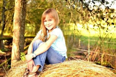
#4 is too orange and over processed - if you are using Photoshop, try making your changes using layers, then you can dial in more or less
of the effect quite easily.
And the chopped foot in #5 is distracting, and the image is overexposed. The histogram would show a spike on the right hand side.
Overall, however, I like them.




 The other pictures, you get too close.





![[No title]](/data/xfmg/thumbnail/34/34685-17f2466cddc9890af6ca67c65e2e7d5c.jpg?1734165691)