What's new

Pictures in the Park

Photographiend

No longer a newbie, moving up!
Joined
Jul 31, 2012
Messages
1,234
Reaction score
188
Can others edit my Photos
Photos OK to edit
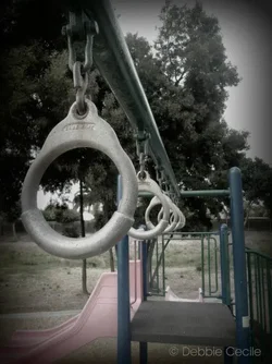
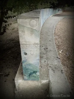
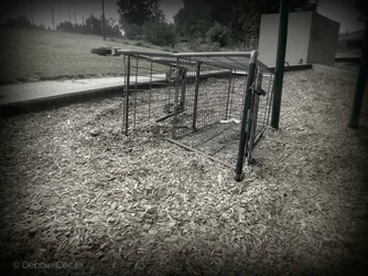
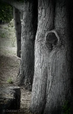
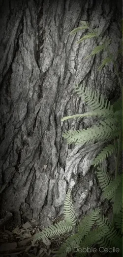
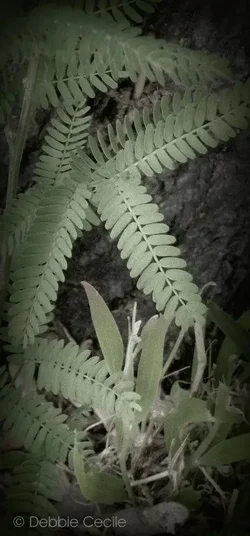
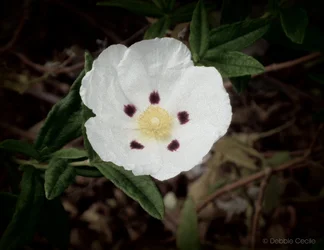
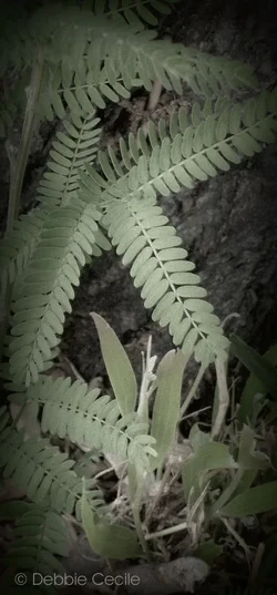
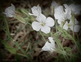
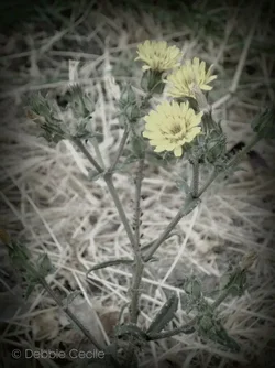
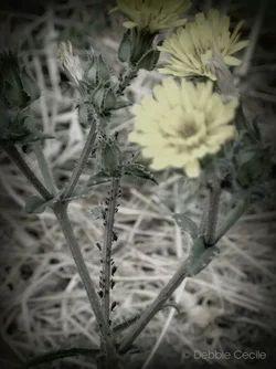
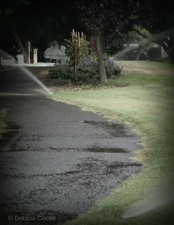
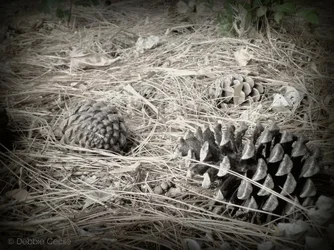
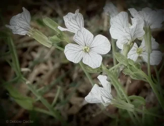
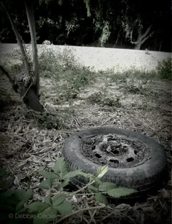
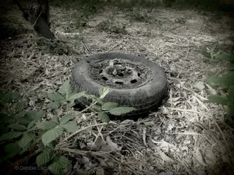
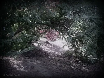
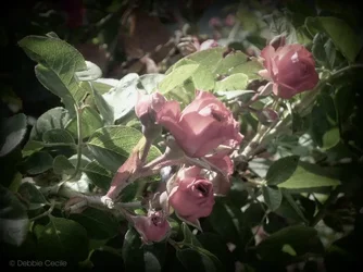
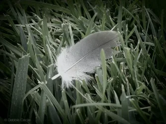
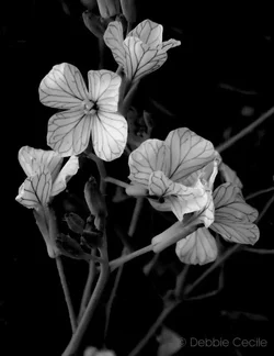
These are from today. I could use some critique here. Please tell me frankly: What is working? What isn't working? and Why?

$533058_10150954491432373_1277755973_n.webp

$385533_10150954490617373_377742010_n.webp

$306722_10150954491847373_1367400185_n.webp

$422202_10150954490882373_1102463190_n.webp

$527385_10150954492092373_1914380561_n.webp

$428842_10150954492222373_1628113056_n.webp

$CIMG2464a1.webp
 

Attachments

  • $CIMG2500a1.webp
    $CIMG2500a1.webp
    600.1 KB · Views: 84
  • $CIMG2548a1.webp
    $CIMG2548a1.webp
    442.2 KB · Views: 73
  • $540402_10150954493272373_1570282731_n.webp
    $540402_10150954493272373_1570282731_n.webp
    52.5 KB · Views: 67
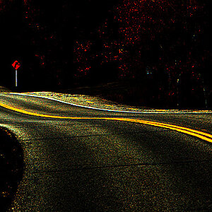
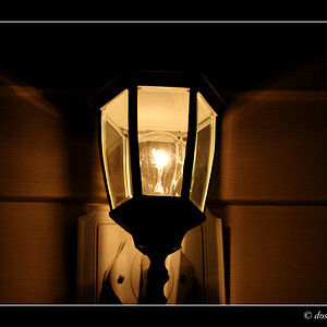
Way too much vignette! It is killing these shots! Not even going to bother with C&C with that being there...
 
Hmmm... I noticed 3 of the files I removed from the last post are showing at the bottom as attached files? :confused: How do I remove these?

Okay continuing...

View attachment 15646

$527301_10150954493527373_578041141_n.webp

$422353_10150954493717373_734930727_n.webp

$251879_10150954493892373_1212711327_n.webp

$394647_10150954494017373_1983494910_n.webp

$561401_10150954494517373_358377505_n.webp

$562750_10150954494742373_843001434_n.webp

$292308_10150954495027373_1742972917_n.webp

$418333_10150954495907373_1669422371_n.webp

I know this last one is not focused right. My bad there... also some touch ups should have been done to get rid of that string of web and some how mend the leaf... that may actually be beyond my abilities.

Any how, need the feedback. Thanks.
 
And the last one that couldn't fit on the other two posts.

$387083_10150954496132373_810379666_n.webp
 
Heavy vignette harms every single image you posted.
 
If you want people to critique your work you should pick your 3 best shots. Most people are not going to sift through 20 photos and comments on all of them. It's much more beneficial to you to only post 1-3...
 
Okay... so vignette is okay, just less of it? How much is okay? It was my first time using this tool and I kind of liked it (I am sure you noticed).

:( That is going to be a lot of correcting.

If I am going to re-post which ones should I re-post? Obviously not all of them.
 
It's hard to know how much vignette is enough and when you cross the line. But keep in mind it's not something to use in every photo and it usually works best when used subtly.
To remove attached photos, find the section 'manage attachments' and there remove the ones you don't want.

As for C&C, you really need to post no more than 2-3 pics per thread. But as an overall critique, colours look really muted and desaturated.
 
Yep, big time desaturated. Just short of being black and white.
 
This one was actually my favorite from today's shots. I did a whole mess of black and white too.

$418254_10150954596732373_821862569_n.webp
 
I agree with everyone else. The vignette is so severe it's giving the impression of underexposure.

If I want to add vignette to a photo, I rarely use the vignette sliders in Photoshop. I used the burn tool and gradually burn the edges until I get the effect I want. The vignette sliders in the lens correction tool and even in Camera Raw of Photoshop are not very natural looking effects.
 
Last edited:
I am trying to train my eye to see what you guys are seeing. I thought this tool (Holga-ish in Picasa, no fancy editing equipment here) added a mood to the images. But when I asked my husband he said he just didn't get them which is why I came to you guys to figure out why they were failing.

So, I Googled Vignette images online and what I found was, like you are saying, I didn't like that it seemed the content got lost in the shading. There were some where it enhanced the focal point but in many it didn't.

Harder to be objective with your own work. But I appreciate the feed back. May post back here once I play around with the images again. I am having little prints made of them today so I can see how they translate in print. I suspect my screen makes them look brighter than they actually are (as had been the case with other images in the past) but I wont know until I get to see them in print.

Thanks guys!
 
Vignettes serve to focus attention on the center of the image. Most of the times they are just not necessary. Desaturation, as a technique, can also be useful but where texture is strong but a bit of colour helps differentiate parts of the image. The big problem with these images, at least in my mind, is the visual flow. The eye usually starts at the brightest or sharpest part of the image and then follows the lines to explore the rest. Center placement of a subject is static mainly because the eye doesn't then naturally flow from one element to another. The usual guideline of using the rule of thirds partly addresses this issue by putting the subject on the 1/3 line, which naturally allows the eye to travel across the center to the other side.

If you want to improve, think about what aspect of the subject you want us to look at, then use the technical tools at your disposal (depth of field, lighting, focus placement, arrangement of the elements in the frame) to focus our attention on that aspect. The advice given by Lew Thorton (who I quote in my sig) is very appropriate. If you apply those basic three steps, I am confident your image-making will improve tremendously.

 

Create an account or login to comment

You must be a member in order to leave a comment

Create account

Create an account on our community. It's easy!

Log in

Already have an account? Log in here.

Back
Top Bottom