What's new

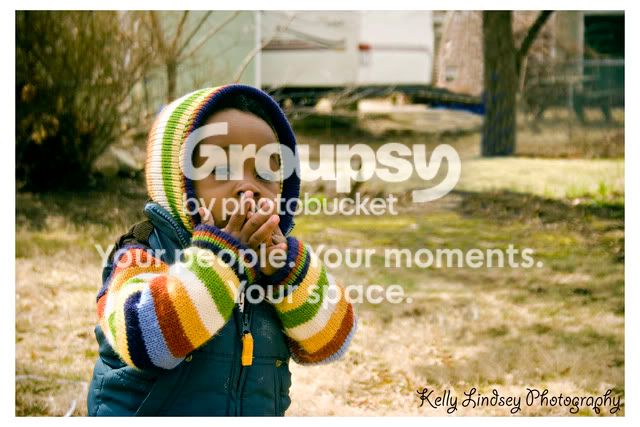
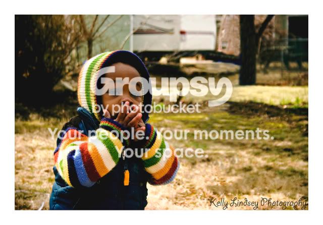
playing w/curves.. too much on this photo?

Joined
Mar 26, 2008
Messages
1,270
Reaction score
0
Location
Haverhill, Ma
Can others edit my Photos
Photos NOT OK to edit
jonah.jpg

jonah3.jpg


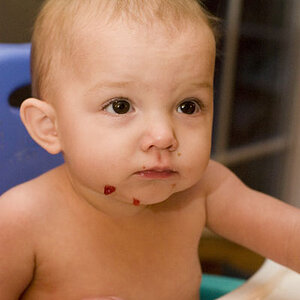
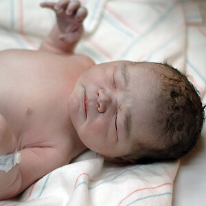
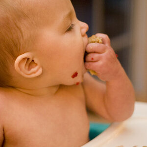
It seems I got the whites where I wanted them, but not the blacks. Is it too much?
 
I think the first one is a better, it just needs some color correction, more magenta.
 
Thanks for your comment!! His skin IRL seems more true to the second one so I liked that... But I definitly know that first one needs color tweaking.. ugh my head hurts from staring at this screen today.
 
Kelly,
Have you tried curves on a layer so that you can erase back where it's too much?
 
I'd just back up the s curve a little bit and mask the face to make sure it won't get too much shadow.
 
Kelly,
Have you tried curves on a layer so that you can erase back where it's too much?

Ya, I had the curves as an adjustment layer. I couldn't seem to get that 's' shape perfect though on the shadows side.. I guess I need more practice with it. Thanks all!

 
The second one is a definite no, no, IMO. I wouldn't have touched anything on the first, but that's me. Some people like color enhancement.
 
I vote for the first one, too. However, I think it looks too green/yellow to me. I agree with a previous post - add some magenta.
 
I like the second one, Kelly. In the first, his skin had a green cast. Cute photo, BTW. I love the colors in his outfit!
 
I would make an adjustment layer for curves but set the layer property to luminosity that can help some of the slight wonky color you're getting...
 
first one i would say is the better of the two
 
In the second one, the whites look almost blown.
 

Create an account or login to comment

You must be a member in order to leave a comment

Create account

Create an account on our community. It's easy!

Log in

Already have an account? Log in here.

New Topics

Back
Top Bottom