What's new

Playing with some concepts

jdsfighter

No longer a newbie, moving up!
Joined
Jun 2, 2012
Messages
266
Reaction score
29
Location
Owasso, OK
Can others edit my Photos
Photos OK to edit
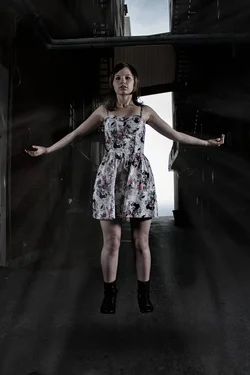
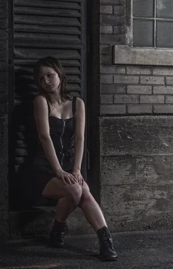
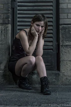
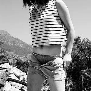
A friend wanted me to get some pictures of her. Turns out our concepts overlapped.

1. $rock_bottom_by_mxjerrett-d657n43.webp
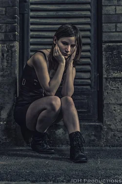
2. $take_me_by_mxjerrett-d657vts.webp

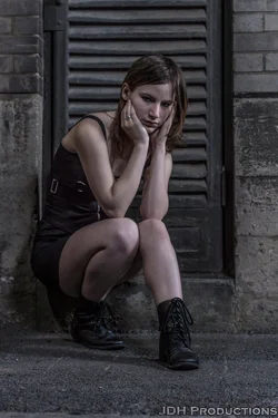
3. $you_ve_had_a_hard_day__how_about_i_ease_it__by_mxjerrett-d657vvx.webp
 
Last edited:
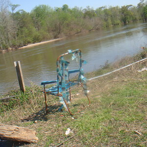
I'm not a fan of the hdr look in #1 but I like the pose and photo. #2 doesn't do anything for me but it seems like a good levitation photo. #3 is probably the best of the set.
 
I'm not a fan of the hdr look in #1 but I like the pose and photo. #2 doesn't do anything for me but it seems like a good levitation photo. #3 is probably the best of the set.

For reference, here are two other versions of the first one. She liked the overly grunged one the best.

High: View attachment 44975 Medium:$rock_bottom_v2_by_mxjerrett-d657vr5.webp Low:$rock_bottom_v1_by_mxjerrett-d657vsp.webp
 
She's the customer so she is right. I personally like the medium one. That's the good part of it, that either one is good depending on your likes.
 
It was an entirely new concept for me. I've wanted to try some grunge style photos for awhile, and she's a derby girl so she was wanting something like it done. It gave me a good excuse to bust out my lights for the third time, find and alleyway, and start clicking away.
 
If she is part of the derby team, it would make more sense to at least have her skates on. but that is my opinion.
 
She has a ton with her skates, she wanted something less relating to derby, but with the same feel that she's used to.
 
Nos. 1 and 3 are almost there, but the muddy light doesn't have any impact. I understand goth/grunge looks a bit but the market for girls who want muddy green skin is very small. You can do grunge without muddy green skin. In No. 3 the girl's face is totally lost. She has no eyes and the eyes are the soul, especially for goth/grunge girls. In No. 2 I don't get what's going on and neither will most viewers; it does nothing.
 
I like the grungy look. Shot #3 is my favorite of the set. I think you did great with the processing and the dark lighting and overall dark look that coordinates perfectly with the grunge processing.
 
I really like #1 and #3 except for the processing. The light catches her face and features really well. I think I don't like the processing because everything is so monotone. Might as well be black and white. I am not sure what it is. Too grungy maybe?
 
I really like number 1, number 2 seems awkward, and 3 seems like she is a little uncomfortable and in an unnatural position.
 

Create an account or login to comment

You must be a member in order to leave a comment

Create account

Create an account on our community. It's easy!

Log in

Already have an account? Log in here.

New Topics

Back
Top Bottom