What's new

Please be gentle (C&C)

Tired but willin

TPF Noob!
Joined
Jan 31, 2011
Messages
118
Reaction score
1
Location
Dartford, Kent, England
Can others edit my Photos
Photos OK to edit
Hello there,

I've literally only been shooting pics since December after purchasing a Canon 500D so really new to this environment. Have been reading non stop and speaking to as many people as i can - sooooooo much too learn, but seriously enjoying it. Still getting to grips with the basic's and trying to shoot in manual as much as possible, as i feel this will progress me a little quicker. Thought i'd post a couple of my better pics to date for some pointers.

Please take into account how new i am to this, but feedback greatly received.......


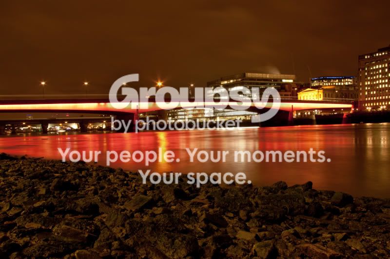
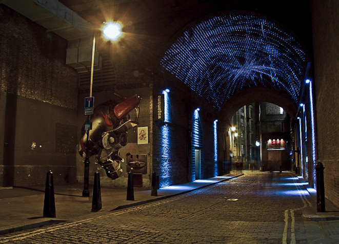
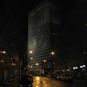
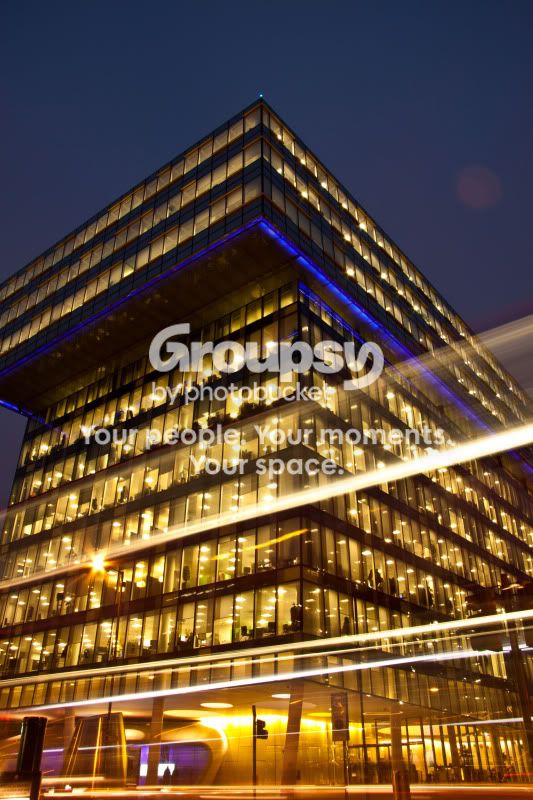
The first is a building near to where i work in London...(ISO 100, F14 at 13sec)
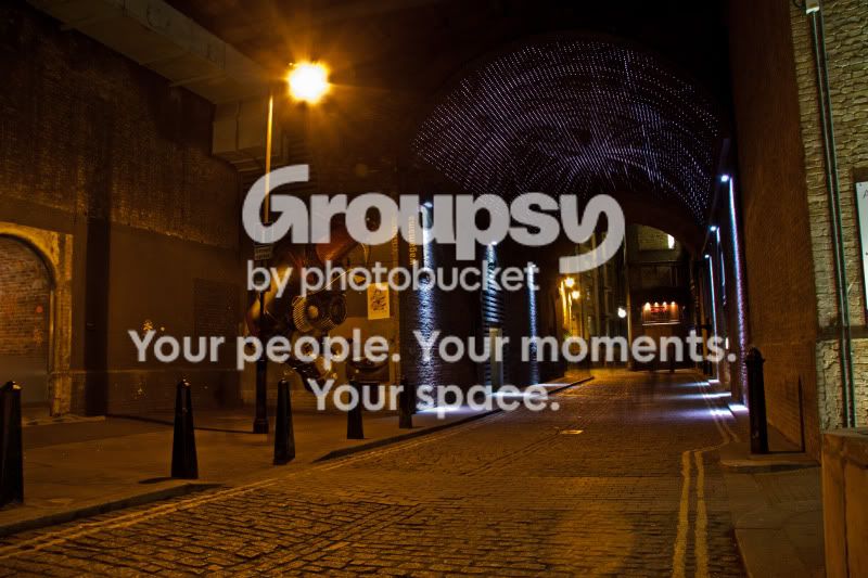
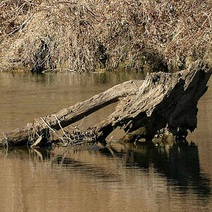
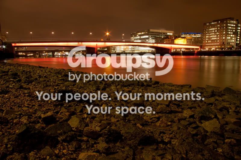
Second is a pic of the Thames...(ISO 100, F14 at 25sec)
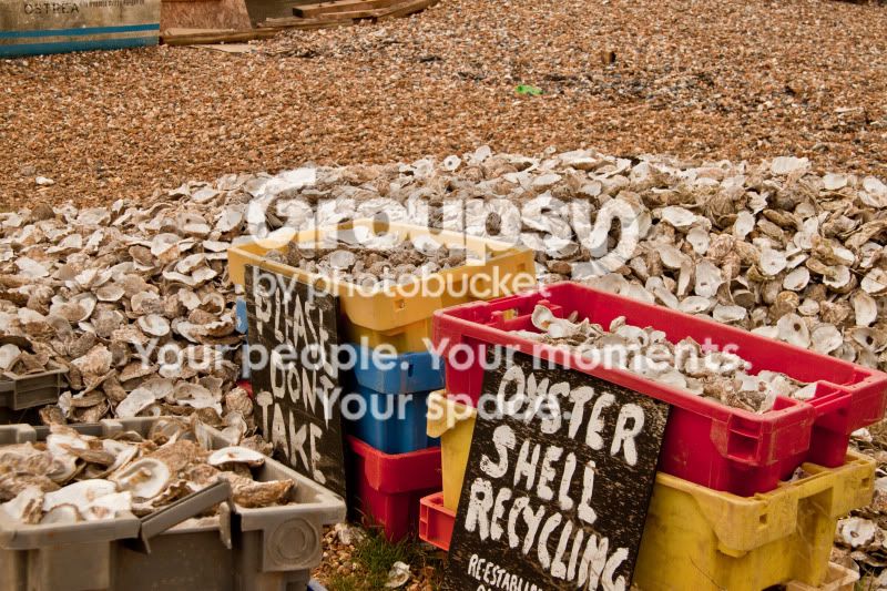
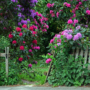
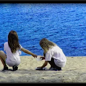
Third is a recent trip to the seaside...(ISO 100, F8 at 1/50)
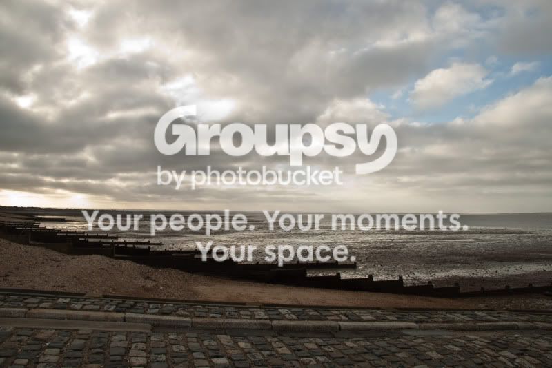
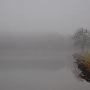
Forth is another of seaside...(ISO 100, F13 at 1/40)
IMG_1749_edited-1-1.jpg


IMG_1790_edited-1.jpg


IMG_2132.jpg


IMG_2136.jpg
 
i'll comment only on the first 2.
I think the first is pretty interesting...the lighting and coloring effect is good, but I think the framing could be improved.
the second is beautiful in color and light, but again...the framing.
 
i'll comment only on the first 2.
I think the first is pretty interesting...the lighting and coloring effect is good, but I think the framing could be improved.
the second is beautiful in color and light, but again...the framing.


Can you elaborate more on how you would frame them otherwise?
 
I like these!
But i always thought that after F8 the pics start to break down, yours look very sharp!

What lens?
 
The first two pics were shoot with the lens it came with 18-55mm IS. The last two were shoot with the EF-S 15-85mm IS (which i've just upgraded too).
 
i'll comment only on the first 2.
I think the first is pretty interesting...the lighting and coloring effect is good, but I think the framing could be improved.
the second is beautiful in color and light, but again...the framing.


Can you elaborate more on how you would frame them otherwise?


sure, since i'm replying..let me start with the river shot because its the closest in my scrolling.

imo, the rocks take up too much of the image...maybe it would have been better to move more to your right to move the rocks out of the image..but keep the bridge and the skyline in the shot...that is your subject, right? if it is..the rocks shouldnt be so prominent in my opinion.

and the building shot feels like the left side of the building is cut out of the image wrecklessly...so, i'd either cut more of it out...or have had included more of it in the original shot.

i think the overall problem with the framing in those images is the sense of balance, but they aren't bad images. They're actually good...just a bit of frame correction would make them better for my personal tastes.

other photogs might disagree with me.

:thumbup:

Regards,
Jake
 
Many thanks for the tips....i took a few of the river and have attached one which doesn't show as much of the rocks. Personally i prefered the one with the rocks, but i'm not sure why......

IMG_1794_edited-1-1.jpg


How about this one as well???

IMG_1776_edited-1-1.jpg
 
I also like the one with less rocks shown (#2). For the 2nd one in the set you posted nice going to the rule of thirds line, but is the street sloped? seems to be at a bit of an angle.

Overall I like the first one, then the two in your 2nd set.
 
#1:
You sliced off the edge of the building. As has been mentioned either slice off more of it or non of it.

#2
I prefer the version with less rocks personally. I like the little starbusts created by the streetlights on the bridge.

#3
Doesn't do anything for me. You sliced off the edge of the sign as well...

#4
Doesn't do anything for me **as is** I think this would look really cool in HDR with the different textures of the brick, etc, but as is, it just looks like a dreary day.


***OMG..I forgot you're a beginner and you want us to be gentle...disregard the previous C&C***

They're great.
:thumbup:
 
Last edited:
:lmao: you don't need to be that gentle lol. Thanks for all the pointers, I really appreciate the feedback. I've been thinking about the first pic, and if my memory serves me, the reason why its taken like that is there was a huge street light in the way, but I need too go back and double check!!
 
I like the last 2 pics posted also #1 in the post

If you haven't read about the rule of thirds you should. For me I fall to it unless something really merits breaking it. Some examples - double reflection that matches perfectly. To get these usually means the horizon line needs to be right in the middle. the foreground is so interesting that it merits that much of the frame like your first bridge pic. I and I think many others don't think the rocks in your pic merit that much frame. That's personal taste
The 2nd bridge shot is nice with lines and thirds

I think this is excellent if this is one month in.

Are you doing post processing? I think these could be real nice with the right treatment. I think they could all use a white balance adjustment. Sometimes that will improve a night shot drastically
 
I like the building in that 1st photo but could really do with out the Airy disk and streaks, and check framing.
I like the last one, and the rest just dont do anything for me.
 
Thanks again for the pointers.

I've been using Elements 9 for processing but it's early days......have started reading a book called 'The Photoshop Darkroom' by Harold Davis and Phyllis Davis and need to put into practice now!
 
Hope you don't mind but wanted to play with one of these. Everything was done with very basic post processing that elements has. Just shows the different looks you can get with small changes to stuff like wb

5410926085_be116ae593_b.jpg
 
Last edited:

Create an account or login to comment

You must be a member in order to leave a comment

Create account

Create an account on our community. It's easy!

Log in

Already have an account? Log in here.

Back
Top Bottom