the lighting is interesting.
the globally-present gradient on the wall is a cool contrast with the box, which reflects light differently. nice colors too
only thing i don't really like is that it doesn't say much or tell a story. this is the kind of photo which it would please me to come across in a larger context of interrelated work, like some kind of installation art or a website
I liked it because of the contrasting color palette (red/blue/yelow)
and yes I agree not very artistic, not to mention croocked (at work with no tripod (hehe I got enough looks in the corridor taking several pictures of the extinguisher...lol)
I need to reload PS and learn how to fix such croocked images..
well I had a topic, but someone suggested if I wanted a critique to not have more than one picture.
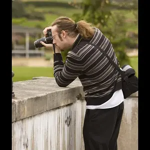
here are the pictures I had associated under the theme "at work"




![[No title]](/data/xfmg/thumbnail/37/37413-e579e9da185db973d8cb34300b9f0eb9.jpg?1734170438)