What's new

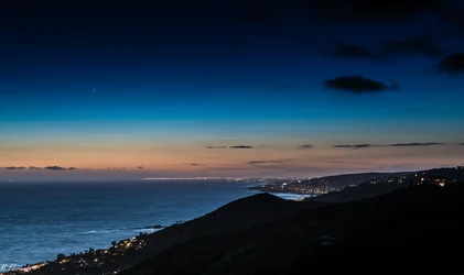
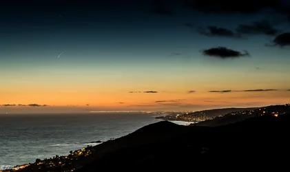
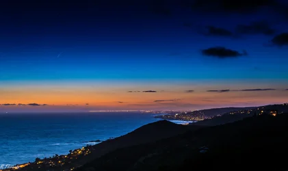
Please critique. Orange county California coast line

Joined
May 11, 2014
Messages
401
Reaction score
194
Location
Southern California
Can others edit my Photos
Photos OK to edit
Trying to capture the blue hour with city lights but still have the ocean and land visible.

8 sec, f7.1 and iso 100
$Badlands #2 5-20-14 (1 of 1).webp
 
way over saturated... back off a bit with the colors

did you add vignette... if you did, why?


of course jmo
 
Yeah, I think the first is really heavy on the blue. I like the orange/yellow colors, keep that part and back off the blue in the sky.
 
I love it, the blues are a tad over saturated but it gives it an interesting appeal. Very lively for a dark photo
 
I kind of liked the fact that you could see land MSteel. When I take the blacks down I feel like there is a dead spot on the foreground hill since there are no lights on it. Thoughts?

$Badlands #6 5-20-14 (1 of 1).webp
 
IMO, the first one is the best. But I love really saturated colors. You said you were trying to capture the "blue hour," and that is definitely BLUE. I feel like it's more impactful than the last one, which just looks kind of washed out to me. But like I said, I really like intense, saturated colors, which doesn't seem to be too popular around here. Beautiful shot, I like it a lot. :)

Sent from my iPhone
 
Thanks Playboy_mommy. Yes I think it just boils down to preference. I like the angle and composition so the PP is just preference. I like the first one as well since I posted it that way initially. I am very new to photography and value everyone's opinion but realizing that PP is very subjective. I guess as long as there are no technical critiques then I am doing OK. Thanks again for taking the time to comment.
 
I'm very new as well - just finished week 2 of my basic photography class! So I'm not only learning about photography and all of the technical pieces, but I'm also trying to figure out how to use my camera lol! It's incredibly overwhelming.

Your work is beautiful. Just take whatever is posted here with a grain of salt. A lot of it, like the saturation comments, is just opinion. And you know what they say about opinions - they're just like a$$holes, everybody's got one. ;)

I like my photos really saturated in some situations. That's what I like to look at so that's what I'm going to create. It's MY art. Don't get me wrong, I welcome constructive criticism and suggestions on how to improve my work. That's incredibly helpful. But I get really irritated when someone points out what *they think* I'm doing wrong, but makes no attempt to explain why it's wrong and how to fix it. Frankly, that pisses me off. It's not constructive criticism, it's just criticism. It's like some people enjoy just saying negative things. I guess it makes them feel superior or something. Whatever.

Ok, sorry for my rant. Lol. I really went off on a tangent there, didn't I? But....yeah....great work. Keep doing what you're doing, I really love it! :)

Sent from my iPhone
 
I kind of liked the fact that you could see land MSteel. When I take the blacks down I feel like there is a dead spot on the foreground hill since there are no lights on it. Thoughts?

Sooooo I don't know why, BUT it's not opening in full view for me.

From what I can see, I like the colors a lot more. I could imagine what you're saying about the lack of detail for the ground though. Personally I like the idea of it being silhouetted but that's just me.

And yes, opinions are opinions. However some things are indeed technical. If you over-saturate too much you end up losing detail and skewing others.

For example, the first pic looks fake. It's a great shot but just too much. The second edit is loads better but the water looks like a pastel instead of a photo. That's totally OK and looks great if it's what you want.

The third (it's now opening correctly) is cool but I agree it's too dark and I find myself missing the blues in the sky.

PP is a lot of preference, but there is still a science to it. The only time it's not is when you're going for realism, in which case it's all about realistic accuracy.
 
Thanks Msteelio. All very good points. I am still working out the LR options and yes there are trade offs each time I seem to make an edit. As long as the shot is there I can work on the PP and get it just to my liking. Thanks again for taking the time to comment.
 
When I first looked all I saw was - blue! with a peach colored horizontal streak thru it. That's I think what happens with over saturating, it brings the viewer's attention to just seeing color more than the subject or scene. To me the dark filtered effect doesn't enhance the photo either, it doesn't seem to add anything to it. I think this much intense color makes the photo and the scene in it not believable.
 

Create an account or login to comment

You must be a member in order to leave a comment

Create account

Create an account on our community. It's easy!

Log in

Already have an account? Log in here.

Back
Top Bottom