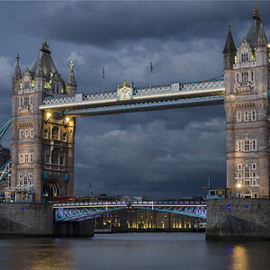
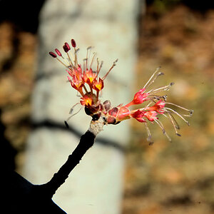
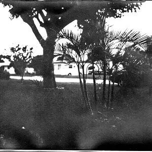
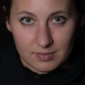
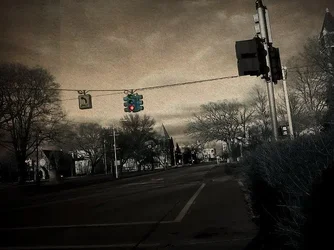
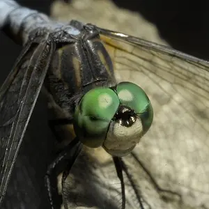
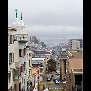
All of these are processed to the point that the processing risks overwhelming the image. I see the selective color, I see the gimmick, I don't see the photograph.
That said, they're not bad. I like #1, although it looks like a composite when you look closer (the out of focus subject feels pasted onto the bricks). The composition is unorthodox, but pretty good.
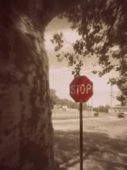
#2 and #4 are too overt to appeal much to me.
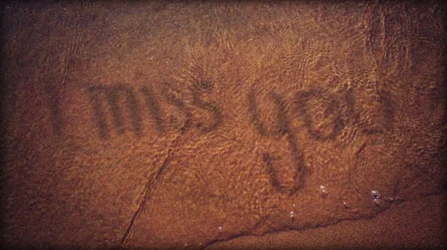
#6 and #7 are snapshots of nothing that you've tried to save by processing.
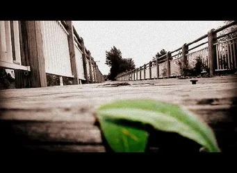
#3 is an interesting perspective, but it's in every stupid "how to pep up ur snapz, try a different perspective!" guide online, so it's a bit cliched.
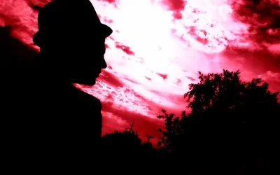
#5 has some stuff going on, but I think ultimately the drama of the silhouette and the sky doesn't quite compensate for the fact that it's a picture of some guy in a hipster hat sitting around in a park.
Anyways. All that said, these have a coherent look so you have some ideas about how your photographs should look. That's good! You have some decent photographic ideas, too. That's also good! I think editing more ruthlessly, and using a lighter touch on the post processing effects, to let your photographic ideas breathe a little more while still getting that coherent look, would be a help to you.







![[No title]](/data/xfmg/thumbnail/32/32811-2108d3f1ed7b5806eb452fc776aac668.jpg?1734162499)
![[No title]](/data/xfmg/thumbnail/32/32810-094482c1ef1c76eae62a96107013a72e.jpg?1734162496)
![[No title]](/data/xfmg/thumbnail/32/32808-9d1f657a1903d3bdbd67ea830397d62c.jpg?1734162491)
![[No title]](/data/xfmg/thumbnail/38/38741-89a8c6f9d841889783a4fae2b8c40902.jpg?1734172602)
![[No title]](/data/xfmg/thumbnail/33/33449-978bff23ad40c63da778b7e59d54f546.jpg?1734163488)