Portfolio (5 Shots)

lostcase_gib

TPF Noob!
Joined
Jan 29, 2008
Messages
341
Reaction score
0
Location
Gibraltar, Europe
Website
www.markgalliano.com
Can others edit my Photos
Photos OK to edit
Here is the portfolio that got me second place in a beginners course here in Gibraltar!

Enjoy!

C&C as usual!

1. Portrait
Portrait.jpg


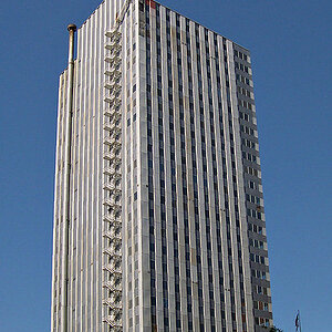
2. Night Shot, Low Light
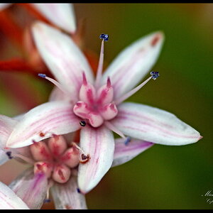
NightShot.jpg


3. Nature/Close-up
Nature.jpg


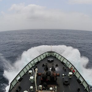
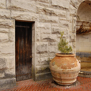
4. Landscape/Seascape
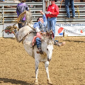
Lanscape.jpg


5. Action/Movement
Action.jpg
 
They look good. Nice composition on #3.
 
Two and three are my favorites. I really love the composition of that second shot! Also the color is very vibrant in your third shot!
 
1, 3, and 4 for me. #1 looks kinda like Perry Ferrell! (Jane's Addiction, Prono for Pyros).

Nice work on all of them. I'm not real fond of "people pictures" but the 1st one is cool.
 
I love 4 - were you on a roof for that shot?

C.
 
I'll take them one at a time, as to give you the best critique I can, since you say you're in a beginner's course, I'll try and tackle what I think to be basic mistakes, or advanced executions. :]

One: This shot is a pretty unique take on the portrait, and I like it a fair bit. I feel the composition is well done, as the subject is the main focal point, as there's not much else to look at, which is good for this particular shot. It might have been nice to get a bit of a scene for the shot though, to help the viewer best understand what's going on in the shot. It looks as if the focus was on the hands, rather than the eyes, which is generally a big no-no for portraiture. And there is also a lot of middle gray (not enough variation in the tones) in this shot, which is a tough thing to get past with black and white portraiture. Overall, it's a decent shot.

Two: There's not a lot to pick apart with this shot, but I feel it might be slightly tilted, like half a degree, if that, to the right, it's tough to really tell for sure. I like this shot, it's beauty is in its simplicity. Good stuff.

Three: The composition of this shot isn't particularly bad, but the focus is on the front flower, which would usually work, except that there isn't enough of the front flower actually in the frame. I think you were planning on this, but I just don't feel it works well for this shot. It might have been wise to step a bit further away from your subject, and use a smaller aperture to get a larger depth of field, and try and get all the flowers as equally sharp as possible, or at least change the composition enough where the sharpest flower was also the most prominent. Just my personal view on this shot though, to each their own.

Four: The sky on this one is blown out, but, that's rather understandable, and might even work to the advantage of this shot to better solidify the building as the subject. I enjoy this composition, it's traditional, and effective. I also like how you got a bit in at the bottom, of foreground, no matter how out of focus it is (which is good for the effect the foreground has), it creates a bit of a natural frame to this shot, and I like it. The building might be a bit too dark, but overall, this is a very nice shot.

Five: The skin tones are too red, in my personal opinion. And on top of that, it's just not a shot I find particularly interesting, it's hard to tell if it's a portrait, or a snapshot, no offense intended, just my personal view. I'm not sure what you could have done differently with this shot to make it seem better to me, I just guess it's not a subject, at least in that particular pose, that would interest me no matter how it was presented.

I hope my critiques have given you some new perspective, even if you completely disagree with all of what I said. Thanks for sharing! And congratulations on the 2nd place!
 
thanks everyone for your comments!!

Shoebacca - thats the view from my fianceés house.

Trenton - thanks for that advice on all of them! My action shot was my weakest as i only took it 24hrs b4 the event as i didnt have any shots for that.
 

Most reactions

Back
Top