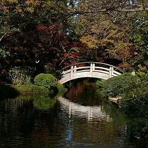
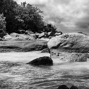
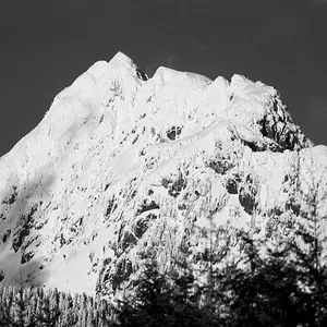
looking at LANDSCAPES. the last picture seems to be of a barman (?). you need to level-off some of your horizons etc. go for quality over quantity. the snaps of clouds and trees - there are millions of these made with P&S every week and uploaded onto the web. choose carefully - those type of shots just look like fillers when people start using terms like 'Portfolio'.
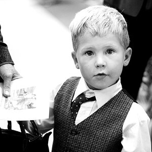
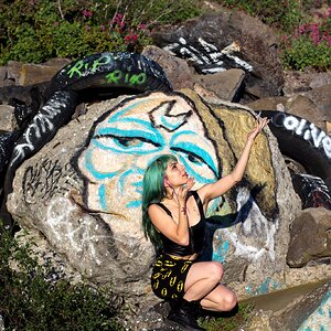
the PEOPLE section seems more interesting. but a mistake that seems to be often made is: when a photographer doesn't specialise in something, they try to project a level of competence in everything...and fall between stools. PEOPLE is ok but i'm getting into a street-doc series then #3 i'm shown a shot of a young woman in a garden..then back to the street performers again (?). forget #3, it's unremarkable and messes up the series.
BLACK AND WHITE: again just some navel-gazing snaps. incompatible with a website 'styling itself as a creative ''Production" outfit. it's self-inflicted egg-on-face.
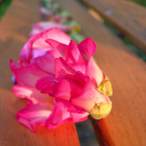
MACRO/ABSTRACT: people who are not photographers are uninterested in being told something is macro or abstract. show it, don't tell it.
ABOUT: unfortunately, your photography falls far short of your mission statement, at this time. although it is a mission rather than an achievement. if you culled 75% of the images presented, your photography would come across a lot better. but it's obvious you lack skills and awareness. i think the whole commercial aspect of the website is far too optimistic, for now.
being available for nighclubs, weddings and portraits is an aim but as previously commented upon, there is no eveidence you can do this and do it professionally. also selling these services with an image celebrating the ritual torture of a bullock is just plain bonkers !!
i'll leave it there! :thumbdown:




![[No title]](/data/xfmg/thumbnail/38/38738-7933157d1b8968c986eeeab2d1828524.jpg?1734172602)