- Joined
- Aug 2, 2015
- Messages
- 2,169
- Reaction score
- 1,774
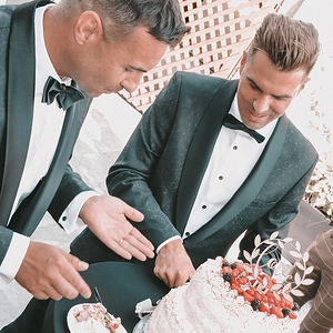
- Can others edit my Photos
- Photos NOT OK to edit
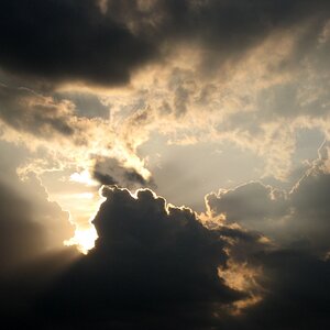
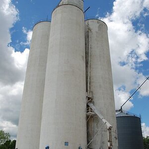
D850
f/8.0
ISO 64
1/320Sec.
50 mm - f/1.8G
(Processed In LR (Using Serge Ramelli Presets) & Color Efex Pro 4).
Image received an HDR treatment, composed of ten (10) images of varying ISO & Shutter Speed.

Thanks For Looking Any Comments/Criticism Will Be Appreciated.
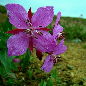
Enezdez
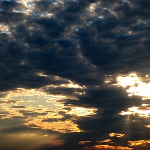
f/8.0
ISO 64
1/320Sec.
50 mm - f/1.8G
(Processed In LR (Using Serge Ramelli Presets) & Color Efex Pro 4).
Image received an HDR treatment, composed of ten (10) images of varying ISO & Shutter Speed.
Thanks For Looking Any Comments/Criticism Will Be Appreciated.
Enezdez
 at least it wasn't all. LOL

![[No title]](/data/xfmg/thumbnail/37/37413-e579e9da185db973d8cb34300b9f0eb9.jpg?1619738059)