What's new

Portrait C&C

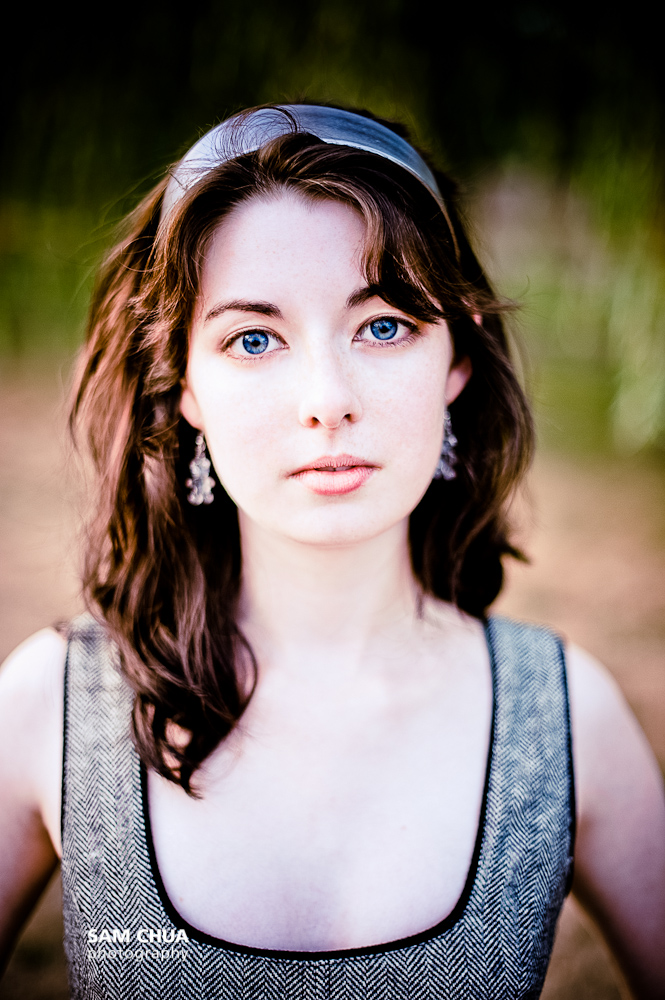
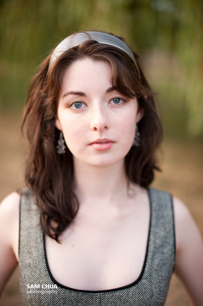
I liked what you did with the first one but after seeing the original I like the original a lot more. I feel the humanness was removed in the first image...if that makes sense. I think just too much skin smoothing left it emotionless. And as stated the blue chest I didn't like.
 
Her eye color is nothing short of beautiful in the first photo, the blue has been lost in all the tweaking in the others.
 
I didn't smoothen the skin any more in the first edit. I had merely increased the exposure to use a high key style photograph to remove the freckles. I see what you mean by the blue eyes being lost in the untweaked version. The model is gorgeous and I did not want to do the overly done tilted pose. Her wide set eyes and figure lent well to a head on shot.

My real reason for putting up this C&C is to see how far I could go with my retouching before it was noticeable. Here is my latest edit compared to the Straight out of Camera shot.
6960421153_04b6580f0e_o.jpg

6960421331_5fb20ef40e_o.jpg
 
Last edited:
Once again...You fall, you lose.
4f4f36d1309d8.jpg


4f3aeabe83fd7.jpg


4dd22bd156111.jpg
 
The last one is awesome. I am a sucker for doomsday shots :D
 
I still like the original skin color and I would just process it without the high key. Just my opinion I know you are trying to do the high key I just enjoy her natural skin.
 
I like the crop of the first, but the white balance of the second. It could be cooled slightly, but needs to be even across the whole image. The DOF is spot on! Cute girl too :)

EDIT: I was referring to page one of photos. I didn't realise there was another page of photos!
 
Well ask her is she happy with it? If she is happy that is what really counts>

Not so. The OP is asking for a critique (Comments & Criticisms) on this portrait from photographers... something quite different from affirmation from the client.

I find her expression to be mesmerizing. The light skimming her hair is very nice. Good job on clothing and accessories, echoing the color of her eyes. I do see the blue cast on her chest and find that a bit troublesome.

Since you have her centered in the frame, which I like, I wish she was absolutely centered.

And for the record, this is not a high key portrait... rather, it is a high contrast portrait.

All-in-all, nicely done.

-Pete
 
I would tend to disagree. An absolute centring would leave way too much space above her head and lead to an amateurish looking composition.
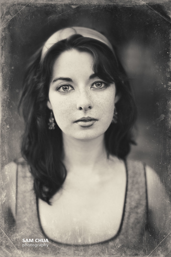
I recently discovered this program called AlienSkin Exposure 4.0. I am hooked.
Here's a re-rendering using the WetPlate setting of Exposure.
6963657489_265cfb7ca0_b.jpg
 
I would tend to disagree. An absolute centring would leave way too much space above her head and lead to an amateurish looking composition.

Oh... sorry... I mean left-to-right centering. This feels like you have a bit more space on the right.

I recently discovered this program called AlienSkin Exposure 4.0. I am hooked.

Yes... very nice.

-Pete
 
That last version is money!
....but then I like the film retro look.
 
I actually quite like it..very soft & feminine. Although her skin is too bright for me... But great job!! :)
 
Christie Photo said:
And for the record, this is not a high key portrait... rather, it is a high contrast portrait.

All-in-all, nicely done.

-Pete

Exactly; the original photo is in no way "high key".
 
Nice shot. There's something going on with the editing i think. The levels aren't quite right.
 

Create an account or login to comment

You must be a member in order to leave a comment

Create account

Create an account on our community. It's easy!

Log in

Already have an account? Log in here.

Back
Top Bottom