What's new

Portrait - First Attempt

eric1971

TPF Noob!
Joined
Jul 25, 2012
Messages
107
Reaction score
8
Can others edit my Photos
Photos OK to edit
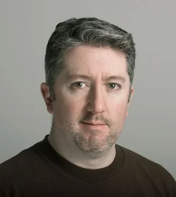
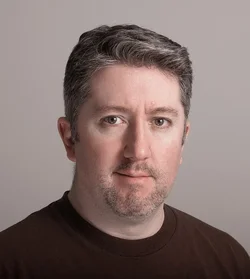
So I've been doing a lot of reading about photographing people and off camera lighting. This is my first attempt at a portrait. C&C please. Hit me with your best shot! I want to learn. Thanks.
$7897185560_e0ecbc28c8_z.webp
 
All I can help with is the WB (White balance) as I still have lots to learn! Is it just me or is there like a pink/magenta tint to the picture?
If you dont mind I took it into Photoshop and gave it a go. Heres what I came up with:
$7897185560_e0ecbc28c8_z.webp

I played with the color balance, added some cyan and yellow not much though.
 
I like your photo much better than the edit. Your skin looks dead and gray in the edit.
 
The lighting looks ok. The shadows are well enough lit in my humble opinion. what I can not work out though is the colour on the neck looking noticeably different to the face?
Just one thing I'd like to ask is, is that the actual colour of the background?
 
Well to be honest with you this image is boring ( I don't mean to offend you or be mean) But always check your wb because sometimes auto is not always the best way to go. Also try using a different background to make your subject pop. The lighting is ok and you are on the right track. Think about what you are relaying to the viewer. What kind of shot this is and what it's intended for. I understand this is your first attempt but paying attention to the details goes a long way. It is posible to make a head shot interesting by the way. Good luck and keep shooting.
 
The lighting is fine; my monitor isn't calibrated right now, so I can't comment on the skin tones, but I will say the original seems better than the edit. It looks like the subject may have got rather a lot of sun on his face while wearing a cap and glasses, accounting for the slightly odd look. My only comment would be I think you need to burn in the aera on his left temple and cheek JUST A HAIR. Other than that, it's good. Not exciting, but sound and effective.
 
Skin tones are tricky in the absence of a known white reference. People have wildly varying coloration, it turns out. Make him look natural, but good! I think he's a hair too red to be flattering in the original (although he may well actually look like that) and he looks a bit dead in the edit. Try someplace in the middle ;)

Lighting is fine. This is basically a corporate headshot, so it's not like it's going to "say" much.
 
Thanks for the comments everyone. I tend to agree that this is a pretty boring shot. It sounds like I am at least on the right track as far as the lighting, but need to start thinking more about making shots interesting.


The lighting looks ok. The shadows are well enough lit in my humble opinion. what I can not work out though is the colour on the neck looking noticeably different to the face?
Just one thing I'd like to ask is, is that the actual colour of the background?

The background was a white wall. I tried to kill the ambient as much as possible (I would have prefered a darker grey background), but couldn't get as far away from the wall as I would have liked do to a lack of space.
 
The light on the mans face is ok, I think there could be a better back ground given his complexion, I also think a indirect light on the back ground would have given the shot some depth.
 
Last edited:
412 Burgh said:
The edit is terrible.

Care to explain why, or do you prefer to just sit in your trash can and be grouchy?
 
OP's image is definitely more natural than Haya's edit, the skin tones in the original look natural. Exciting shot, no but it is a decent headshot and I've seen way worse. Nice catch-lights, good angle of light. The only thing I like to see is a little backlighting.
 
The edit it awful. WAY too green and yellow. WB way off the mark.

OP, post your lighting setup for us to see.
 
The edit it awful. WAY too green and yellow. WB way off the mark.

OP, post your lighting setup for us to see.

Hmm? It's all right there in the eyes ;) The key is arguably too much above the subject, for traditional lighting setups, extending the nose shadow.

I'm gonna guess "key about 20 degrees off the centerline, up high, camera-right, reflector 10 degrees off center down low camera left" and I don't see any other lights. I'd probably spread the light sources out, and maybe pull the key a little toward the camera and away from the subject.
 
The edit it awful. WAY too green and yellow. WB way off the mark.

OP, post your lighting setup for us to see.

Hmm? It's all right there in the eyes ;) The key is arguably too much above the subject, for traditional lighting setups, extending the nose shadow.

I'm gonna guess "key about 20 degrees off the centerline, up high, camera-right, reflector 10 degrees off center down low camera left" and I don't see any other lights. I'd probably spread the light sources out, and maybe pull the key a little toward the camera and away from the subject.


Yeah, I see your point. I'm curious about diffusers. Umbrellas or SB? Brolly?
 

Create an account or login to comment

You must be a member in order to leave a comment

Create account

Create an account on our community. It's easy!

Log in

Already have an account? Log in here.

New Topics

Back
Top Bottom