
helenjune
TPF Noob!
- Joined
- Jun 5, 2011
- Messages
- 43
- Reaction score
- 2
- Location
- Australia
- Can others edit my Photos
- Photos OK to edit
I feel like working on my critiquing skills, but I don't feel truly comfortable with commenting on other peoples work yet, especially when I haven't really sat down formally to do it with my own. I think I have a lot to learn in terms of critiquing and looking at my own work critically in a formal manner like this, so I thought I'd have a practice. Also, I think it's important I be able to look at my own work and be able to consciously point out what I like and dislike - so far I've just been sitting back and passing them off as acceptable or unacceptable without really thinking about WHY.

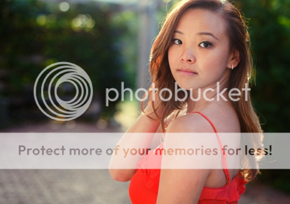
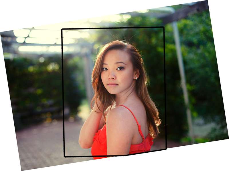
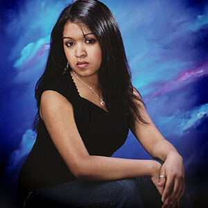
Here is what I believe to be an acceptable portrait taken by me. I do think it's one of my better portraits, but at the end of the day it only strikes me as mediocre.
It's shot at 1/160, f2.2 with a 50mm on a Canon 5d MkII.
Positive Attributes:
* I like the colour/post processing I have done here. I like the shade of greens and yellow.
* I think the lighting is good. I like the light catching in her hair. I like the faint haze of light above her head.
* I think the exposure is good.
Negative Attributes:
* It's very boring. Her expression doesn't say anything to me and there's no emotion to connect with.
* I think I could have framed it to include a bit more of her body and a tad less head space.
* The longer I look at the arm furthest from the camera, the weirder it looks because you can't see her hand behind her hair.
* The stray hairs coming off her head at the top are a little annoying and could easily be cleaned up in PS.
* Overall composition is nothing great. The white wooden post to the right, annoys me because it's distracting to my eye and breaks the picture up unnecessarily. It's another thing I could have edited out in post.
* The green fringing around the beams, top left hand is not a good thing, I think it takes away from the quality.
I think this is all I have to say on it right now. If anyone else sees any slack they want to pick up or things they want to educate me on, they are more than welcome to and it would be greatly appreciated.


![[No title]](/data/xfmg/thumbnail/40/40287-4f839095000f74d779b90ed75df9dc62.jpg?1619739408)


![[No title]](/data/xfmg/thumbnail/41/41755-a922f39cc29ff8f6e66a197508bf99f3.jpg?1619739881)

![[No title]](/data/xfmg/thumbnail/41/41756-e54235f9fba04c8380cd991845bb84b1.jpg?1619739881)