What's new

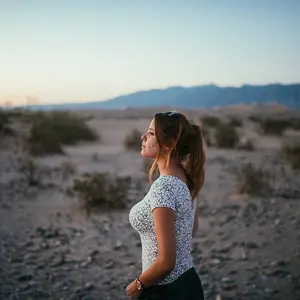
Portrait of my Girlfriend :)

Status
Not open for further replies.
Didn't want to come across rude.

You might have more experience, but if you ask me, if you would have done this shot in portrait, it would have looked like a bad passport photo.
It looks good as it is for me.

I think I can post my opinion even if I haven't got 20 years of experience. Maybe I am thinking outside of the box and don't think everything needs to be the old fashion way. It clearly works and is balanced to me.
 
Didn't want to come across rude.

You might have more experience, but if you ask me, if you would have done this shot in portrait, it would have looked like a bad passport photo.
It looks good as it is for me.

I think I can post my opinion even if I haven't got 20 years of experience. Maybe I am thinking outside of the box and don't think everything needs to be the old fashion way. It clearly works and is balanced to me.

yea.. we hear that a lot! You are welcome to your opinions.. we all have them! Good luck with your photography!

Since I obviously have nothing I can teach you, I will just add you to my Ignore List... so I won't bother you in the future! :)
 
Didn't want to come across rude.

You might have more experience, but if you ask me, if you would have done this shot in portrait, it would have looked like a bad passport photo.
It looks good as it is for me.

I think I can post my opinion even if I haven't got 20 years of experience. Maybe I am thinking outside of the box and don't think everything needs to be the old fashion way. It clearly works and is balanced to me.

My dear, there's a difference between opinions in photography and facts in photography. Thinking outside the box is fine so long as we're not talking about fundamental elements of the art. What you call "old fashioned" is as close to written law as it gets. Do you complain that your Doctor treats your flu the old fashioned way?
:soapbox:

And you can feel free to express your opinion regardless of your level of experience. However, with professional experience comes credibility. If you don't care about silly things like credibility, then by all means, go ahead.
 
Last edited:
There's no such thing as a "fundamental error of art" and dragging out the "I have more experience than you do" is the logical fallacy of "appeal to authority".

I didn't like the chopped off head either. It seems like it's not a thing that occurred to the OP, so it's great that it was pointed out, and I think the OP appreciated it and learned. On the other hand, you should always approach these things with the notion that maybe there was a purpose. In the end, all we have to offer are opinions -- did you piece work for me, or not? You can add some stuff about why it did or did not work for you, that's cool, that's great information.

But accept, always, that there's always the possibility that while it doesn't work for YOU, it's incredibly successful for 90 percent of other people. for reasons that you probably cannot even fathom. That's how art works.

I respect pros immensely, what they do is serious work, it is difficult, it is demanding.

That said, being a pro doesn't necessarily mean you know one goddamned thing about art. Professional work is about a) running a business and b) about producing the cliched work that the customers demand,
with a personal touch and a little client specific novelty, but not too much because you don't want to break the client's brain and god knows their brains break pretty easily. Clients don't want art or new ideas, well, ok, they want very very small new ideas that don't make them nervous.

All THAT said, almost every weird stupid-looking thing is just a mistake and a weird stupid-looking thing.

All I'm saying is: Don't assume that you or anyone else is automatically right, and don't assume that you have anything, ultimately, to offer beyond your own opinion.
 
cgipson1 said:
yea.. we hear that a lot! You are welcome to your opinions.. we all have them! Good luck with your photography!

Since I obviously have nothing I can teach you, I will just add you to my Ignore List... so I won't bother you in the future! :)

Thanks, I am booked out next months and just got a few spot lefts til end of november, so my photography can't be too bad. Good luck to you too!
 
As others were saying, the issue isn't that it's horizontal, it's that there appears to be no good reason it's horizontal.

The human face is naturally an oval most of the time oriented vertically. Unless there is a good reason to do otherwise, your frame should do that as well.

Doing something 'random' for no reason doesn't cut it. And doing something 'just to be creative' is no reason at all.

I've seen portraits that work with the top of the head cut off and I've seen portraits that work horizontally. This one doesn't, though it's otherwise very good.
 
Here is my take on the whole landscape vs. portrait orientation...other than what has been said and Lew put it very well.

So many of the ones I see where the discussion comes into play, is because of chopped off heads. Not even talking about dead space. So, with that one point alone...it is obvious why the proper orientation should have been used. Had it been...the head would not be chopped off.

I won't bother with the artistic side of the coin.

It is not anal to try to educate people on proper techniques.
 
amolitor said:
There's no such thing as a "fundamental error of art" and dragging out the "I have more experience than you do" is the logical fallacy of "appeal to authority".

I didn't like the chopped off head either. It seems like it's not a thing that occurred to the OP, so it's great that it was pointed out, and I think the OP appreciated it and learned. On the other hand, you should always approach these things with the notion that maybe there was a purpose. In the end, all we have to offer are opinions -- did you piece work for me, or not? You can add some stuff about why it did or did not work for you, that's cool, that's great information.

But accept, always, that there's always the possibility that while it doesn't work for YOU, it's incredibly successful for 90 percent of other people. for reasons that you probably cannot even fathom. That's how art works.

I respect pros immensely, what they do is serious work, it is difficult, it is demanding.

That said, being a pro doesn't necessarily mean you know one goddamned thing about art. Professional work is about a) running a business and b) about producing the cliched work that the customers demand,
with a personal touch and a little client specific novelty, but not too much because you don't want to break the client's brain and god knows their brains break pretty easily. Clients don't want art or new ideas, well, ok, they want very very small new ideas that don't make them nervous.

All THAT said, almost every weird stupid-looking thing is just a mistake and a weird stupid-looking thing.

All I'm saying is: Don't assume that you or anyone else is automatically right, and don't assume that you have anything, ultimately, to offer beyond your own opinion.

Well said...
 
I think image is well balanced and works very well.

As Derrel said, vertical would indeed give it a different feel. That means you have a choice to make, and something to base it on.

It seems the majority in this thread feel all close up portraits MUST be shot vertical, and MUST include the whole head. That's bull****.

Take a cue from cinematography. Tops of heads are chopped all the time! Before you claim cinematography is different, and follows different rules, I suggest you start watching movies in a different manner. Moving pictures follow all the same theories of composition and elements of design as still photography. While cinematography is constrained to landscape ratio, if it were important to always include the tops of heads, they could simply back up and do so.

I am all for using different framing ratios when appropriate. I see subjects that definitely work better one way than the other, but I don't see it as such hard fast rule as the majority of you do.

In this image, to me, the subject is really her eyes. They really command attention! The Travel has some "rule" (term used loosely) about cropping out what's not important in an image. Apply that to this image. The top of her head just does not matter. It's not a key or supporting character.

So stop looking at frame orientation as being something that's "proper", something that is either right or wrong, and loosen up a little. Portraits can work this way. Some do, and some don't. But like everything relating to composition, there are no hard, fast, rules, but choices, and decisions that need to be made as a means to an end.
 
Y
E
S

A

V
E
R
T
I
C
A
L
Might have given this photo an entirely different feel. She has a lovely haircut, and great features for photography!

The manufacturers secretly make the cameras sideways so no matter how big the watermark and FB page.....nevermind
bigthumb.gif
 
Bitter, I'd agree a little more there if the crop were tighter and her eyes were at a power point in the image.

My thought is the white space to the right isn't more interesting than the top of her head, and the framing doesn't point anything out, so why do it?

Though I definitely agree that for some portraits cropping the top of the head off is fine, I don't feel that way when there is no payoff in it.

And of course video is different, because portrait orientation isn't a possibility. If you talk to cinematographers, most of the time when they crop the top of the head off, it's precisely to avoid lots of dead space on the sides and have the face fill the frame up more, to show more emotion. Here the top was chopped off, but we get both the shoulders and dead space to the right. So while that's usually a trade off cinematographers are forced to make, he got the bad of the trade off without getting the upshot of the trade off that cinematographers are forced to make by the necessity of horizontal framing in movies.
 
Bitter Jeweler said:
I think image is well balanced and works very well.

As Derrel said, vertical would indeed give it a different feel. That means you have a choice to make, and something to base it on.

It seems the majority in this thread feel all close up portraits MUST be shot vertical, and MUST include the whole head. That's bull****.

Take a cue from cinematography. Tops of heads are chopped all the time! Before you claim cinematography is different, and follows different rules, I suggest you start watching movies in a different manner. Moving pictures follow all the same theories of composition and elements of design as still photography. While cinematography is constrained to landscape ratio, if it were important to always include the tops of heads, they could simply back up and do so.

I am all for using different framing ratios when appropriate. I see subjects that definitely work better one way than the other, but I don't see it as such hard fast rule as the majority of you do.

In this image, to me, the subject is really her eyes. They really command attention! The Travel has some "rule" (term used loosely) about cropping out what's not important in an image. Apply that to this image. The top of her head just does not matter. It's not a key or supporting character.

So stop looking at frame orientation as being something that's "proper", something that is either right or wrong, and loosen up a little. Portraits can work this way. Some do, and some don't. But like everything relating to composition, there are no hard, fast, rules, but choices, and decisions that need to be made as a means to an end.

Thank you!
 
I think image is well balanced and works very well.

As Derrel said, vertical would indeed give it a different feel. That means you have a choice to make, and something to base it on.

It seems the majority in this thread feel all close up portraits MUST be shot vertical, and MUST include the whole head. That's bull****.

Take a cue from cinematography. Tops of heads are chopped all the time! Before you claim cinematography is different, and follows different rules, I suggest you start watching movies in a different manner. Moving pictures follow all the same theories of composition and elements of design as still photography. While cinematography is constrained to landscape ratio, if it were important to always include the tops of heads, they could simply back up and do so.

I am all for using different framing ratios when appropriate. I see subjects that definitely work better one way than the other, but I don't see it as such hard fast rule as the majority of you do.

In this image, to me, the subject is really her eyes. They really command attention! The Travel has some "rule" (term used loosely) about cropping out what's not important in an image. Apply that to this image. The top of her head just does not matter. It's not a key or supporting character.

So stop looking at frame orientation as being something that's "proper", something that is either right or wrong, and loosen up a little. Portraits can work this way. Some do, and some don't. But like everything relating to composition, there are no hard, fast, rules, but choices, and decisions that need to be made as a means to an end.


Bravo! Bravissimo! This is fantastically stated.
 
Didn't want to come across rude.

You might have more experience, but if you ask me, if you would have done this shot in portrait, it would have looked like a bad passport photo.
It looks good as it is for me.

I think I can post my opinion even if I haven't got 20 years of experience. Maybe I am thinking outside of the box and don't think everything needs to be the old fashion way. It clearly works and is balanced to me.

My dear, there's a difference between opinions in photography and facts in photography. Thinking outside the box is fine so long as we're not talking about fundamental elements of the art. What you call "old fashioned" is as close to written law as it gets. Do you complain that your Doctor treats your flu the old fashioned way?
:soapbox:

And you can feel free to express your opinion regardless of your level of experience. However, with professional experience comes credibility. If you don't care about silly things like credibility, then by all means, go ahead.


Your website.
Image 204 of 216.
You cut off his head.

Just sayin'
 
Especially after CA's explanation of what he was going for, I like the pic. I think the most distracting element for me was that her chin almost disappears against her neck. Looking at the photo, I wasn't looking for the top of her head, I was trying to find her chin. That is, when I got away from the eyes.

As far as a professional - in my opinion a professional is NOT someone who hijacks a thread to get catty with another member, regardless of who started it. Based on my time on other forums, it's really bad here. Gag.

Call to question - nice work on the photo.
 
Status
Not open for further replies.

New Topics

Back
Top Bottom