Portrait Photography - Beginner: need C & C please

rtalex

TPF Noob!
Joined
Jun 26, 2013
Messages
7
Reaction score
1
Location
Houston
Can others edit my Photos
Photos OK to edit

TopTechAlex, on Flickr

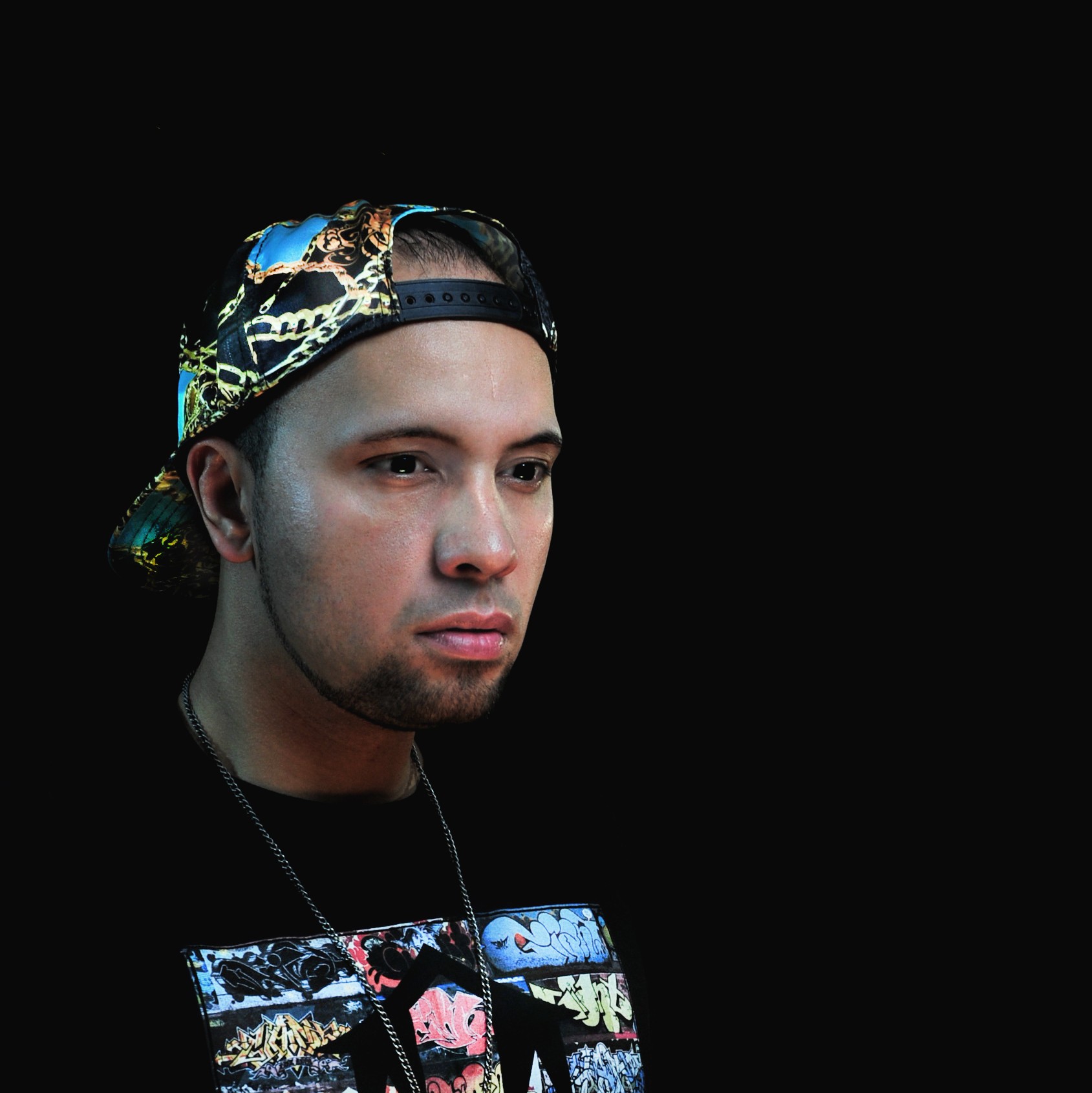
I have become quite interested in portrait photography and would love opinions and advice as I strive to learn more. Thank you for any of your comments!
 
Eye contact would be better. Most of the light is on his neck, which doesn't work well.
 
Eye contact would be better. Most of the light is on his neck, which doesn't work well.

The light on his neck is causing odd shadows too.

Could you give us some details about the lighting set up that is being used here?
 
Get that light behind him higher so his hurt doesn't cast a shadow on his neck. I'm finding this lighting setup interesting.

I think it would have worked better on a different color background though
 
There's no visual reason for the back light. It doesn't tell a story. This looks like a character that needs a more low-key photo. Most viewers subconsciously would probably want the left side of the face to be darker, or if you showed them that version they would pick it without knowing why.
 
Eye contact would be better. Most of the light is on his neck, which doesn't work well.

The light on his neck is causing odd shadows too.

Could you give us some details about the lighting set up that is being used here?

Strobes on both sides, slightly behind. Blue gel on left strobe, yellow on right. Beauty Dish in front. I was playing around with the lights, trying to come up with something interesting. Not much planning was done.
 
Get that light behind him higher so his hurt doesn't cast a shadow on his neck. I'm finding this lighting setup interesting.

I think it would have worked better on a different color background though

I see what you mean about the shadow on his neck. I agree on bringing the light higher. Thank you so much for your suggestion.
 
There's no visual reason for the back light. It doesn't tell a story. This looks like a character that needs a more low-key photo. Most viewers subconsciously would probably want the left side of the face to be darker, or if you showed them that version they would pick it without knowing why.

Thank you for the comment. That actually does make sense to me and it makes me rethink the whole shot. I appreciate the comment. I am a beginner and I am trying to get my thought process to think about every detail in the shot. Some times its so easy to focus on one thing that you overlook the rest or end up missing the theme you are going for. Thank you again.
 
Search "portrait lighting" on YouTube and other sites; learn the basic patterns, split, loop, Rembrandt, clamshell, etc so that you have a foundation on which to build. You certainly don't need to confine yourself to those, but they will help you understand a LOT about how light behaves, which will help you immensely when you want to design your own lighting patterns.
 

TopTechAlex, on Flickr

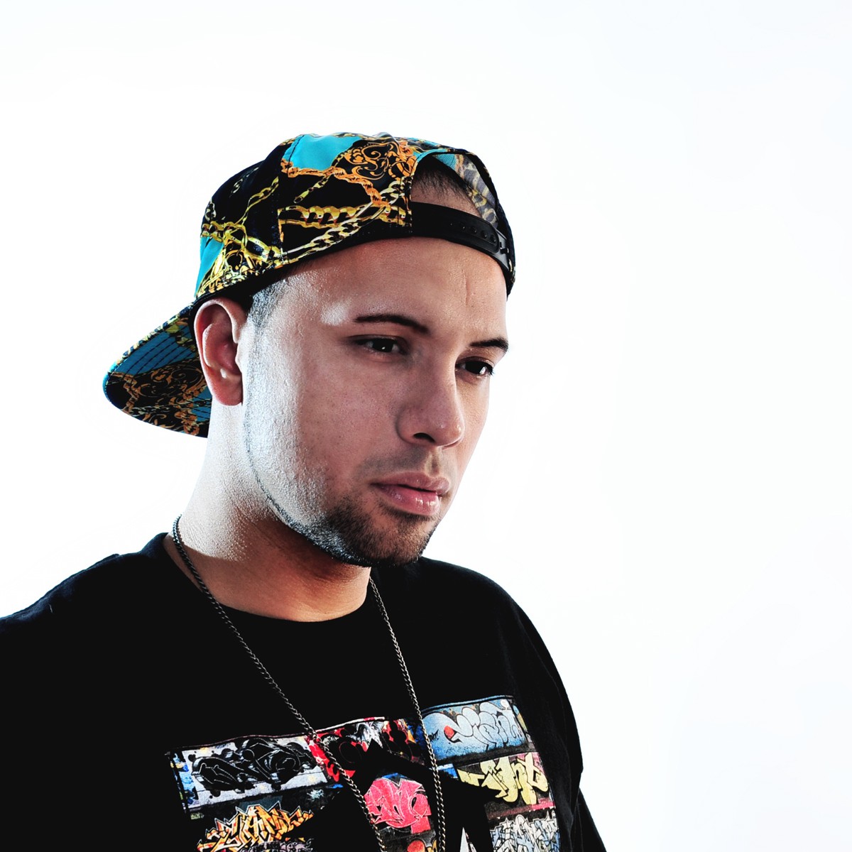
I did a quick reshoot tonight to try and apply some of the things I learned with this post. I wanted to see what you guys thought? Im not crazy about the pose itself, but I was mainly trying to duplicate the shot but with different lighting. Thank you guys so much.
 
Main light seems pretty low, causing some kind of unusual lighting in the top of each eye socket, and catchlights very low in the eye. The shirt blends in with the background quite a bit, making this sort of a "floating head" shot on black. You handled the light on his face on the left side better in this shot; looks like maybe a blue gel on that one? Compared to the earlier shot, this one is much more subtle in the lighting effects. Another light behind him, fired at the background, to show his outline, would have eliminated the floating head thing. I think though that this is a lot of progress from the earlier shot!
 
There's no visual reason for the back light. It doesn't tell a story. This looks like a character that needs a more low-key photo. Most viewers subconsciously would probably want the left side of the face to be darker, or if you showed them that version they would pick it without knowing why.

Thank you for the comment. That actually does make sense to me and it makes me rethink the whole shot. I appreciate the comment. I am a beginner and I am trying to get my thought process to think about every detail in the shot. Some times its so easy to focus on one thing that you overlook the rest or end up missing the theme you are going for. Thank you again.

One thing I find helps me a ton is when i have the shot n my head and pose/light to get the result i am searching for. IMO you need to work both on pose and lighting. Tirediron made a great suggestion. look up different type of lighting in youtube or wherever and practice that and in no time you will get the concept and what best compliments your subject.
 
Main light seems pretty low, causing some kind of unusual lighting in the top of each eye socket, and catchlights very low in the eye. The shirt blends in with the background quite a bit, making this sort of a "floating head" shot on black. You handled the light on his face on the left side better in this shot; looks like maybe a blue gel on that one? Compared to the earlier shot, this one is much more subtle in the lighting effects. Another light behind him, fired at the background, to show his outline, would have eliminated the floating head thing. I think though that this is a lot of progress from the earlier shot!

Correct on the blue gel. I see what you mean about the "floating head". I photoshopped the background with a gray texture and it looks much better. Youre completely right. Thank you for the suggestions. Next time I will fire a light at the background as you suggested. Thank you again.
 

Most reactions

Back
Top